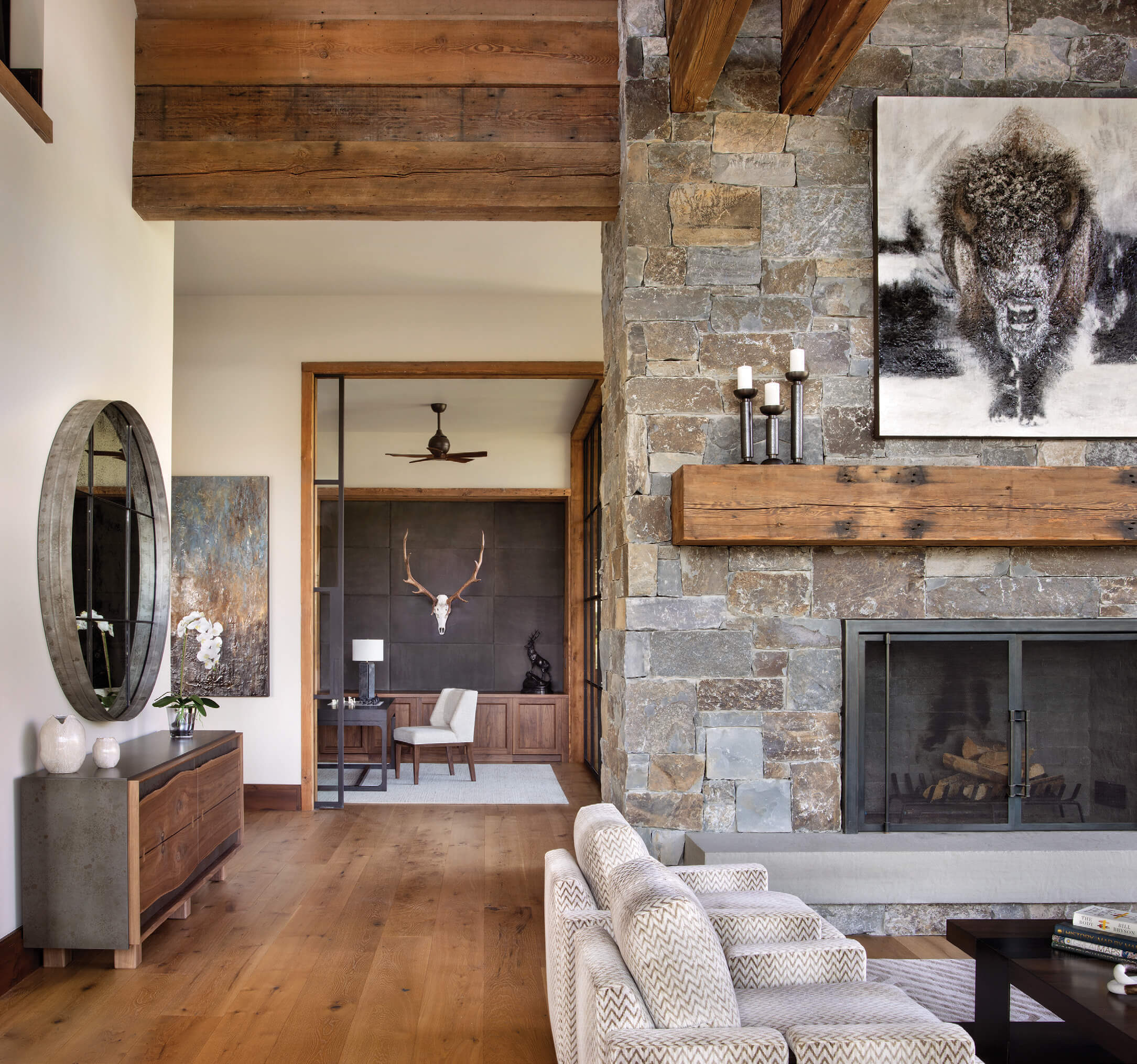
28 Sep Western Design: Second Chances
Architecture
Locati Architects
Interior Design
Locati Interiors
Construction
Schlauch Bottcher Construction
For a longtime Big Sky family, a new build from the ground up wasn’t so much about having a fresh experience as it was about preserving and expanding on what they loved about their old home. The East Coast-based family of six had long outgrown their Montana condo, but were loath to give it up. They loved its location, views, and the sense of family togetherness that it fostered. For the new home (which was selected after viewing multiple properties with Locati Architects, buying an existing home, exploring a renovation, then ultimately deciding to start over), the focus would be on sense of place and connectivity.
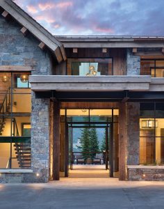
The tone of the home — one of transparency and views — is set from the entry, where the eye is drawn straight through the central living space to the patio and mountains beyond. The glass orbs in the stairwell and entry were custom made by Bozeman artist Ona Magaro. “There was an extreme amount of detail in making sure the scale of the fixtures, the bulb colors (gray and amber) and the height were right, even down to escutcheon plate on the ceiling and cording that came down,” says Interior Designer Amanda Heys of Locati.
“They knew what they loved about the area, as well as what they loved about the old residence,” explains Locati’s Darin Hoekema. “The experience of the sunrise is something the owners had had and were set on for a new residence. We were able to create that experience of enjoying the sunrise from the kitchen, the dining room, and the outdoor spaces. A key element [for them] was standing at the kitchen sink, simply sipping a cup of coffee and watching the sun rise. And as the sun rises, the hill comes alive at the same time, and you see the rest of the world waking up.”
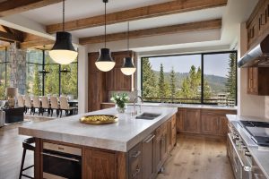
The kitchen, which is open to the primary living areas, has a lower beamed ceiling to create a sense of separation.
The clients’ main goal was to embrace the traditional mountain aesthetic of their previous home while building a larger home that could accommodate extended family and friends and offer multiple amenities, including a mudroom, billiards room, bar, ski room, hearth room, TV lounge, glass-walled office, lofted sitting room, workout room with cedar-lined sauna, and guest bedrooms. The architect designed the three-level structure in a U shape to screen nearby neighbors, then based the entry sequence on the iconic view of Lone Peak. After parking in the courtyard, guests are drawn to the front door by the two-story glass lantern to its left, which frames a dramatic modern staircase. The sense of openness and transparency is evident from the moment of entry, as the architecture leads the eye right through the house to the deck and landscape beyond. “It was one of the toughest design elements [to create] in the house,” notes Hoekema, “but it’s usually the toughest challenges you face as an architect that lead to the most successful outcomes.”
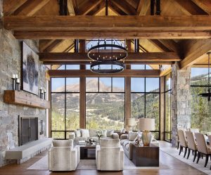
Almost all of the furniture in the house was made to order, with custom fabrics, sizes, and finishes. Every decision was based on accommodating large groups of friends and family (the dining table was designed for 16). Fabrics throughout the home — mostly chenilles, cut velvets, and leather — had to be high performance and comfortable, as well as hypo-allergenic. The chandelier and dining pendants were custom made by Ona Magaro.
The home’s aesthetic is a refreshed version of traditional, which Locati achieved by using classic materials — stone, wood, timbers — then adapting the fit and form of those materials. From the driveway, the paving transitions to gray sandstone, then the same stone and pattern are carried into the foyer and through to the deck, anchoring all the spaces and emphasizing the indoor/outdoor connection. Stone veneer and large timber plank sections are also carried from outside in, and from inside out, to enhance connectivity. While the prevailing palette is neutral, dramatic moments abound: in the central staircase, with its extraordinary three-dimensional wall of walnut panels; in the monumental timbers and truss work of the great room; in the glass-cornered dining room, which cantilevers out over the lower level; in the glass-walled office and upper-level glass bridge; and, of course, in the site itself.
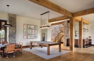
The lower level playroom and bar area has full views and access to the outdoors, thanks to the sloped site. “The owners really liked their old home, so we updated the neutral palette into more current finishes,” says Heys. “The kids didn’t really want to move into the new house, even though it’s three times the size [of their previous home], but now that they’re there, they love it. They’re into playing games and doing puzzles so we put a game table downstairs. When they’re there, they all like to be together all the time. They enjoy every space in the house as a group.”
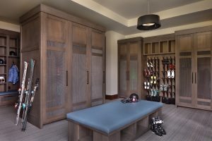
The ski room was designed for maximum storage. Each family member has his or her own locker and there’s still room for guests to have their own. With the center ottoman and a bench along the windows, there’s plenty of seating.
Interior fabric finishes were established from interior stone colors, Heys explains. “You’ll see grays and tans and rich browns and a little bit of rust. We tried to play with texture and material changes to compensate for the neutral palette and bring in interest. Once everything fell into place, we said, ‘Wow, this works!’ You see so much design and architecture repeated, on Pinterest or wherever, but you don’t come across this look very often. I think the neutral palette allows the wood to pop, and it allows you to take in the architecture and one of the best views at the Yellowstone Club.”
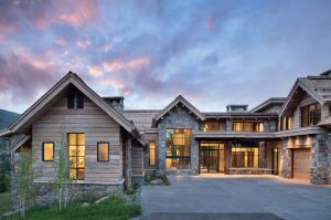
The house is arranged in a U shape to take full advantage of the views, while creating a sense of privacy. The dramatic double-height stairwell to the left of the front door becomes a lantern at night. The plan takes full advantage of the slope to create a home that is generously scaled, but not monumental. “It’s all about the site,” says Hoekema.
The home’s ample size is belied by its sense of connection, an imperative for this family-centric home. Throughout the design process, the goal of encouraging interaction was paramount. For instance, while some bedrooms are remote, the central staircase ensures that everyone circulates through the heart of the home. “When they’re there,” explains Heys, “they all like to be together all the time.” Whether milling around in the kitchen, doing a puzzle or shooting pool downstairs, hanging out in the hot tub, or throwing sleeping bags down in the loft lounge so they can camp out together, “They enjoy every part of the house as a group.”
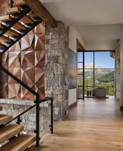
The architect, designer, and homeowner worked closely together to design the remarkable custom walnut panels. These extend from the main level to the upper level in a two-dimensional layout with a repeating pattern that changes orientation. “We designed it together to finesse detail and movement, then had it custom built in Montana,” explains Heys. “It replaces art in the stairwell. With the glass railing and the simplicity of the stairwells, I think it’s the most successful element of the whole project.”
In the end, the family got what they wanted without losing what kept them coming back to Big Sky, explains the architect. “There were a lot of things they did love: the mountain-architecture vibe and the setting, as well as experiential things, like how the sunlight came in in the morning, and the views. We were able to carry those through with this project; we were able to bring them in, expand on them, reinterpret and freshen up all those things.”
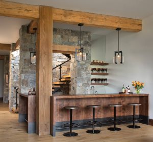
Adjacent to the hearth room, the walnut and steel bar area was conceived as a space within a space. “It becomes a more intimate hang-out space,” says Hoekema, “but it still has iconic views across the hearth room to Lone Peak.” Pendants by Ona Magaro.
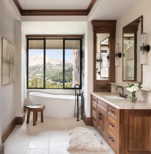
In the master bath, walnut cabinets are offset by a contemporary tub placed for maximum view enjoyment.
Chase Reynolds Ewald has been writing about Western design, food, art, travel, and rustic style for more than 25 years. A consultant and freelancer, her recent books include National Outdoor Book Award winner Bison: Portrait of an Icon, her sixth collaboration with photographer Audrey Hall; Modern Americana; and At Home in the Wine Country; chasereynoldsewald.com.
Peter and Kelley Gibeon began their path of collaboration in 2003. Based in the Mountain West, this husband-and-wife duo specializes in luxury architectural and interior design photography. Featured in numerous publications, their passion for their clients and craft shines through in every frame.


No Comments