11 Dec Western Design: Moutain Home Makeover
When it comes to design, Tracey Byrne, of the Massachusetts-based Waldyn Group, has become known as a transformation specialist. Having undertaken more than a dozen renovations in Big Sky, Montana, since she and her family discovered the wonders of this tucked-away mountain town 15 years ago, she has perfected the art of finding well-built but slightly dated homes and bringing them up to date with her unique style. In a nutshell, she gives older buildings new life. “My favorite projects are renovations. I love the process of transformation, and the challenge,” she says, adding that she is also happy to work on new construction projects, and does so often.
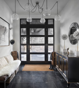
For a renovation of a mountain home in Big Sky, Montana, designer Tracey Byrne focused on lightening and brightening the interiors while celebrating the home’s overall structure and spectacular views. To create a welcoming entryway, she added a glass front door, hung Otis Pendants by Regina Andrew, and topped a vintage cabinet with a Kate Spade lamp.
Contractor Dan Gibbons of the PRG Group, who has worked with the designer on almost all of her Montana projects, says Byrne has a gift for perceiving potential in older homes. “A lot of the homes were built within a 10-year span, 1998 to 2008 or so,” Gibbons explains. “The bones are amazing; these are big, beautiful houses with lots of glass and incredible views. Tracey strips them, sometimes all the way and sometimes just cosmetically, for a night-and-day transformation. What she does is like taking an old, rusted-out boat and returning it to its prime. She’s got a unique vision and the ability to give these older homes a modern, contemporary flair.”
For one of her latest Montana projects, Byrne worked with Gibbons and architect Jamie Daugaard of Centre Sky Architecture on a 1990s ski home on a mountain lot. “One nice thing about this house,” she recalls, “was that it had a lot of old timber beams, which are longer than what you can get now. It had really nice original stone work, high ceilings, and a lot of natural light. It also had a big open floor plan, and I loved the openness. Structurally, it was really well built. … Everything else just needed refreshing.”
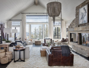
One challenge in renovating this home was creating a sense of separation within the oversized great room. Newly whitened walls and ceilings make the room feel bigger, while the timbers — sanded down to a natural finish — act as natural dividers to create coziness. The Classic Copper end table is from Global Views, and the Urchin Chandelier is from Ngala Trading. A sumptuous rug invites visitors to kick off their shoes.
The exterior of the home and the detached guest house presented square-edge planks with plaster chinking that had yellowed over time. “I’ve been told you can’t really go lighter but you can go darker. We went with black, and we also stained the chinking black to make it more neutral and to erase the white lines. Lots of people asked, ‘Are you sure?’” Byrne laughs. “But I had an idea. I had Googled ‘black cabin’ and found an image of a cabin in Norway. It was much smaller and had white trim, which we didn’t do, but I’m really happy with the way this turned out. It looks great in the woods with the stone foundation.”
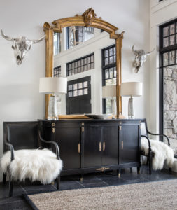
For the lower entry, Byrne chose an antique mirror, cabinet, and chairs with Aiden table lamps from Made Goods.
Both levels of the home’s interiors were dark, with tones that were uniformly brown and windows that were broken up with mullions. “Everything needed to be lightened up,” Byrne explains. “We took out the window trim and mullions — it was just too much detail — and replaced them with big, open windows, so as not to obscure the view of the Spanish Peaks.”
Architecturally, the most significant move was creating a proper front door to the upper level’s entertaining spaces. Previously, the main entrance was on the lower floor, as using the upper floor entrance involved walking through a shower and bathroom from the pool and hot tub area. Because of this change in the layout, Daugaard was tasked with creating a sense of arrival at the new entry. He designed a gabled roof to extend between the primary structure and the guesthouse, offering shelter from the elements while guiding arrivals — with the aid of new lighting and hardscaping — to the front door.
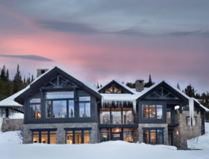
Jamie Daugaard of Centre Sky Architecture helped re-envision the project. The biggest intervention involved moving the primary entry from the lower level to the main level, where a new roof addition connects the guest house to the primary home. The team decided to stain both the exterior planks and the chinking black.
The team reconfigured the laundry and mudroom; created more space and a sense of separation from the living room for the master suite; replaced the entrance to the wine cellar; built in a bar and TV area on the far end of the great room; reshaped the kitchen island; and transformed the media room, game room, and bedrooms through updated window treatments, lighting, and overall décor.
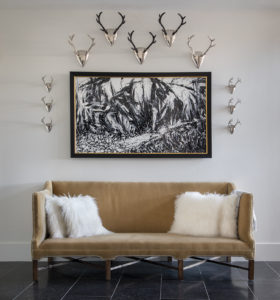
A rustic, modern vignette pairs a velvet sofa by Bobo Intriguing Objects with a painting by Bill Stone, surrounded by an array of antler mounts.
Throughout the process, the team worked so well together that they’ve already embarked on their next project. Of Gibbons, whom she has nicknamed “Mr. Can-Do,” Byrne says, “I love working with him. Nothing is too hard; he’s always so positive.” Rounding out the trio, Centre Sky Architecture brings creativity, rigor, and technical knowledge to the table. “Good projects need a good team and a good client,” says Daugaard, “and we had both.”
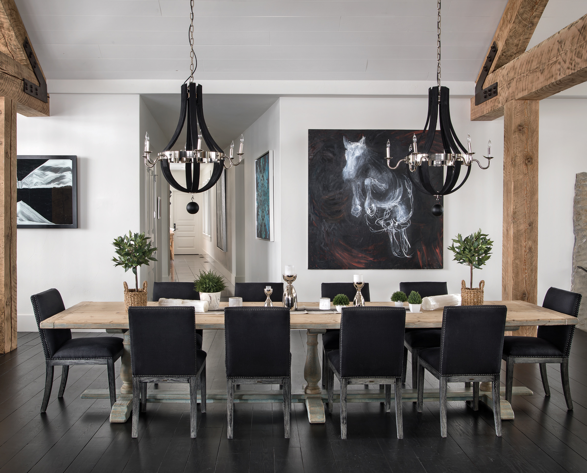
Byrne’s remodeling projects exemplify the ways in which a total transformation can be wrought without replacing everything. “We just worked with what we had,” she explains. In the great room, they replaced the wall paneling and sanded the chunky timbers to give it a cleaner look. In the kitchen, they reshaped the island, squaring off and widening the top, pulled the trim off the windows, painted the mullions, cabinets, and island black, and replaced the light fixtures to achieve a fresh, contemporary look despite retaining the original layout, cabinets, and appliances.
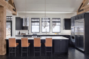
The changes to the kitchen were cosmetic but transformative; the Viking appliances and cabinets are original. Byrne painted the cabinets black, replaced the windows, and added white marble slabs as countertops. The hanging fixtures are Ralph Lauren’s Modern Lanterns.
The most transformative effect was achieved by changing the colors in the great room from an orange-leaning tone to more natural hues. This involved bead-blasting the timbers to raw wood, sanding and painting the floors, and painting the ironwork for contrast. Painting the ceiling white, says Byrne, “added so much light. It was like night and day, and as if the ceiling had been raised 10 feet.”
When it comes to furnishings, the designer takes a simple approach. “In all the homes I do in Montana, my philosophy is not to compete with the views and colors that you see through the windows. I like to keep everything neutral: off-white or linen upholstery, natural leather colors, and unfinished wood for tables and consoles, especially in places with big windows. There are so many amazing colors in nature,” she adds. “I don’t like for anything to interfere with that.”
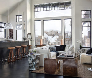
The end of the large open living room houses the TV area and a new built-in bar with chamcha wood carved chairs, a silver “log” end table from The Phillips Collection, and a vintage shearling chair.
While the overall transformation is an example of what can be achieved without sending material to the landfill, Byrne’s solution to the oversized great room represents a different kind of success. “The most interesting thing,” says Daugaard, “is that great room space. It’s a really big volume, probably 80 feet long. The question was how to dissect it and bring it down to scale. Tracey did an amazing job with colors and furniture; it worked really well.”
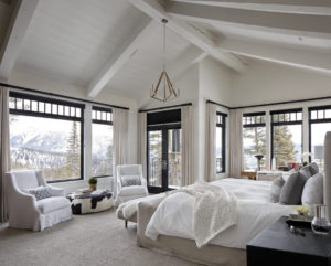
The master bedroom features 180-degree mountain views and a private deck. Byrne chose a vintage hide-upholstered table, an upholstered bed by Brownstone Furniture, and leather nightstands by Made Goods.
Byrne loves a layout — like the one in this home — that encourages people to be in the same space, while perhaps having varied experiences. “I love that the whole family can be together, but everyone can be doing different things: watching TV, working on a puzzle, playing games, or tuning out by yourself with a book,” she says.
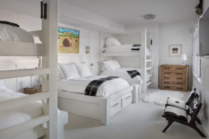
The bunkroom was transformed from dark to light and airy with white walls and furnishings. The plaid throws are from Mainely Alpaca; the painting is by Bill Stone.
To that end, Byrne deliberately placed a double chaise lounge in the corner by the big windows that face out to the mountains. It offers a private space to sit with a cup of coffee in the morning, or to retreat with a book in the afternoon. It’s no accident, she says, that this quiet nook quickly became the owner’s favorite spot.
Chase Reynolds Ewald has been writing about Western design, food, art, travel, craftsmanship, and rustic style for more than 25 years. Cabin Style, her 10th book (and fifth collaboration with photographer Audrey Hall), was released in August; chasereynoldsewald.com.
Peter and Kelley Gibeon began their path of collaboration 15 years ago. Based in the Mountain West, this husband and wife duo specializes in luxury architectural and interior design photography. Featured in numerous publications, their passion for their clients and craft shines through in every frame


No Comments