12 Aug The Wild World of Color
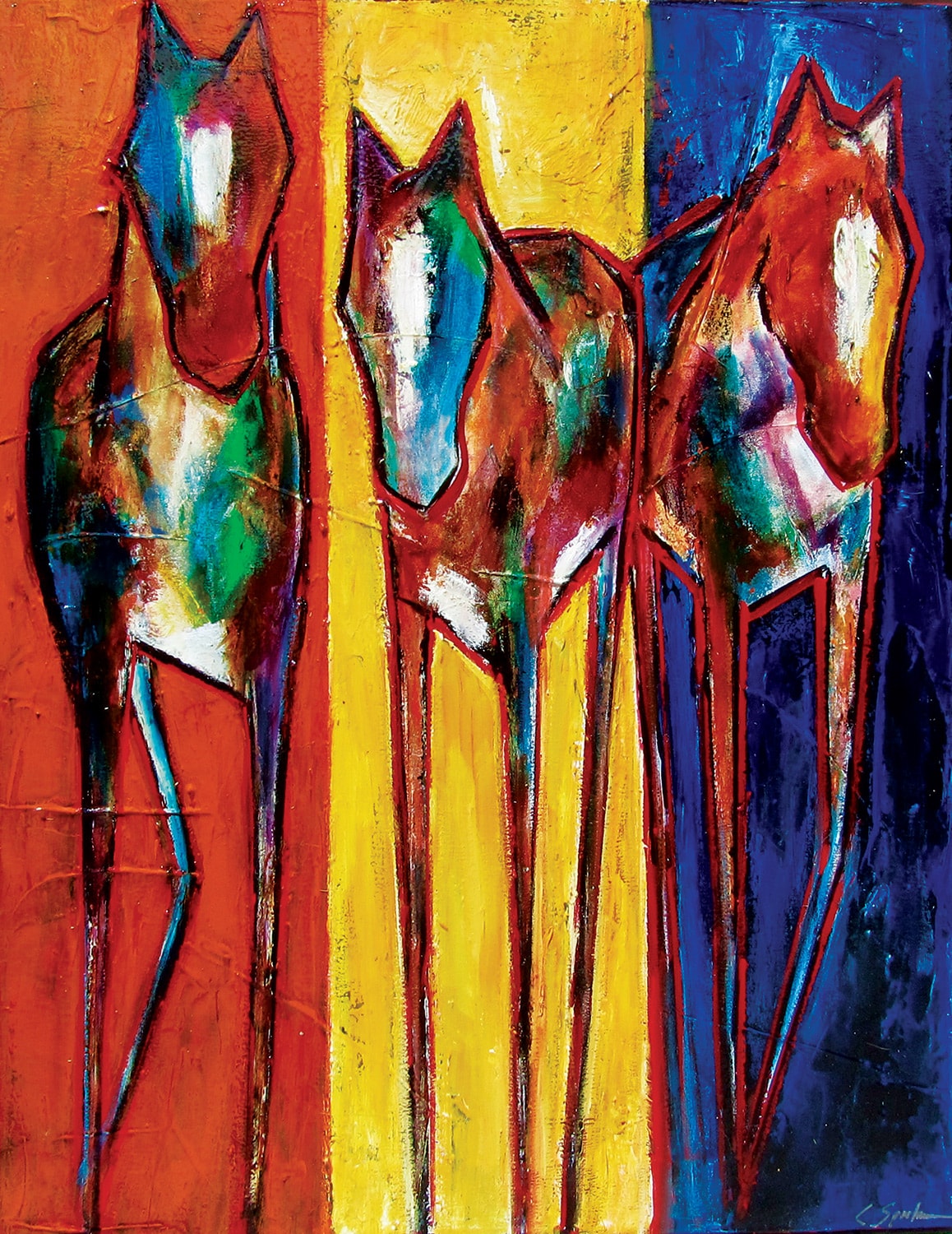
When artist Carol Spielman paints, it’s as if she’s entered another world. Moving excitedly around a piece that’s spread flat on the floor, she mixes colors right on the canvas to see how the layers will unfold. Sometimes she dims the lights and lets the buzzing of her creative energy guide her, often surprised by the colors that pop once the lights come back on. “It’s a feeling, and the feeling is happening as I’m creating the piece, as the colors mix,” Spielman says. “I’m trying to capture that energy, and I try to react to it; it guides me to where I want to go.”
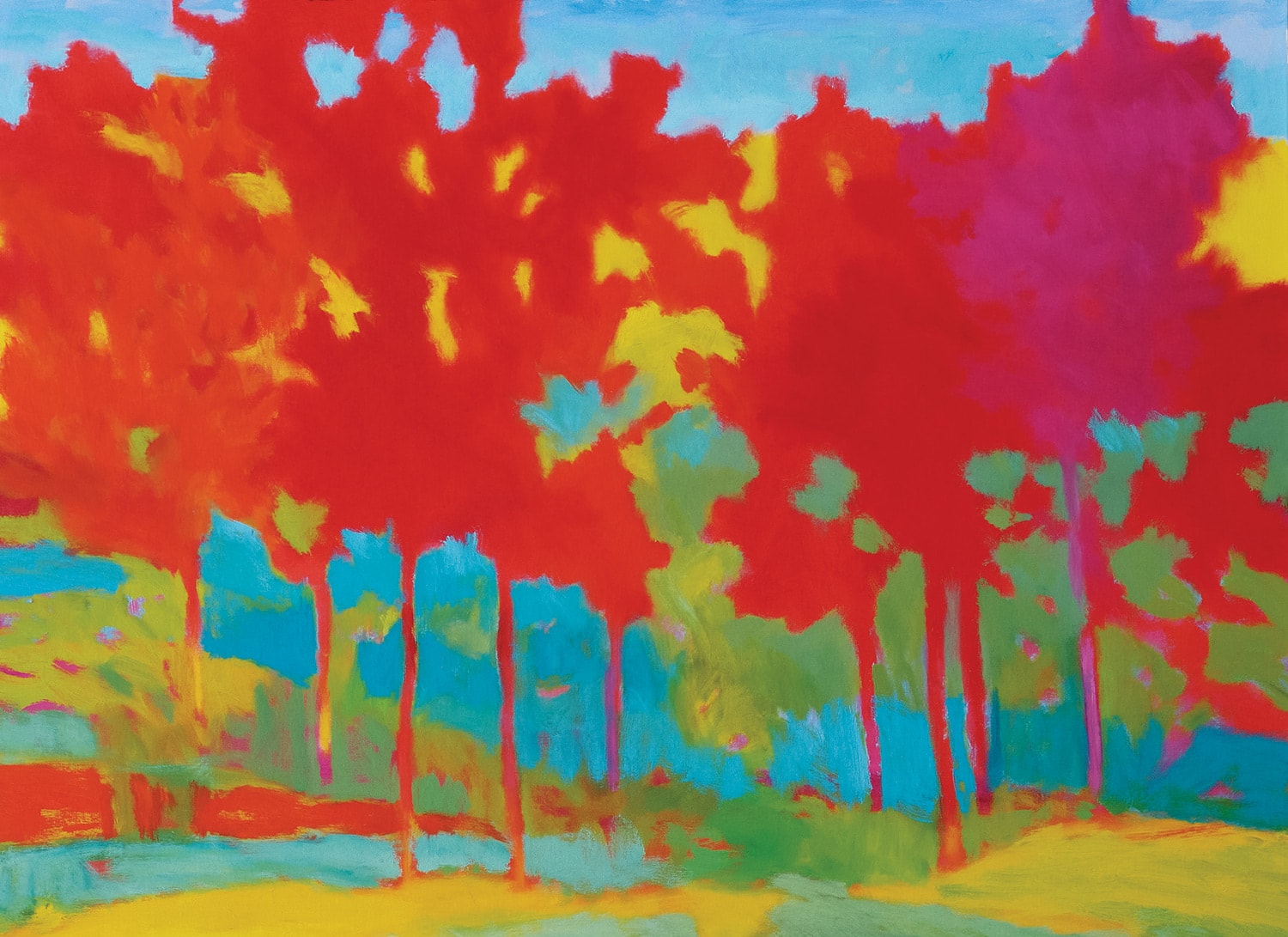 Toward Red Lodge | Marshall Noice | Oil on Canvas | 36 x 48 inches | Courtesy Waxlander Gallery, Santa Fe, NM
Ask any artist about why they use color the way they do, and be prepared to get a wide variety of answers. Color is, after all, the essence of painting, whether a painter is capturing a scene exactly as he or she sees it, or manipulating color in an abstraction. Some artists are calculated mixers, creating the perfect brown hue to emulate a tree trunk, while others, like Spielman, take a more carefree approach. Especially in contemporary art, the colors may be what draws a viewer into a piece, or makes one turn away.
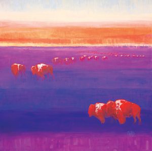
“The Wind Roams Free” | Carrie Wild | Acrylic, Gold Leaf, and Resin on Canvas | 48 x 48 inches
For some contemporary artists, bold colors are their signature, their focus, while the subject matter is perhaps secondary. Spielman, for instance, is known for her exaggerated depictions of horses. It’s the bright colors she uses within and around her horses that make them leap from the canvas. The process of using color so freely came about during her art education at Montana State University in Billings, with a professor whose style was rooted in the nontraditional use of color. “My work is not representational, but there is a figure there,” she says.
Spielman, who now resides in Billings, grew up around horses on Orcas Island in Washington. After walking her horse into the ocean one day, and feeling the animal’s power as it began to swim, she chose the horse as her totem. “Horses are very sculptural and humanistic. There’s a form, but for me it’s more about the color and texture; that’s where the feeling comes in.”
Kalispell, Montana-based artist Marshall Noice also has a specific focus when it comes to subject matter. His paintings are usually landscapes, but the bold and often conflicting colors he uses — magenta, orange, and turquoise, to name a few — are what make them distinctly his own. When put next to each other, the colors just about vibrate off the canvas.
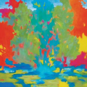
“Juniper” | Marshall Noice | Oil on Canvas | 48 x 48 inches | Courtesy Waxlander Gallery, Santa Fe, NM
“The landscape is about my desire to work outdoors, and to a great extent the subject matter could be anything; it’s an excuse to work with paint and color, line, composition, and form,” he explains. Noice was greatly influenced by the work of Post-Impressionists such as Cézanne, Gauguin, and Matisse. “They used strong color and emphasized painterly qualities over the representational and realistic values that had been prevalent in earlier painting,” Noice says. “What they were doing, and what I am doing, involves a high degree of simplification of the subject matter, and the use of color to express emotion instead of depicting a scene literally.”
Jackson Hole, Wyoming-based painter Carrie Wild has chosen to portray the wildlife that surrounds her in her mountain town: bison, elk, horses, moose. But the offbeat colors she uses are also her trademark, and of gravitational appeal for her collectors.
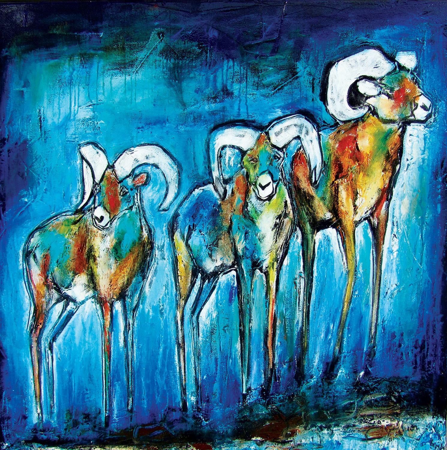 Big Sky Rock Stars | Carol Spielman | Acrylic on Canvas | 36 x 36 inches
Wild started her art career with animal portraiture and realistic scenes — which remains evident in her animal’s more realistic features — but she eventually evolved into abstract settings and bold colors. “I went through a moment of needing to do something different,” she says. “I got a big canvas out on the floor, smeared a lot of colors around, orange and purple, added some horses, and it worked. I attempt to create some sort of habitat even with my abstract shapes and colors, a place for that animal to be.” Wild is a self-described “addict to wide-open spaces,” and she takes many of the colors from nature, although she exaggerates them, adding an esoteric touch.
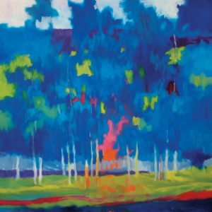
“An Evening View” | Marshall Noice | Oil on Canvas | 48 x 48 inches
While each artist uses color differently, and for different reasons, one consistent commonality is their desire to communicate emotion. “I know that color affects people, evokes emotion, and makes people feel things,” Noice says. “A particular combination of colors can create a sense of serenity and relaxation. They can be easy to look at.” However, Noice is going for a different emotional reaction. “I try to use bold colors that create tension and are sometimes even unsettling to the viewer, which I think creates excitement visually,” he says.
Wild, on the other hand, strives for pops of color that hit a happy nerve. “I like happy art, I think that’s one reason I paint in bright colors, it feels good,” she says. “I just go with what I’m feeling. I might start with some color in mind and then that might change. I work on trend a bit too, and use colors that are ‘in’ at the time; I have fun with it and try and change it up.”
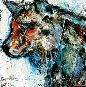
“Wild Side | Carol Spielman | Acrylic on Canvas | 20 x 20 inches
And for Spielman, the goal is to capture the feeling and excitement she has while painting, hoping that it’s reflected in the work in a positive and powerful way. “A lot of times people think that it looks just like their horse,” she says. “I’m trying to capture a feeling, a moment, and when they say that, that’s when I know I’ve done it.”
Colin Mathews, owner of Creighton Block Gallery in Big Sky, Montana, which represents Spielman’s work, says that through his years of working with artists and collectors, he’s learned that the feeling makes the sale — whether it’s the excitement and tension that Noice strives for, or the sheer pleasure that Wild and Spielman lean toward. “Colors are a powerful language unto themselves. It’s not just about the color wheel, it’s also about psychology,” he says. “But I also like to think that good artists have a tube of something in their paint kit that’s called magic, whether it’s coloring composition or whatever it is that’s distinctive.”
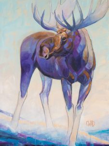
“Free Spirit” | Carrie Wild | Acrylic, Gold Leaf, and Resin on Canvas | 40 x 30 inches
Mathews also thinks that the use of bold color is tied to happiness. He gets to watch the buyers’ and viewers’ interaction with the pieces he sells, including the works of Kevin Red Star, Duke Beardsley, John Yato, and other artists who use bold colors as their trademark. “Viewers unconsciously are experiencing an emotion that takes them to their happy side of the street.”
And for Noice, Wild, and Spielman, no matter why they choose the colors they do, in many ways it’s also an unconscious act, a slice of magic, a sporadic reflection of the feelings they are experiencing in the moment of creation; whether they are painting outside, or, like Spielman, dancing around a flat canvas. “You have to turn off your left brain — that’s critical — and just play and have fun,” Spielman says. “I want it to be a feel-good thing. It can make the world a better place.”


No Comments