23 Nov Western Design: Traditional Meets Modern
Architecture
Centre Sky Architecture
Construction
Teton Heritage Builders
Interior Design
Clean Line Consulting
An Atlanta-based family first discovered Big Sky, Montana through their love of fly fishing, but when they realized how extensive the skiing and hiking options were there, they decided to put down roots in the mountain town. After settling on a property that was thick with lodgepole pines, located at 7,800 feet of elevation, and facing northeast to monumental views of the Spanish Peaks, they turned to Centre Sky Architecture, Teton Heritage Builders, and Clean Line Consulting for a house that would blend traditional and contemporary architecture with unique and unexpected touches. The result is a striking home on a spectacular site that straddles the line between classic and modern through familiar gabled roof forms that are paired with walls of glass and steel that flows inside and out.
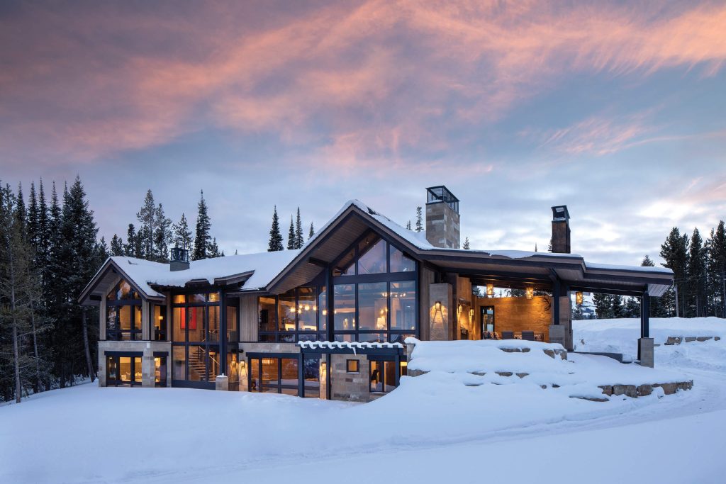
The shed-roof portion balances the home’s mass while creating an outdoor living area that’s sheltered from the elements yet open to the views.
“This is a mountain modern home,” says architect Jamie Daugaard. “The rooflines are traditional, but the walls are modern. As we discussed ideas and walked the site, it was clear the clients wanted a very open concept, so the home is more traditional in form, but we dissolved most of the view walls.”
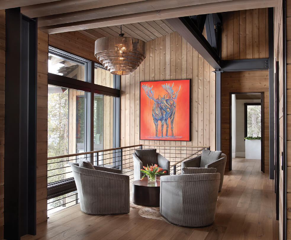
A sitting area between the main living spaces and the hallway to the owners’ suite is filled with natural light from the open stairway and two-story wall of glass.
Positioned on a moderate slope and anchored into the ridgeline over two levels, the architecture is asymmetrical yet balanced, with a long center ridge that’s aligned with the hillside. Two prominent gabled structures — the larger one creating a drama-rich view corridor from the front door, and the second housing the primary bedroom suite — focus on views of the Spanish Peaks. A shed-roof portion extends out on the western end, balancing the home’s mass and creating an outdoor living area that’s sheltered from the elements but gloriously open to the view. The shed roof is an integral part of the design, producing a soft line that terraces down and ties into the topography. On the home’s downhill side, a monumental wall of windows flows from the main floor to the lower level, drawing light deep into the interiors. The structural expression of the steel, meanwhile, is minimal on the home’s exterior, yet central to the interior experience.
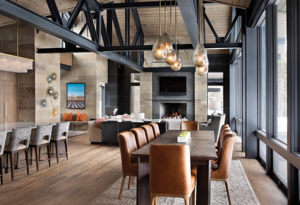
Two parallel steel chord trusses that span from the grand staircase through the great room to the kitchen and dining areas transform on both ends into traditional gable trusses. Interior designers Kelly Lovell and Ashley Sanford of Clean Line Consulting worked closely with the homeowners to identify the stars of the lighting scheme; one was the custom wall sconce from Tracy Glover Studio in the entry/great room.
“Clearly the owners and architect appreciated that the steel truss, along with the girder truss tail, was going to be the focal point of the home, and everything cascaded out of that,” explains Peter Lee of Teton Heritage Builders. “When we’ve done steel homes in the past, they tended to be extremely rectilinear and cube-like. In this case, the forms are traditional, yet the steel is the primary expression of the home, and the steel truss is a classic form that adds interest. … For us to be able to play with the steel, but maintain the traditional Rocky Mountain form, was a lot of fun.”
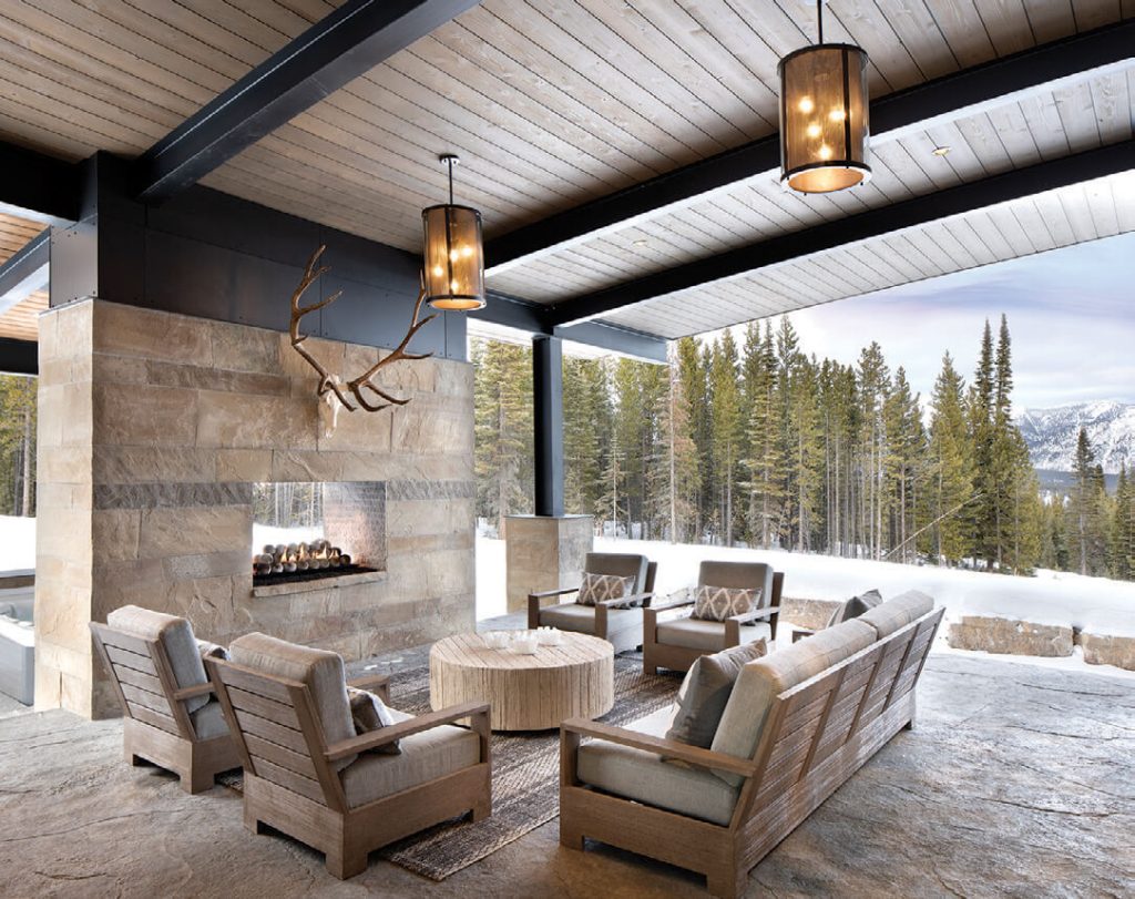
An outdoor, all-season space is sheltered from the weather, yet open to the sublime views. The two-sided fireplace creates privacy and a sense of connectedness for those enjoying the hot tub.
From the arrival area on the uphill side, the home’s promise is immediate. The view across the valley to the mountains draws attention even before reaching the door, while to the left, a wall of Montana sandstone — punctuated with small square windows rising part-way to the open roof above it — illustrates the unexpected architectural touches.
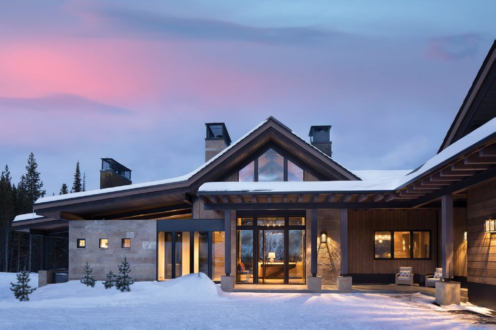
Viewed from the arrivals court, the architecture signals the surprise inside.
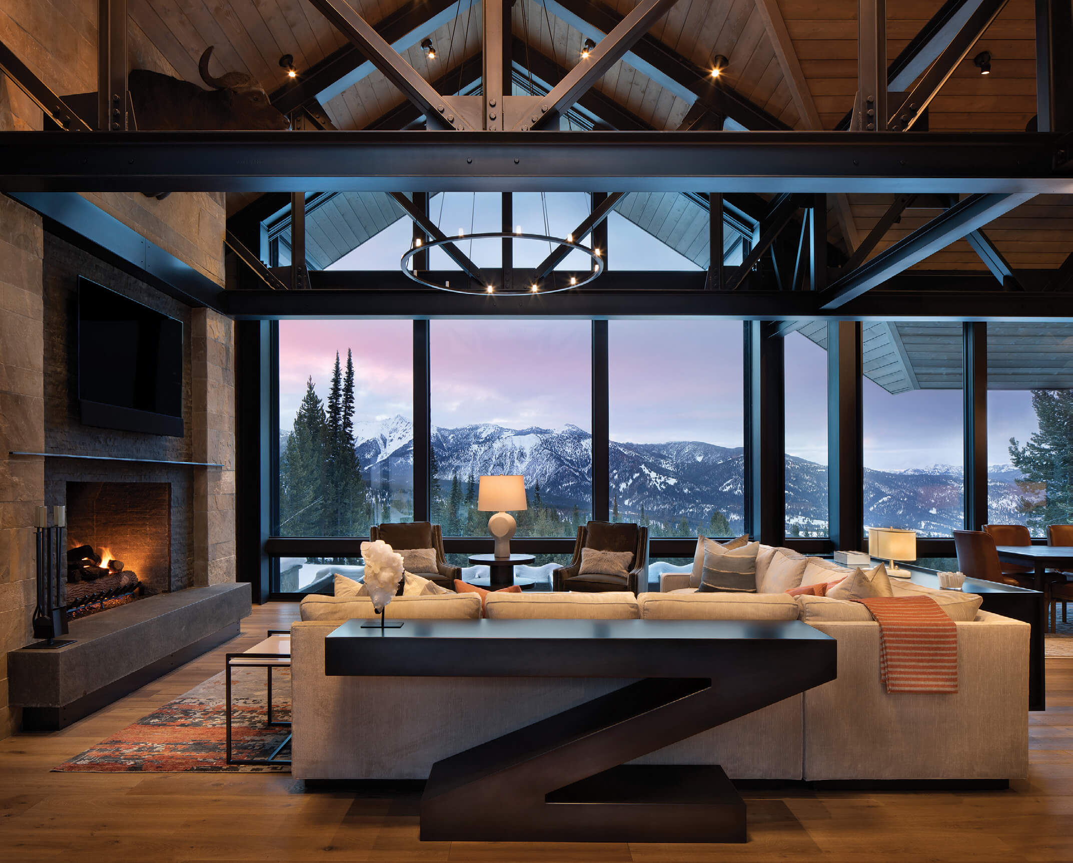
Once inside, the vastness of the view is balanced by the architecture. Two parallel steel chord trusses span from the grand staircase through the great room to the kitchen and dining areas. They attach at one end to the fireplace structure and transform on both ends into traditional gable trusses. The metalwork creates a bold contrast against the wood-clad ceiling, while wood- and stone-clad walls create warmth and visual richness.
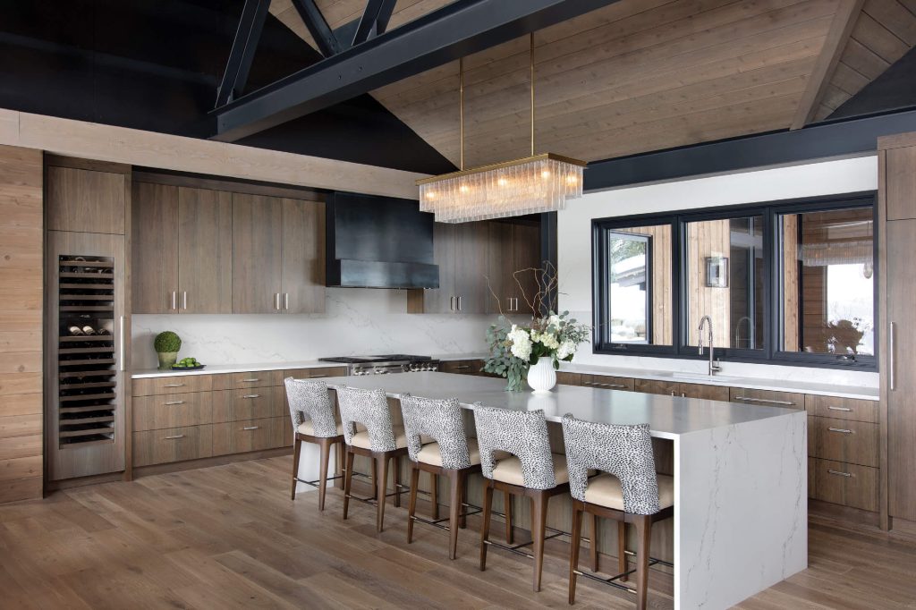
The kitchen features clean lines and neutral tones, and it opens to the dining room so that the cook can be in on the action.
With shiplap cedar extending from the exterior to the interior, the indoor-outdoor traction is seamless, as is the transition to each room. “We want our spaces to blend from space to space to space,” explains Daugaard. To that end, the architect used the stairs to create a flow between both levels — the entire section of wall features glass and steel over two stories — and to bring light into the lower bedrooms, bunkroom, and game room. “The staircase is a great piece,” says Lee. “The architect and the owners wanted a surround of glass. It’s a big feature inside, but you can also experience it from the outside, especially in the evening. The home glows; you feel like you’re inside even when you’re on the back patio.”
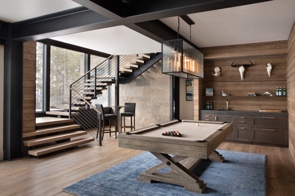
The wall of windows lets natural light into this lower-level game room.
Once downstairs, the steel beams contrast with the white ceiling and the wood- and stone-clad walls to create drama, says Daugaard. “The drywall accentuates the material around it and causes a reflection of light so that the lower space doesn’t feel like a lower space.” Another interesting design element is what the architect refers to as “bending space,” a technique that involves wrapping one space around another. “So even without doors, you can’t see in,” Daugaard adds.
Throughout the project, the architecture is complemented by harmonious interiors. Kelly Lovell and Ashley Sanford of Clean Line Consulting emphasized the clean lines — as their business name denotes — along with neutral colors and key pieces of bold contemporary Western art that unite the traditional and modern concepts. “In our first conversation,” says Sanford, “the homeowner mentioned that she wanted as little drywall as possible, so we worked closely with the architects to identify what walls would get wood, steel, wallpaper, stone, or tile.”
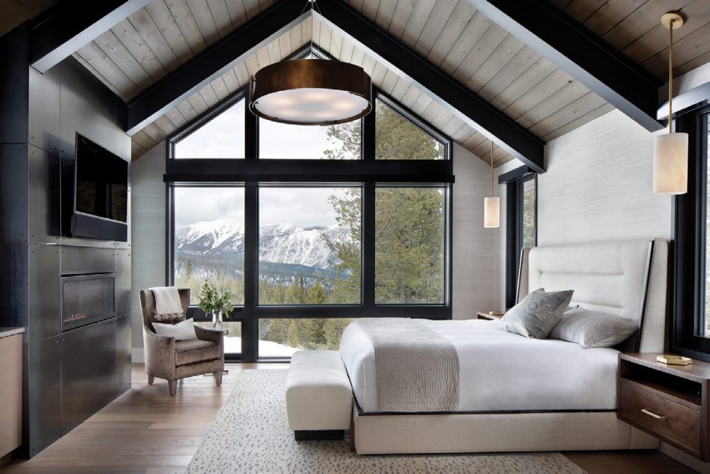
A second gabled form — smaller than that of the main entrance and great room —houses the primary bedroom suite.
The end result is a warm palette and comfortable yet unique touches. “We always tell our clients that we want them to think fondly of us five years down the road,” Sanford explains, “that we want the house to be stunning the first day they walk in, but after years of use, we still want it to feel happy and durable and timeless. Mountain modern can go cold so easily with stone and steel and glass, but it can also feel incredibly peaceful and in harmony with the surroundings. We are always looking for that balance.”
The home, meanwhile, is remarkably versatile, with moments of intimacy amidst the open spaces. “The architects really listened to the owners’ desire for great flow,” Lovell says. “We loved that all of the rooms make sense for gathering people, giving everyone a bit of private space, and providing spots for the family to be together.”
The home is rich in views but also grounded in place through the statement truss work and textural interiors. It is one in which every corner has balance — in scale, materiality, and light — in an original expression of mountain modernism.
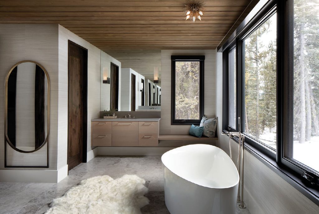
A floating tub is the grounding element and focal point in this serene bathroom.
Chase Reynolds Ewald has been writing about Western design, food, art, travel, craftsmanship, and rustic style for more than 25 years. Bison: Portrait of an Icon, her 12th book and sixth collaboration with photographer Audrey Hall, was released in March 2021, and Modern Americana, with designer Max Humphrey, was released in April 2021; chasereynoldsewald.com.
Peter and Kelley Gibeon began their path of collaboration in 2003. Based in the Mountain West, this husband- and-wife duo specializes in luxury architectural and interior design photography. Featured in numerous publications, their passion for their clients and craft shines through in every frame.


No Comments