30 Sep Western Design: Prairie Renaissance
Great architectural design is often subtle. It can slide by unnoticed, something that resonates unconsciously as opposed to making an obtrusive statement. Effective architecture is something you might not notice, but certainly feel.
The invisible of good design is well articulated in the residence of John and Anne Soares located in Billings, Montana. The design team’s collaborative effort and careful attention to detail — from foundation to rooftop — manifests itself in a classically designed home that’s crafted to be comfortable, inviting and sophisticated. And you feel it as soon as you walk through the door.
Designed by Jeff Robertson of Homesite Designers, the home incorporates elements of Craftsman and Prairie-style architecture. Prairie-style homes, popularized by Frank Lloyd Wright and Louis Sullivan in the late 19th and early 20th centuries, are characterized by low-pitched roofs with overhanging eaves. They seek to integrate with the landscape and feature solid construction, open interior spaces, simple building materials and restraint in ornamentation. Prairie was an attempt at developing an authentic North American architectural style, and it developed in tandem with the design philosophies of the Arts and Crafts movement which advocates for simplicity and functionality.
The Soares residence features these historic design elements, but with a twist of fresh, contemporary styling. “I believe all architecture should be anchored to traditional architecture. That’s just my personal belief,” Robertson said. “Most people will understand traditional architecture because they’ve grown up with it, and I think you always need to build on traditional architecture for people to feel comfortable. Ninety percent of people who walk through here feel very, very comfortable, whereas if you design something more abstract you may only relate to about 30 percent.”
Completed in 2007, the home’s exterior features a low-pitched roof and sheltering eaves supported by stately stone columns. These battered columns, which taper upwardly slightly, were designed to grow out of the site, anchoring the home to the ground. This tapered theme is also found in details on the doors, furniture, cabinetry and interior columns. “It’s a real subtle thread that weaves throughout the house and I think that’s important for continuity,” said Robertson, who designed many of these custom details.
Overlooking a lovely golf course, the home is orientated on a flat lot at the end of a cul-de-sac. To nestle the home into its surroundings, both the structure and the landscaping needed to work together, which required thoughtful planning, said Robertson. “One of the things [the homeowners] didn’t like about the lot was it had so much exposure to the golfers. They like privacy, and so … [we] actually dropped the whole backyard and used materials and berming to contour it so that they could still enjoy the outside but not be so visible.” The result is a private outdoor living space that is not closed off by foliage. “We have a world that thinks structures are one thing and landscaping is another, but really it’s all integrated,” he said.
Emerging during the late Victorian period, the Arts and Crafts movement rejected the formulaic styling found in industrial design and instead sought to return to handmade workmanship. Elements throughout the home are custom-built by local craftsman, from light fixtures, to door handles, to furniture. “I think it’s important that [the design team] sets the theme and then allow artisans to take [that theme] to the next level that we could never see, because they are in the medium and they are the artist,” Robertson said.
Built by Myers Custom Homes, materials of Venetian plaster, stone or walnut are used throughout the home. Care was taken even to match the wood grain found in the trim and floorboards.
“There’s really no detail left unattended to throughout, from ceiling to floor,” said Jeremiah Young with Kibler & Kirch interior design firm. The theme for the home’s interior started with the floor plan and then considered fabric choices. The color palette sought to complement the warmth of the walnut and the ultimate goal was to reflect the Soares’ personal taste and style.
“The house just functions really well; it flows nicely,” explained homeowner Anne Soares. “We wanted our home to be Montana. We wanted it to feel comfortable, warm, elegant but not overstated or formal. We wanted to be able to put our feet up and live in it.”
Bringing all of these details together was a group effort, with each member of the team contributing something special, Robertson said, noting that the design team met weekly for one year during the planning phase and that the Soares were instrumental in contributing ideas throughout the process.
“I look at this house, and it is … I’m even going to get teary-eyed talking about it. This is just a very special house and John and I feel like we are the caretakers of it and we hope that the next person that comes along cares for it as much as we do,” Anne said. “I think 200 years from now, new homeowners will appreciate exactly how the home was designed.”
- The home’s front entry incorporates redwood lap siding and custom light fixtures.
- The backyard was lowered to provide privacy. Landscaping and burming contoured the space.
- In the living room, the clean-lined furnishings reinforce the symmetry found in architectural details.
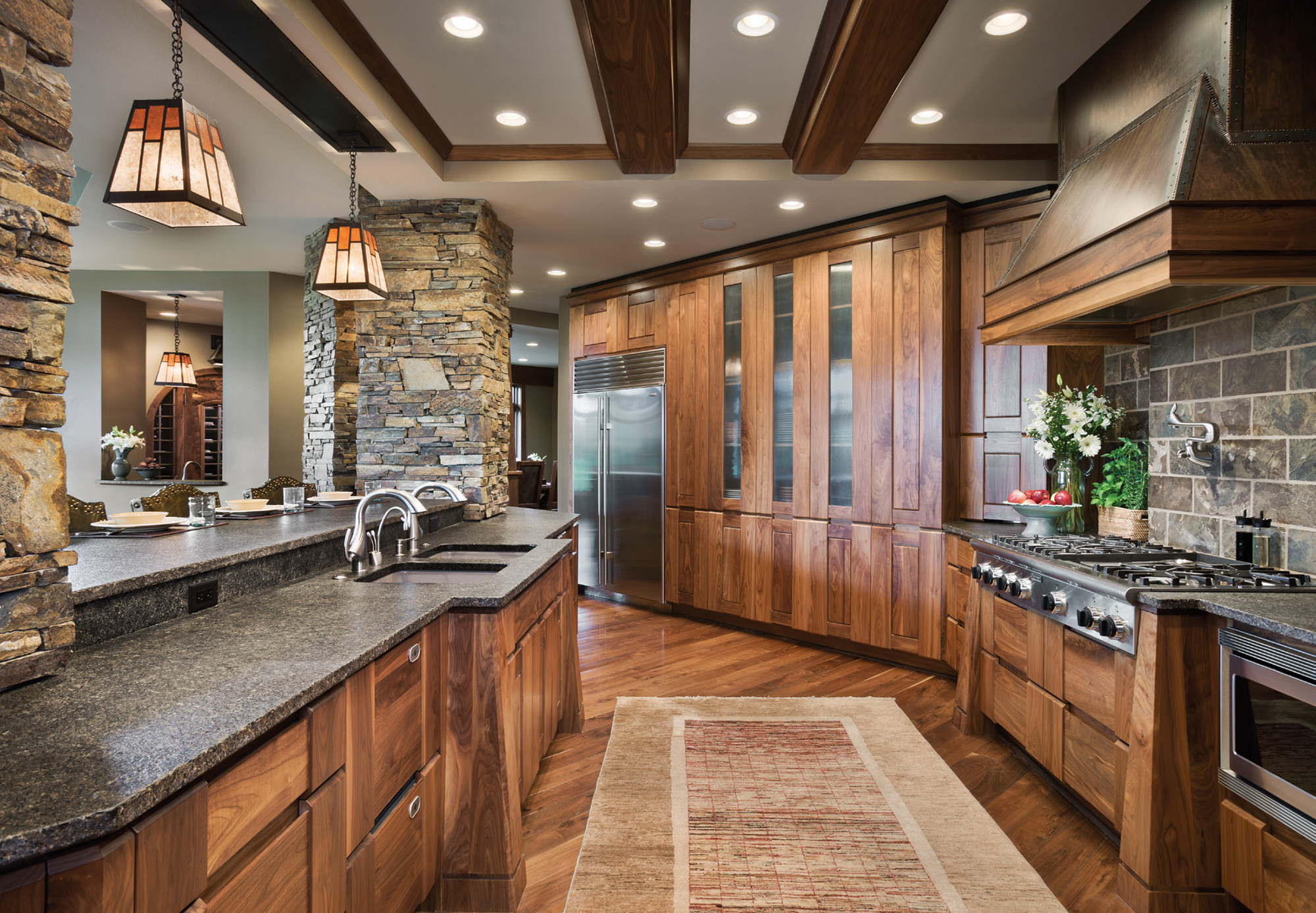
- The kitchen directly overlooks the living room, allowing the family to be close together. Robertson designed the cabinetry.
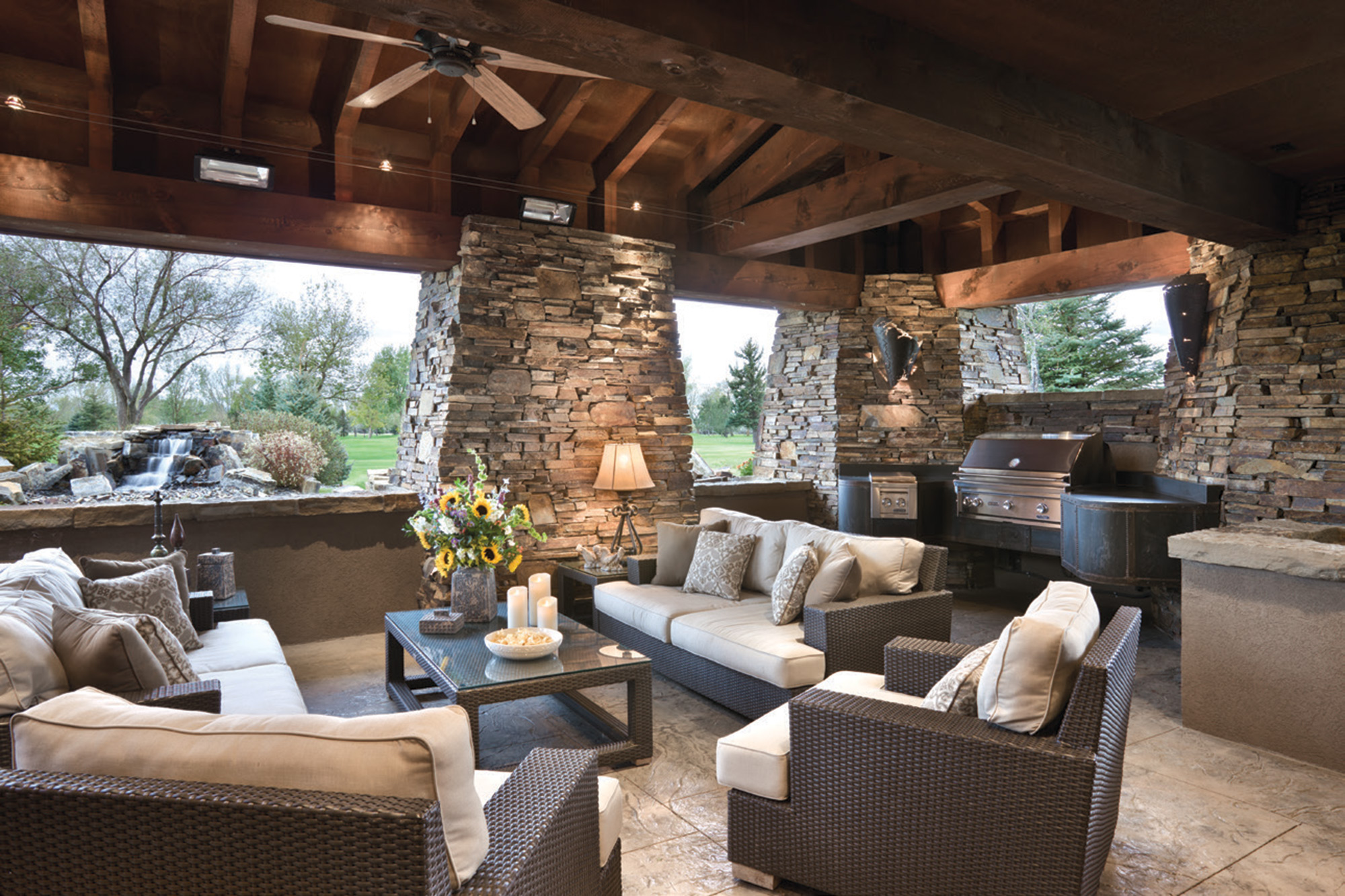
- The covered porch allows for seasonal outdoor living, extending the home’s square footage.
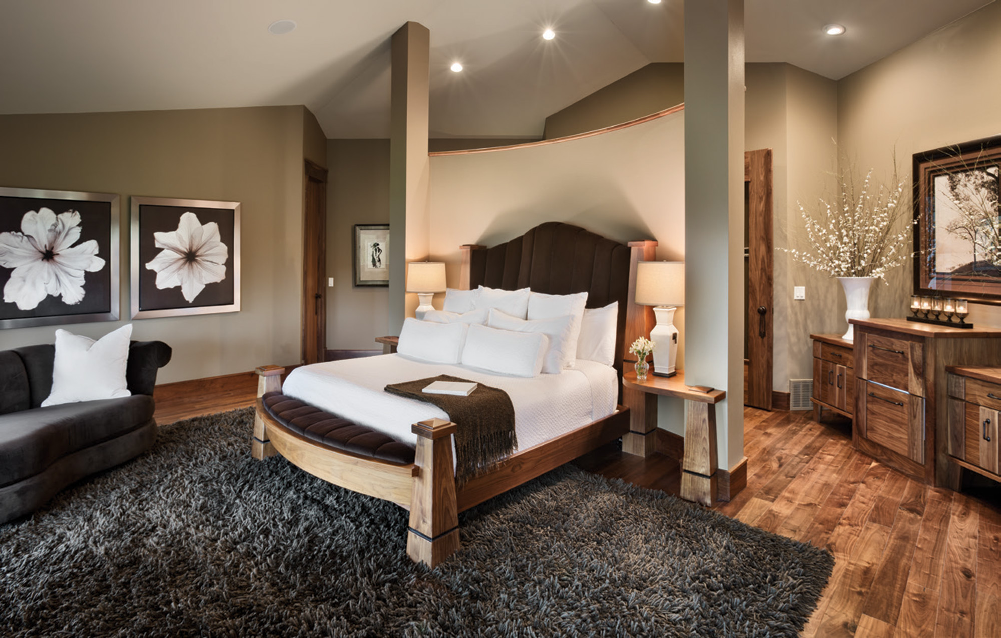
- The master bedroom features a bed custom-designed for the space and to fit seamlessly into the curved partition, which creates a little foyer in the second-story room.
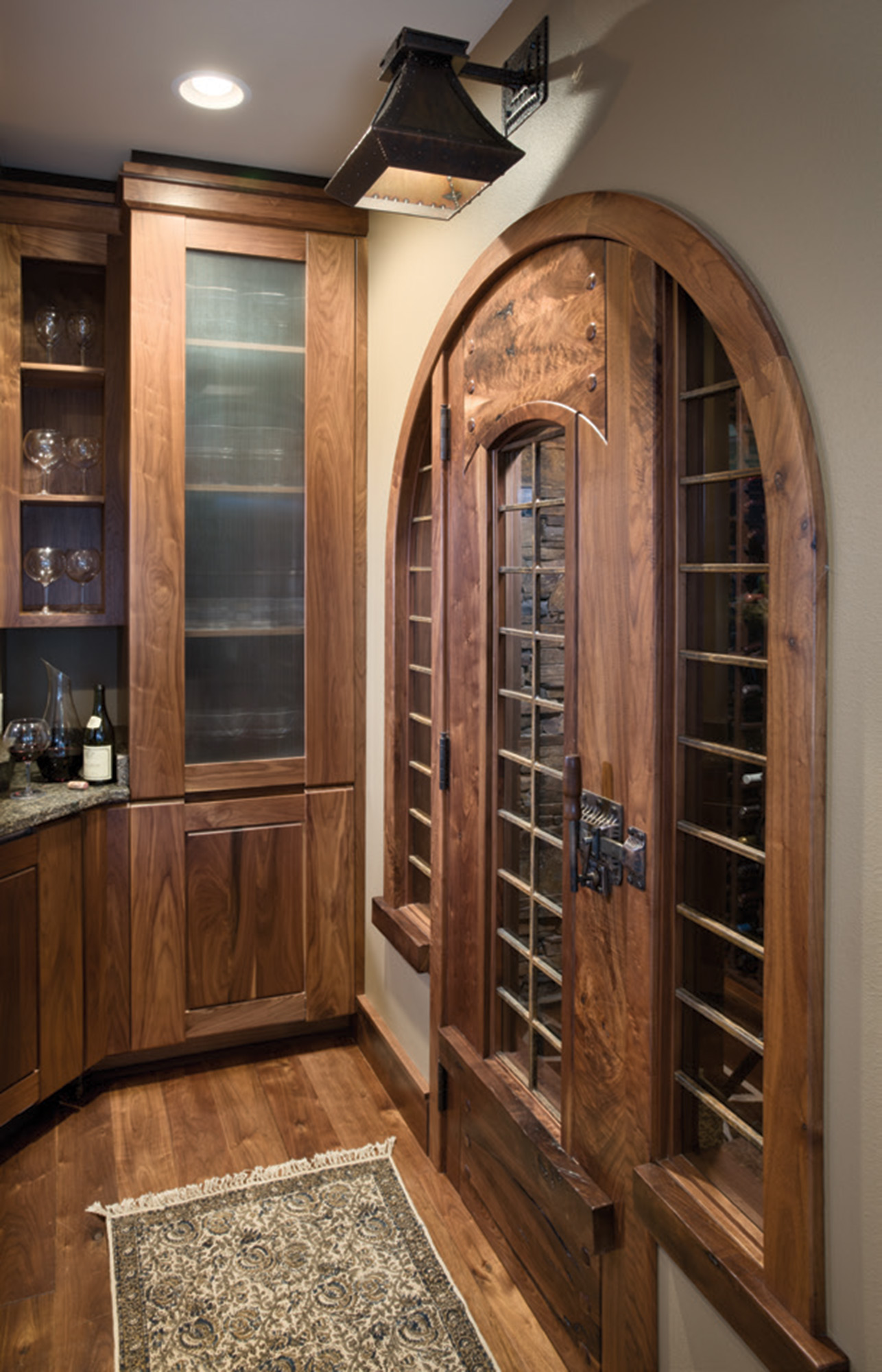
- Robertson designed the doors leading into the Soares’ wine room.
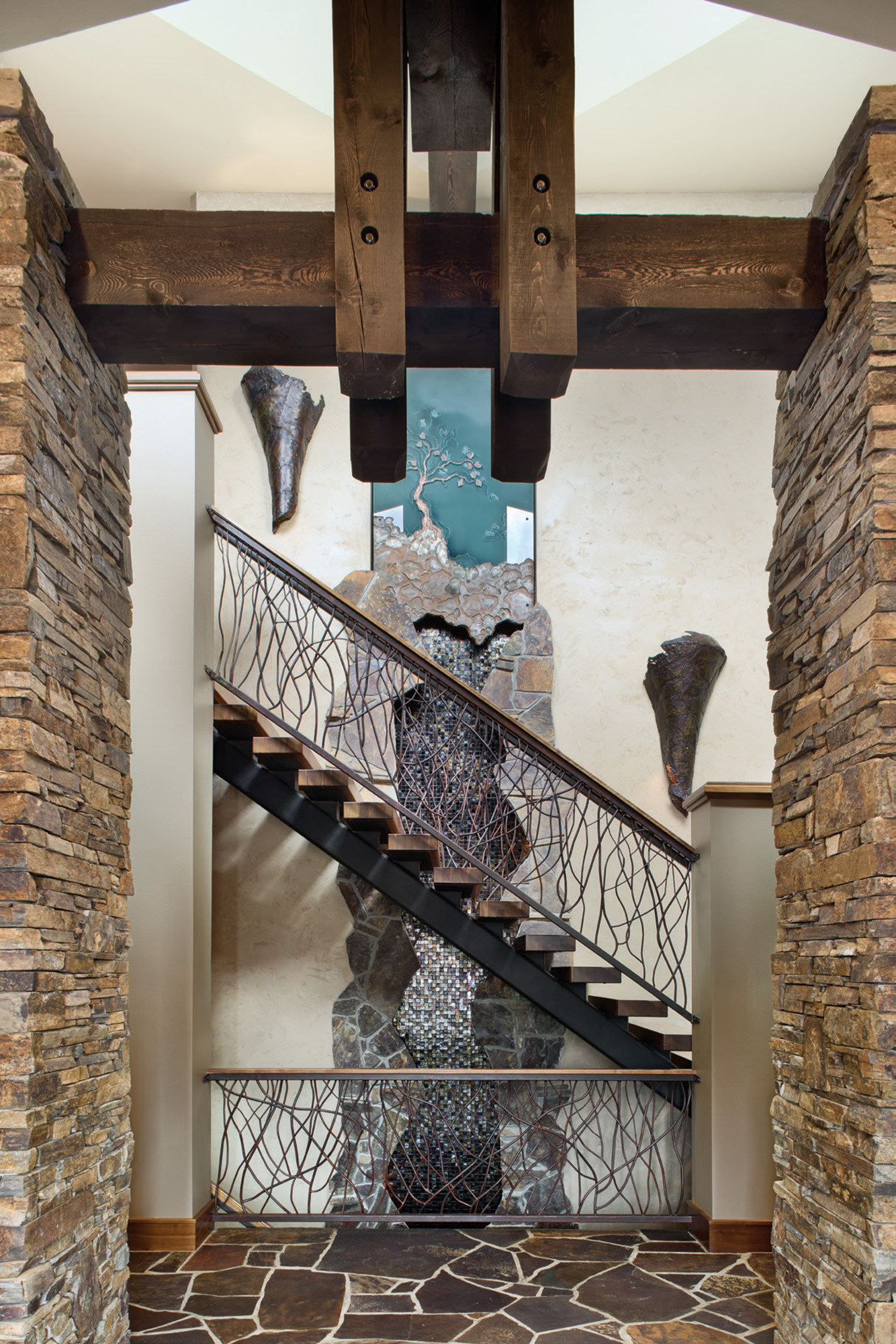
- The front entry of the home offers a custom-made water feature that leads upstairs. The home’s design wraps around the second-floor staircase.




No Comments