27 Nov Western Design: Mountainscape Living
Many residents of Big Sky, Montana, no matter what originally brought them here, never forget their first glimpse of Lone Peak, the iconic mountain that serves as backdrop to the community. Indeed, perhaps it was the clincher: Waking up to these views was what led them to put down roots in this particular place. Architect Reid Smith, who has designed his fair share of Big Sky homes, is no stranger to capturing these impressive views. When it comes to framing Lone Peak in great-room windows, he’s pretty much a pro.
But there was something different about this Yellowstone Club lot. “The first time we walked up to the building site, there was this intense element of surprise,” Smith says. “I live in the mountains, but that experience is something that took my breath away. It was such a memorable moment that I wanted to capture it in the design.”
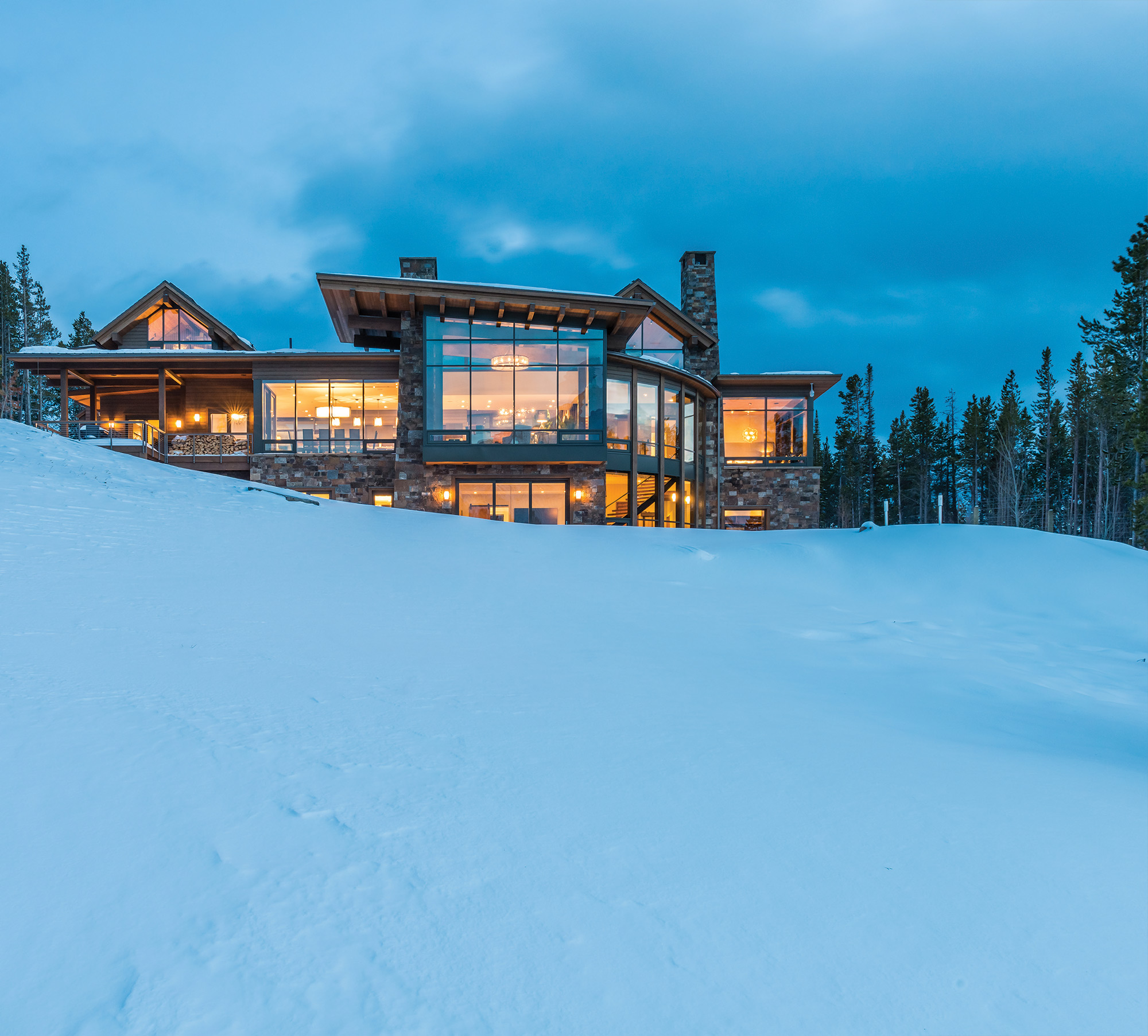
Viewed from the peninsula-like lot, Lone Peak looms front and center — so close that if you squint, you feel like you might recognize that skier coming down the South Face — with Cedar Mountain directly to the west and Pioneer Mountain to the east. Although exposed, the home settles into the hillside with lodgepole forests on both sides, making the structure appear more unassuming than it actually is.
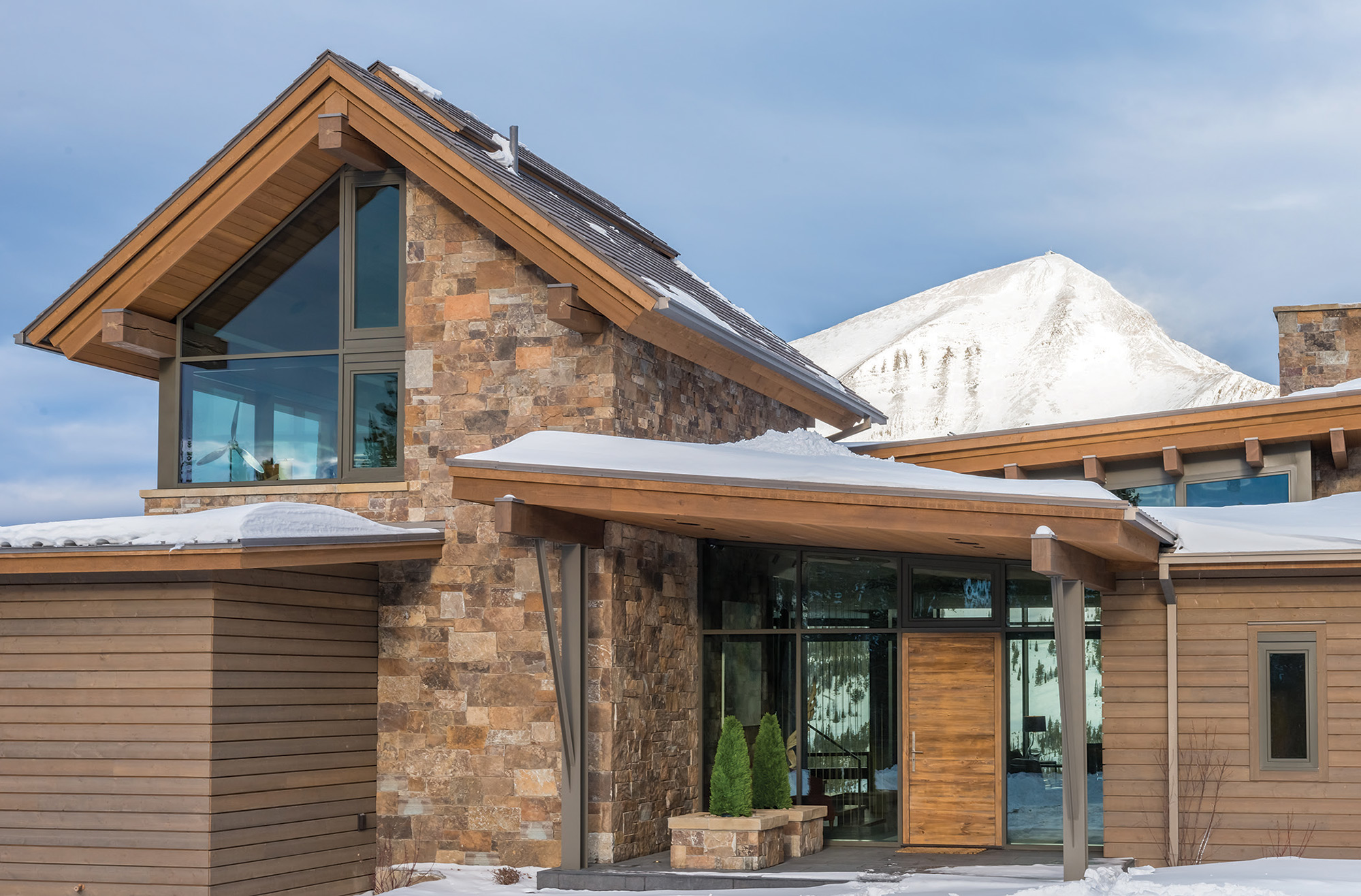
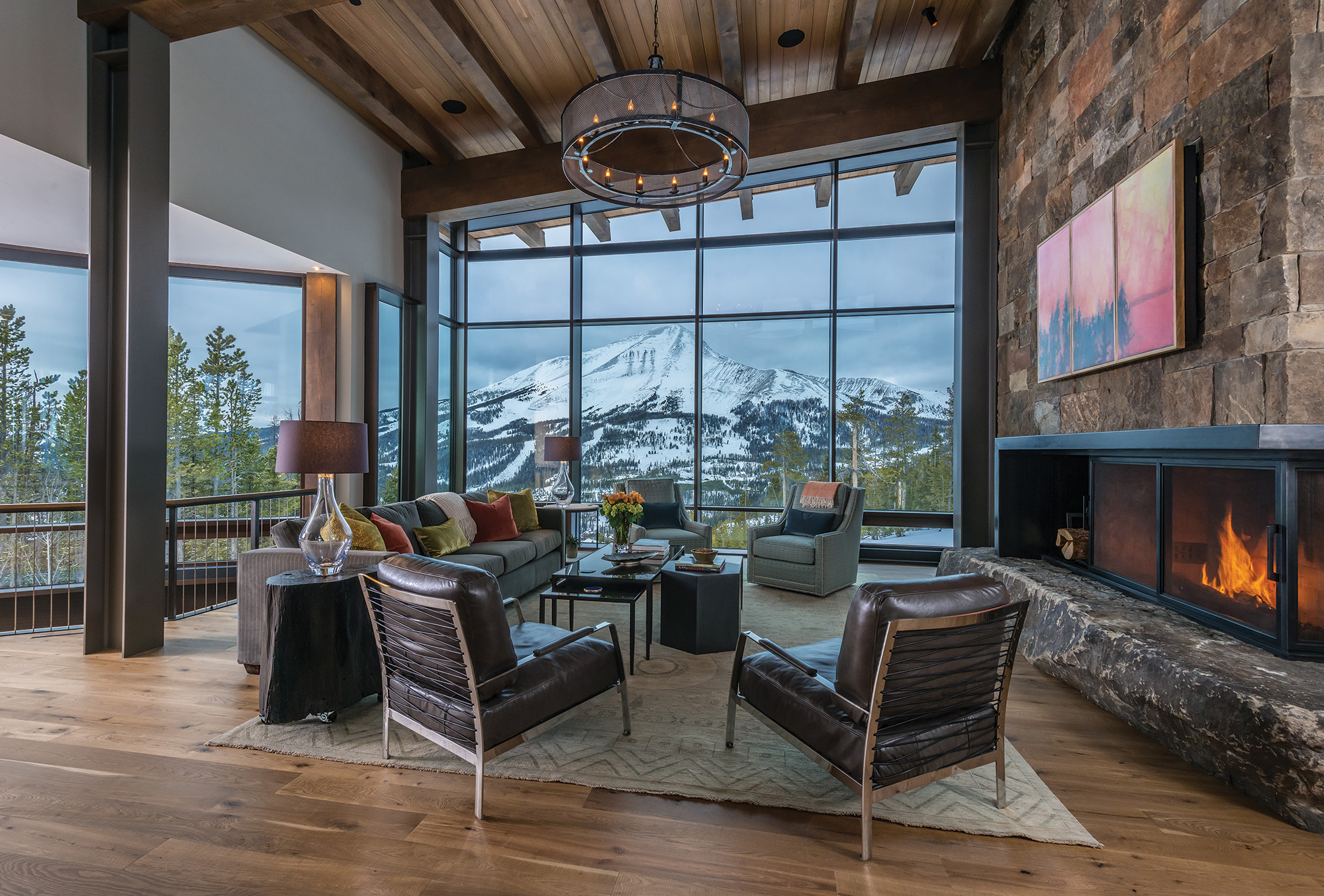
“The views unfold as you’re approaching the building site, so we created lower roof forms in the center and higher forms on either side to frame Lone Peak from the driveway,” Smith says. “Typically views are focused in one direction, but in this case you have views pulling you in multiple directions.” From inside, Lone Peak dominates the great room, and the mountains off to the sides give the views an endless feel.
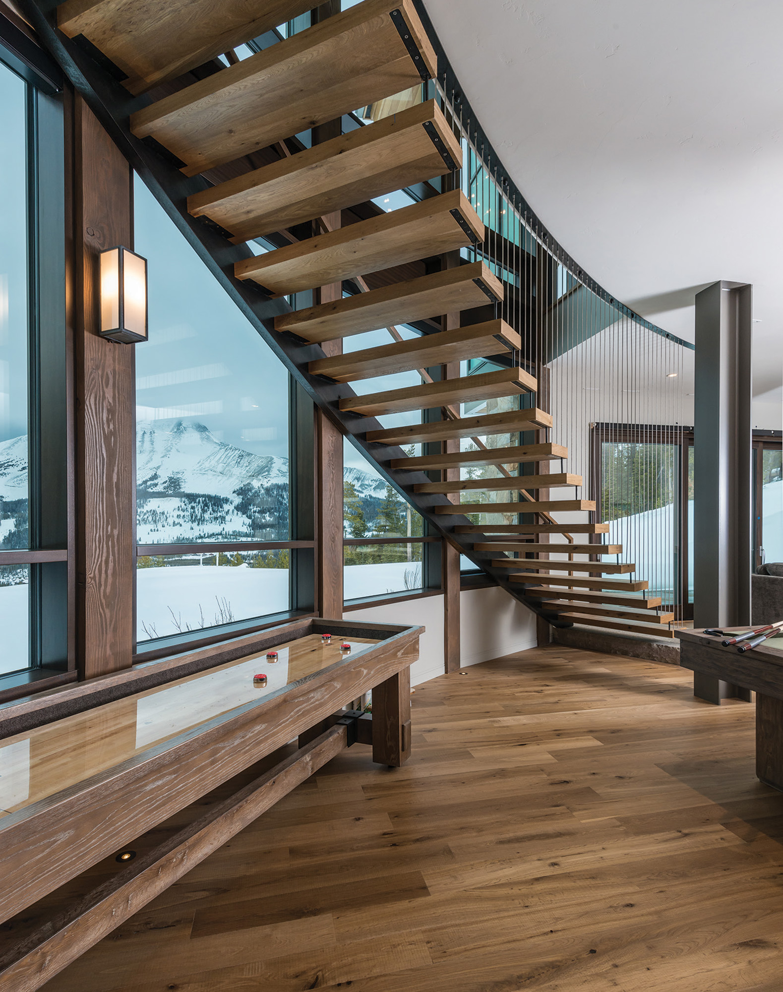
Smith was faced with the challenge of capturing these views in different parts of the home, a feat that he accomplished through a curved stairway, as well as staggered and offset building forms. From the office perched high to one side to the basement-level guest wing, the views remain intact.
Like Smith, Big Sky Build has deep roots in the local building community, and they specialize in mountain home construction. Yet even for them, this project had some surprises. “What sets it apart, besides the phenomenal architecture, is the location, which is awe inspiring; the mountains are right in your face,” says Big Sky Build owner John Seelye. “But because of where it’s sitting, there was a lot of engineering involved.”
He explains that due to the high elevation, the site is exposed to the weather. On top of that, the architecture, with its great expanse of windows, meant that they had to create what Seelye calls a steel superstructure. “These are very sophisticated homes in many respects, a lot like commercial buildings,” he says. “But we were lucky; this is a sophisticated building community in Southwest Montana. From the plumbing to the carpentry, this one was architecturally and structurally impressive. We’re lucky to have great talent available to us.”
The building materials are a mix of structural steel, timber frame, and stone, with strong stone walls that ground the home and tie it to the landscape. “What I really like is that the family uses the house,” Seelye says. “Every aspect of what went into it they use: sitting in the great room and watching a storm roll in, putting their boots on in the ski room and then hitting the slopes.”
The interior spaces, designed by Bozeman-based sister duo Clean Line Consulting, are founded on a sophisticated, playful, organic-modern palette that contradicts yet complements the mountain scenery. And because the young family of avid skiers is made up of four kids and two dogs, the interior had to be casual and durable. “The views and the setting were the inspiration, and we wanted to make it a place where they could retreat and be together as a family,” explains Clean Line co-owner Kelly Coogan. “The driving force for design was also comfort; it had to be family friendly instead of a show house.”
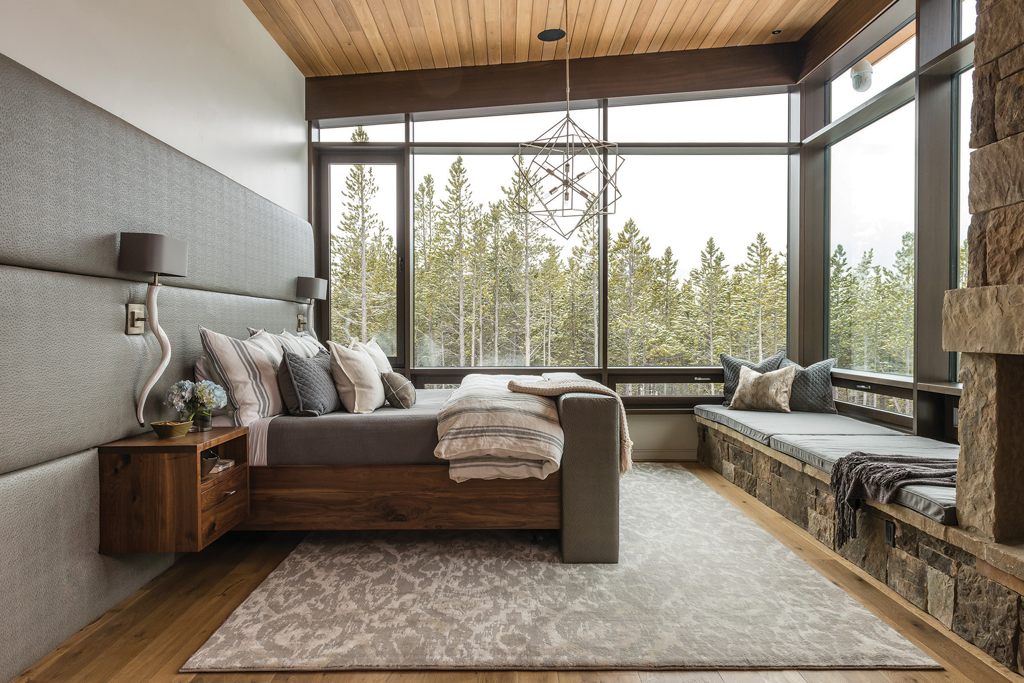
Creating seamless transitions was also important, as Smith’s design was so much about the flow from one room to another. And with some special requests from the homeowners, they also had to consider functionality. The designers brought in local artisans and specialists to give each room custom touches. A hidden liquor cabinet rises from the center of a kitchen counter, the great room TV is hidden behind a three-paneled painting, and another TV rises from the base of a custom bed frame in the master bedroom. “We got the best of everyone’s talents,” explains Clean Line co-owner Ashley Sanford. “We’d stand with these guys in a room and brainstorm about how we were going to pull these things off. They were all amazing to work with.”
Focusing on grays as a base color, Coogan and Sanford bring in pops of orange and bright hues in the artwork and accents in the main living spaces. Guest quarters each have their own personalities, artwork, colors, and accents. The children’s rooms each are influenced by the occupant’s gender and personality.
The home is as much a reflection of the homeowners as it is of the local talent used to put it together. The collaboration between architect, builder, designers, and local artisans created a masterpiece that infuses innovation in design with comfortable living. The views are front and center, but family life comes first.
- A floating staircase by Brandner Design leads down to the game room area.
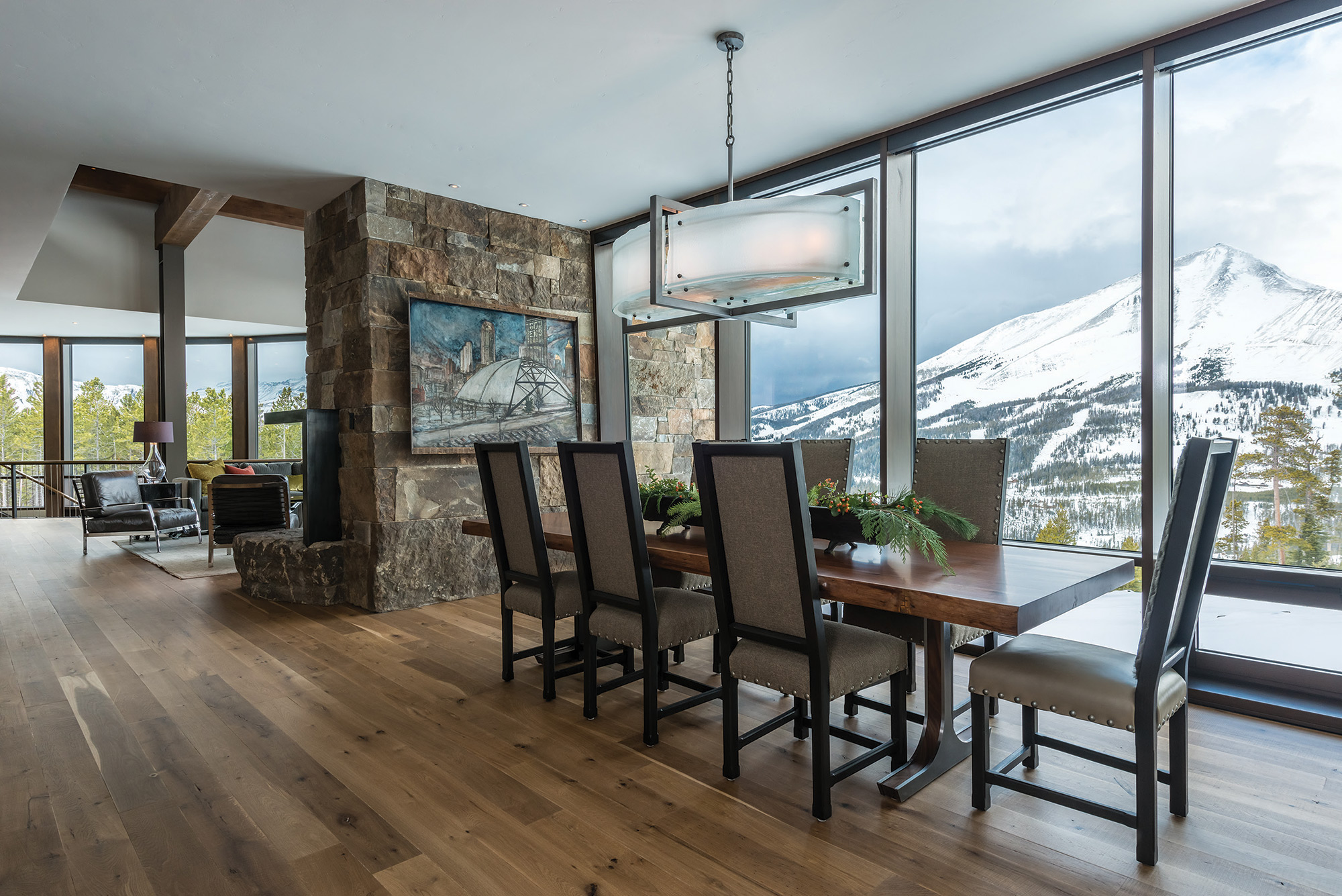
- The dining room table, made from a 100-yearold walnut slab, was custom built by Elements Artisan Concrete, and the chandelier is a custom piece from Iron Glass Lighting. The dining room chairs are from Gallatin Valley Furniture.
- The front entry features a custom light fixture by Iron Glass Lighting and a painting by Pittsburgh, Pennsylvania-based artist Mia Tarducci. The custom staircase, leading to guest quarters, was built by Brandner Design.
- The master bedroom features an upholstered headboard and floating walnut nightstands by Fry Steel and Wood. SAV Digital Environments collaborated with Fry to develop a television lift cabinet, allowing the TV to raise from the bottom of the bed board with a digital control.
- Architect Reid Smith designed this Yellowstone Club home, situated on a peninsula-like lot, to capture views from all sides.
- Lone Peak views are highlighted from the great room windows. A tree-stump end table from The Architect’s Wife sits next to leather chairs from Montana Expressions. The custom light fixture is by Iron Glass Lighting. A three-paneled painting by the homeowner’s father covers the flat-screen TV. SAV Digital Environments automated the panels to open with the touch of a button.
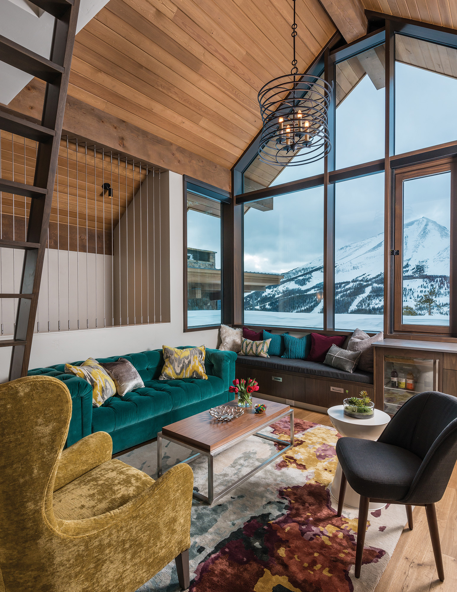
- The guest quarters feature a living space with a custom railing by Brandner Design, a crushed velvet chair from Gallatin Valley Furniture, and a custom rug from Pennsylvania Rugs. A ladder leads up to a kids’ sleeping area.
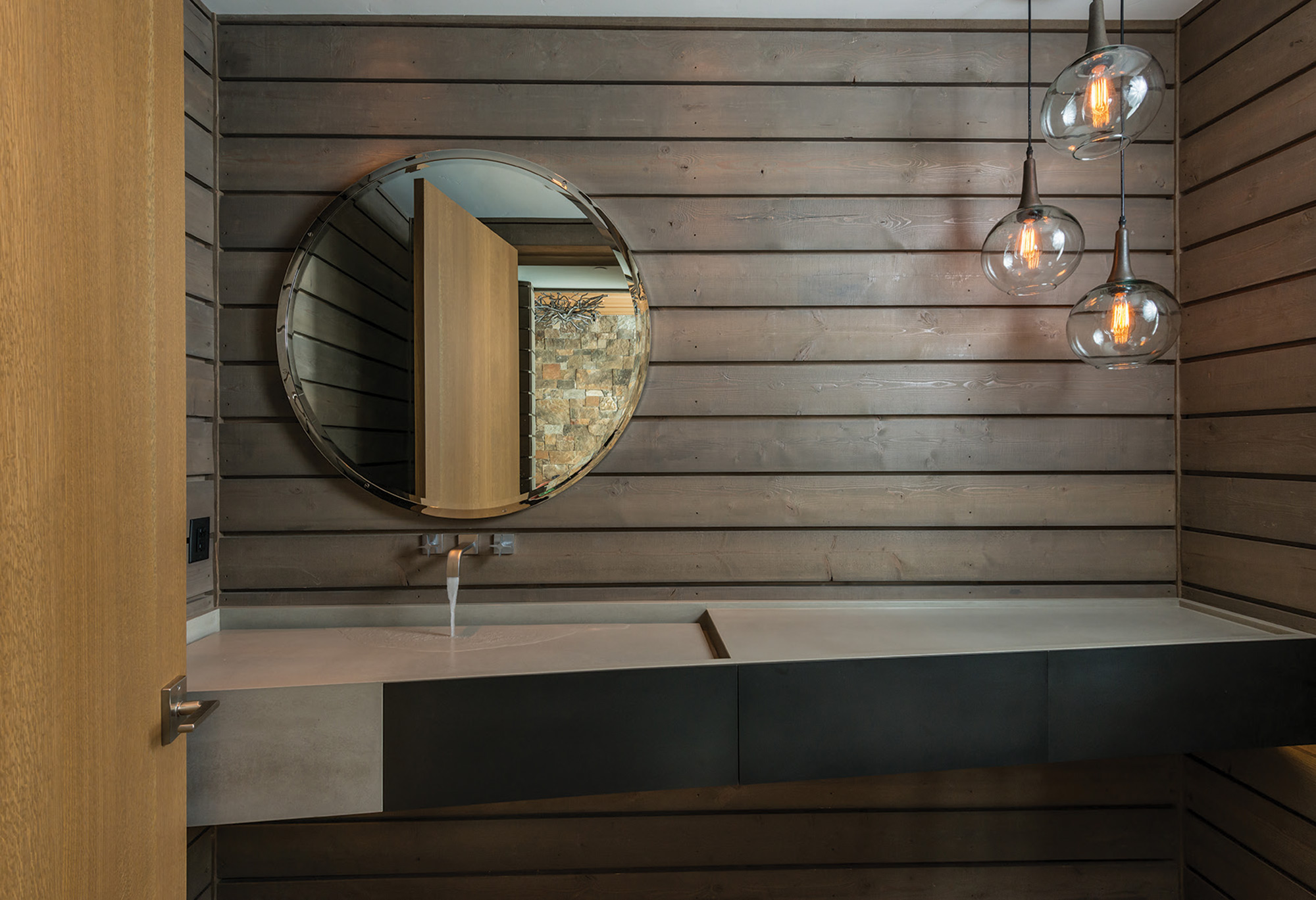
- Elements Artisan Concrete created custom sinks for the bathrooms, some with sleek angles and others with unique curves.



No Comments