10 Apr Understated Western
Architecture
Paradigm 3 Architecture
Construction
E.J. Butts Construction
Interior Design
Kibler & Kirch
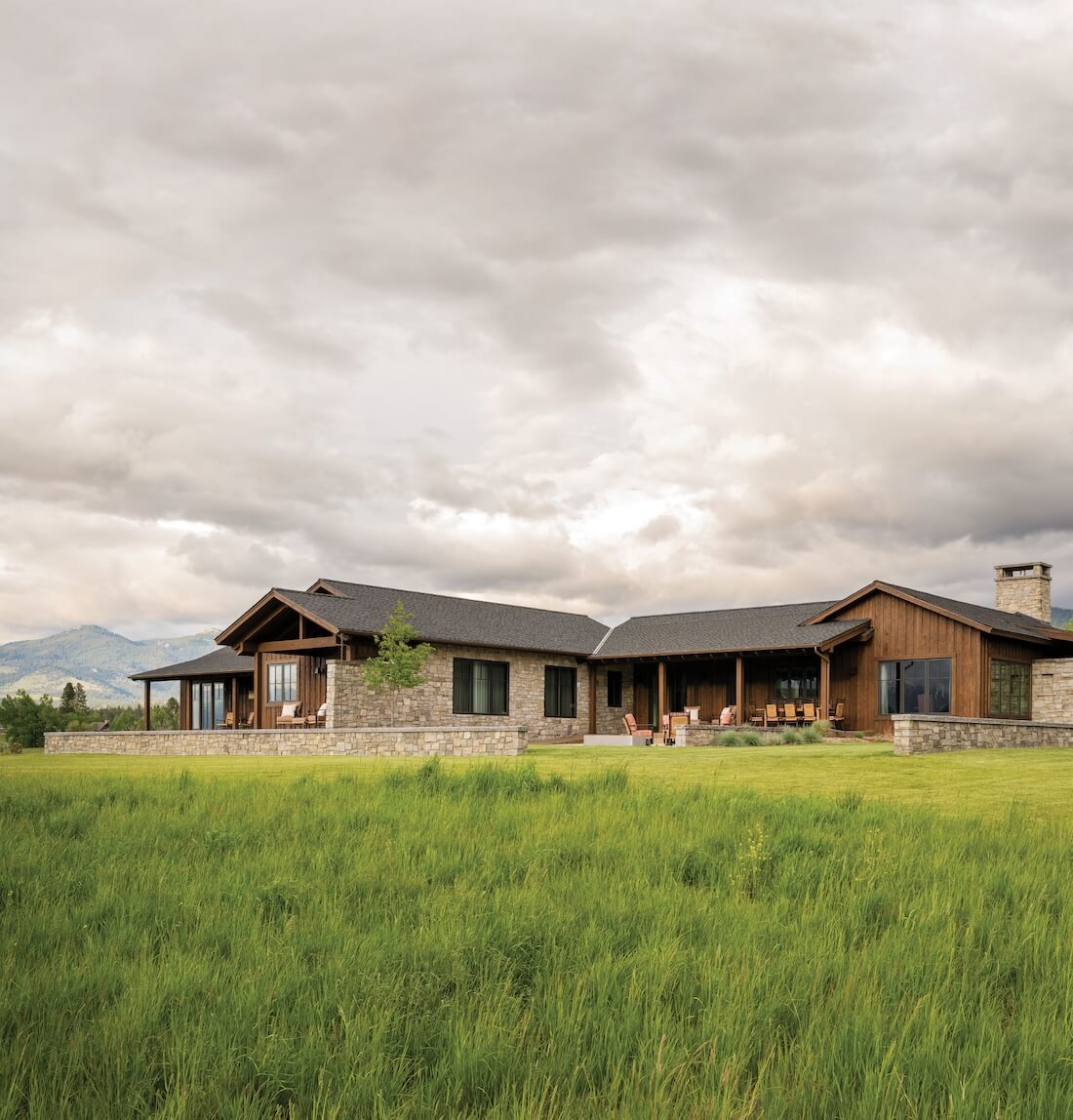
Montana’s Bitterroot Valley is an edenic Western landscape, with towering snow-capped mountains on all sides and a big clear river running through its middle. For a Texas couple passionate about fishing and interested in living an unpretentious Western life, Stock Farm offered the perfect blend of natural beauty and style, in a neighborhood drawn to traditional outdoor pursuits amid picturesque beauty.
The homeowners were longtime community members when they decided to build a new house from the ground up. After living in a log cabin for a couple of decades, they were ready for a change, and they had a vision: an understated Western home inspired by Texas Hill Country, with adaptations for Montana’s materials, climate, and lifestyle. Seeking a more contemporary approach, they ultimately settled into an eclectic home that has varied traditions while borrowing from modernity.
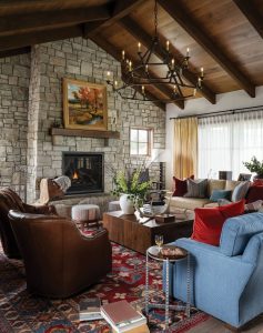
A home at the Stock Farm in Montana’s Bitterroot Valley was inspired by the Texas Hill Country aesthetic. Rugged stone walls ground a room decorated with traditional elements and contemporary touches: mismatched Hickory Chair sofas, Hancock & Moore swivels, a Ralph Lauren chandelier and lamps, and a colorful rug reminiscent of ones the homeowner had in her family home growing up.
“The clients came to us with a fairly broad design intent,” recalls architect Jeff Crouch of Paradigm 3 Architecture. “They knew they wanted a lot of stone, and they provided a portfolio of other projects that had components in them that they found compelling. As we took their initial input and began to conceptualize the design, we very quickly gravitated to two thematic tableaus: The first was the idea of the classic Texas Hill Country ranch house. The second was the joyful tension between solid (stone) and transparent (glass.) What evolved was a design that not only celebrated the client’s heritage as a multi-generational Texas ranching family but also rooted itself in the land, views, and character of the Montana prairie.”
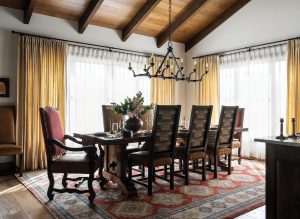
High-back dining chairs and re-covered host chairs surround a sturdy antique table to create a space within a space. A Ralph Lauren fixture and the finest Libeco linen drapery dress this just-formal-enough space.
The structure, built by contractor E.J. Butts, is long and low with gently sloped gable roofs. Materials include a combination of rock walls punctuated with square windows and dark-stained, horizontally applied wood. “The design is rooted to a series of site walls, which we imagined as the historic ruins of a stone agricultural structure,” explains Crouch. “We connected these stone walls with much lighter and more transparent walls to create the spaces within the house. We then set massing and roof lines to honor and emulate the classic Texas ranch houses that tied the entire design to the clients’ own upbringings and lives.”
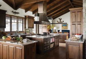
The timeless kitchen bedecked in walnut is a true chef’s space — with a glimpse into the adjacent “keeping room,” which is intended to keep guests out of the cook’s way but within conversation distance.
From the entrance, the layout spreads in different directions, with multiple hallway connectors offering transition spaces flanked by large windows and artwork. To the left, the great room, dining area, kitchen, and “keeping room” inhabit spaces that are open to one another, yet still cozy and defined. These spill out onto patios celebrating views of the Bitterroot and Sapphire mountains on the south and west sides. The middle section of the house — containing the owners’ suite, office, workout room, powder room, and laundry — extends out to the west. The design is balanced to the north by a guest wing with two bedrooms, two baths, and a shared private patio, and to the east by a three-car garage.
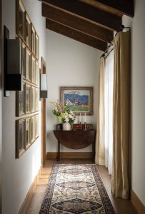
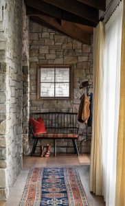
Hallways in the home are full of art and constant light filtered at every window through sumptuous layers of sheers and bone linen drapes. An antique table and oil painting from the family provide a focal point at one end of the house.
Jeremiah Young, creative director and principal of Kibler & Kirch, worked closely with the architect and owners to design the home’s interiors. “The house is low and wide and sheltered,” he says. “It has these stone walls, and the roof structure is expressed inside. All the ceiling beams are exposed and run through the entire home, which gives so much warmth. And it creates opportunities because the stone walls and overhangs create spaces off bedrooms that are very private. The house is very quiet, too, because of the halls, which give a sense of privacy. The ceiling and trusses also cut sound, as do the draperies. There’s a layer of sheers and fantastic heavy linen on every window, and the sheers create this lovely light-box effect. This house is very relaxed and very quiet, which was important. One of the key components of comfort that’s often overlooked is how a space sounds.”
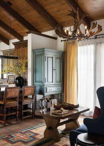
A high blue settee and Hancock & Moore swivel stools make for a comfy place to watch the homeowner cook and entertain small groups. A television is neatly housed in the custom hand-painted cabinet.
Careful attention was paid to scale in furnishings; not just in new pieces, but in the existing pieces that would occupy pride of place in the new home. The owners brought meaningful antiques and art, such as the Walter Ufer painting in the sitting room, from the wife’s family home in Texas. They augmented the collection with custom pieces specific to the house, most notably a massive cherry server, with tooled leather and nailheads, that was designed by Young to delineate spaces between the kitchen and dining areas. Meant to be viewed from all sides, it is lightened at the edges with barley twist corners, and the drawers can be accessed from two sides. In the dining room, a 10-foot-long table atop a vibrant rug is surrounded by tall chairs meant to create a sense of enclosure during a meal. The all-walnut kitchen was built to specific standards, as was the keeping room — literally designed to hold people while meals are being created. “The keeping room is meant to keep people out of the kitchen, which is the husband’s domain,” explains Young. “Nobody comes in, no one helps cook. This is serious business. It has a bar, TV, and access to a patio. You can sit on bar stools and talk to the chef, but the rule is: Keep out of the kitchen.”
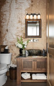
In the main powder room, a custom-printed and sepia-tinted topographic map — oriented correctly toward the town of Hamilton, Montana — establishes a sense of place and provides endless fascination for guests.
From room to room and wing to wing, the house maintains a sense of cohesion even as individual rooms, such as the two guest suites — one more masculine, one more feminine — and a mahogany-paneled office with coffered ceiling, have their own strong identities. It achieves this consistency through beamed ceilings and floors of fumed Italian walnut found throughout the house. Furniture, meanwhile, is traditional in form but made Montanan with the introduction of metal, leather, and natural elements, which creates an effect that leans a bit formal but remains ever casual. The traditional interiors are enlivened by pops of color and given gravitas through antiques and art. The overriding sensation is one of welcome, ease, and coziness through a combination of factors — some subtle but crucial — that create comfort, including attention to sound and light quality, details like well-lit corners and art aplenty.
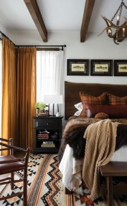
A rustic retreat tucked at the end of the guest wing, the richly textured guest room uses the same Libeco linen as the rest of the house, but in a robust mustard color.
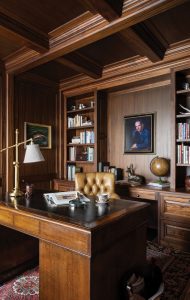
Adjacent to the primary bedroom suite, the mahogany-paneled office houses an antique desk and rug from the homeowner’s generational home in Texas.
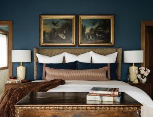
Deep blue walls, moody paintings, and white bedding in the primary bedroom cozy up a space with an antique-trunk-turned-pop-up-TV-cabinet at the foot of the bed.
Finally, there’s the effect of all those Texas-inspired stone walls, especially in the hallways, which, rather than being wasted space, are integral to the design. “When you’re moving down these halls, you’re confronted by the stone,” explains Young. “There’s this weight. And when you move between spaces, you’re passing through these stone openings. It’s lovely; it feels heavy and permanent.”
For a couple creating their forever home, a sense of permanence was exactly what they needed.
Chase Reynolds Ewald has been writing about Western design, food, art, travel, and rustic style for more than 25 years. A consultant and freelancer, her books include National Outdoor Book Award winner Bison: Portrait of an Icon, her sixth collaboration with photographer Audrey Hall; At Home in the Wine Country; and the recently released ByWestern Hands: Functional Art from the Heart of the West; chasereynoldsewald.com.


No Comments