08 Apr Striking A Balance
Architecture
MMW Architects
Construction
JM Moran & Company
Interior Design
Kibler & Kirch
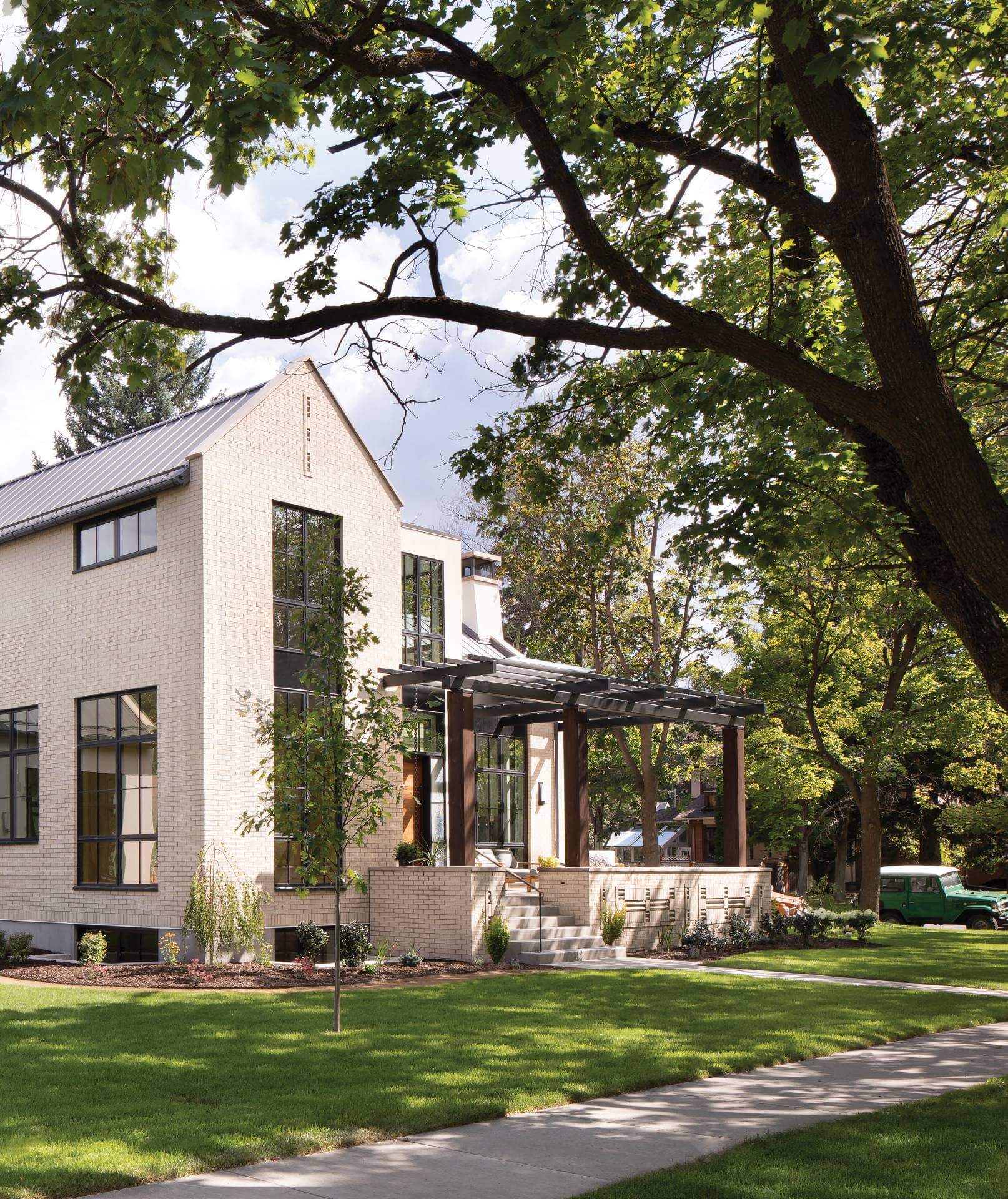
Every now and then, a design defies definition. That’s certainly the case with a home that sits on a corner lot, surrounded by 100-plus-year-old architectural gems, in Missoula, Montana’s University District. And the unique location was not lost on the homeowner or the architect. “We wanted to do the right thing and to be a good steward of this land in the heart of this historic district,” says Angie Lipski of MMW Architects. “I believe in that; that these houses will be here longer than us.” The resulting home was influenced by the area’s history, and also by more modern sensibilities, which contribute to a style that can’t be pigeonholed.
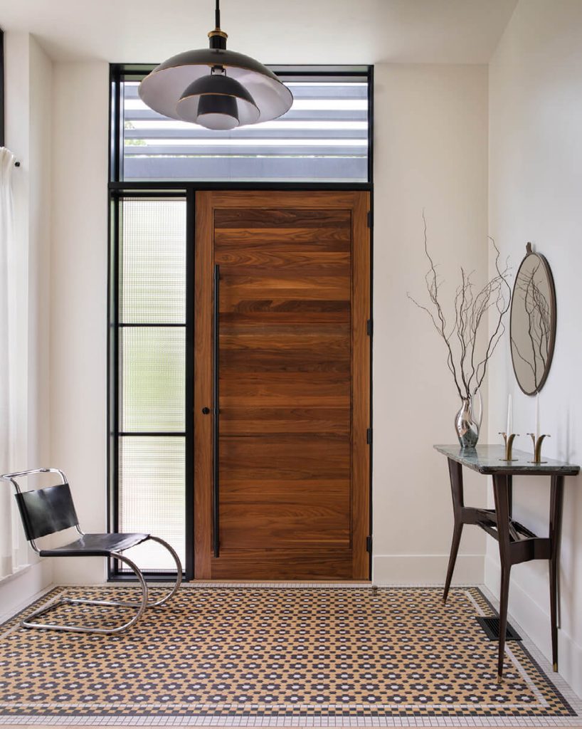
Bold hex tiling and a custom hardwood door set the stage in the entryway
And, according to Jeremiah Young, creative director and principal interior designer with Billings-based Kibler & Kirch, that’s not a bad characteristic. “One of the ways I know that a house or a piece of furniture is a really good one is when you can’t exactly pin it down,” Young says. “Everybody brings their own set of references to it and sees something beautiful in it, but it can’t be pigeonholed. Some people say farmhouse — it has the look of additions over time, that strong gabled peak, that simple form. But then you put it in the context of the Tudor homes around it, and you say ‘Oh, look at the steep pitch, the way the ends are treated, the tall windows relative to their width. It’s a Tudor home.’ And then you look at the university down the street and say, ‘Oh, well, no! This is a collegiate building.’ And that’s kind of awesome.”
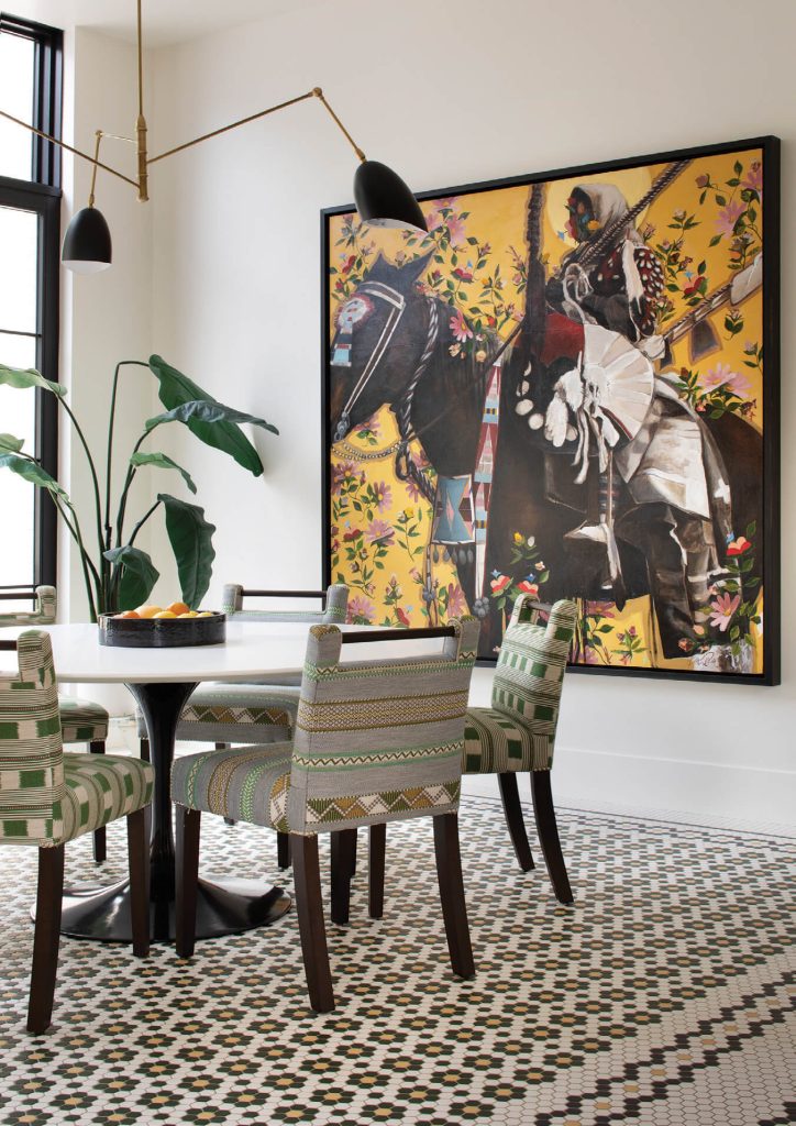
A commissioned painting by Crow/Northern Cheyenne painter Ben Pease commands the dining area adjacent to the kitchen.
Built on the foundation of an existing home, the design was driven by the owner’s cosmopolitan experiences, artistic savvy, and boldness, as well as her desire to reference Montana’s aesthetic legacy. “She’s the kind of person who would ask, ‘How can we incorporate Montana’s history of ceramics into the project,’ thinking of the Bray, Peter Voulkos, and Rudy Autio,” says Lipski, referring to Helena’s Archie Bray Foundation and the legendary ceramicists who influenced it. Therefore, stucco was used as a nod to the state’s clay heritage. The exterior also takes cues from forays into the university campus and downtown Missoula. “We studied the Masonic Temple and the Elks Lodge — we went and studied brick colors and mortar colors — that’s why we have the detailing we have.”
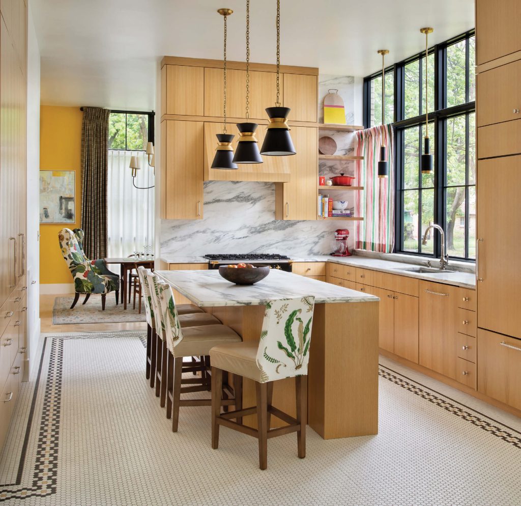
The kitchen embraces classic materials and clean designs with cabinets by Missoula craftsman Ted Germansen and solid marble countertops.
Inside, it’s clear that every space and surface received equally deliberate attention. “I really believe in the choreography of a home,” says Lipski. “I like it to be super subtle, like a piece of music, a ballet, or a movie. I like a tone to be set from the first moment you see the exterior, and then for that tone to be carried through the house.”
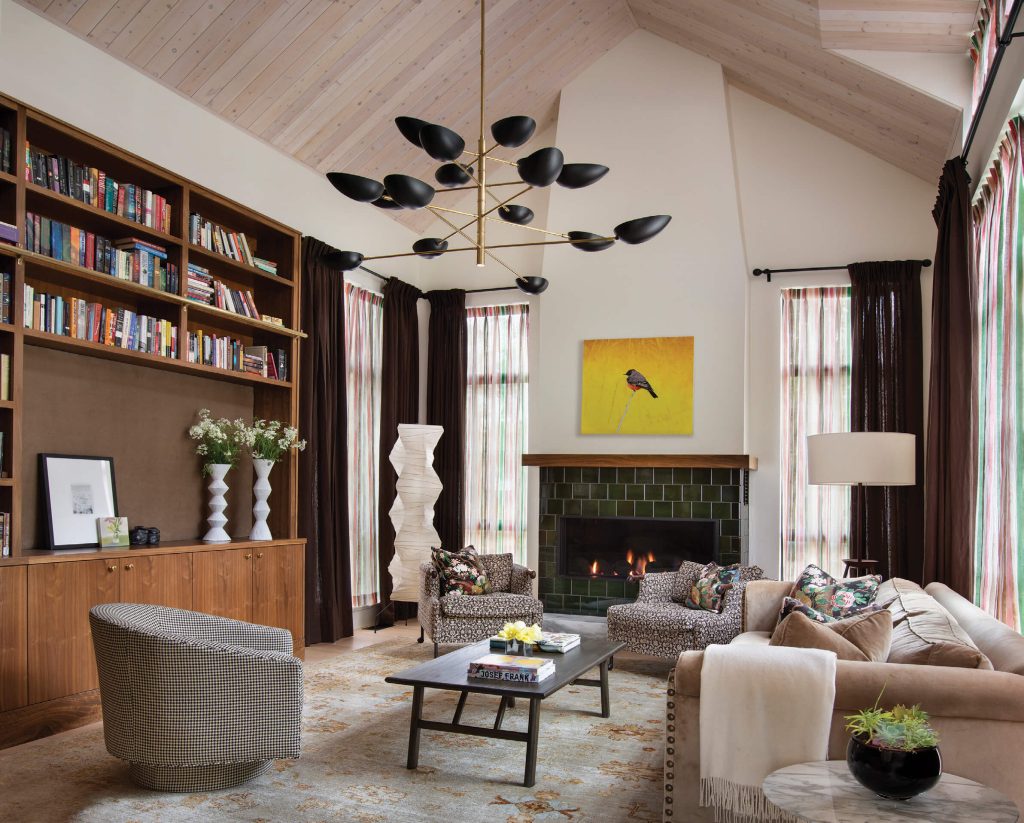
Ceilings of pickled pine give a nod to Scandinavian design, while floorto-ceiling windows gesture toward Tudor styling.
The space reveals itself slowly and suggestively, which feels intentional, and moving from room to room is like experiencing a series of vignettes. “My favorite moment in the whole house is when you come up the stairs and look right,” says Young. “You can see into the master bathroom through this little antechamber, both of which have this incredible wallpaper, and you see this shock of color — a Farrow & Ball [paint] color — and that moment, that framed view… This house is full of those moments.”
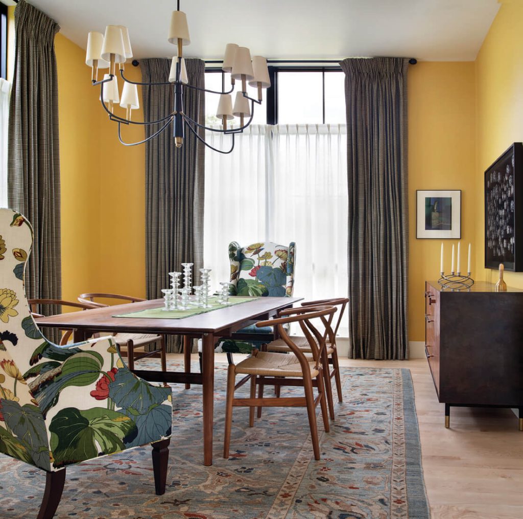
The dining room pairs fearless floral upholstery with a BDDW sideboard and yellow wallpaper.
Indeed, delights and surprises abound at every turn: bold textiles from Kit Kemp pair with the timeless contemporary silhouette of a Saarinen tulip table. Commissioned specifically for the site, a stunning painting by Crow/Northern Cheyenne artist Ben Pease graces the breakfast space. Thousands of square feet of patterned hex tiling cover the floors, and the ceilings are pickled pine. Stand-out wallpaper by Swedish design firm Svenskt Tenn makes appearances throughout the home, while prints of Winold Reiss’ iconic Native American portraits pair with a stylized map of New York City. Color abounds, and soft light from the lofty windows touches everything.
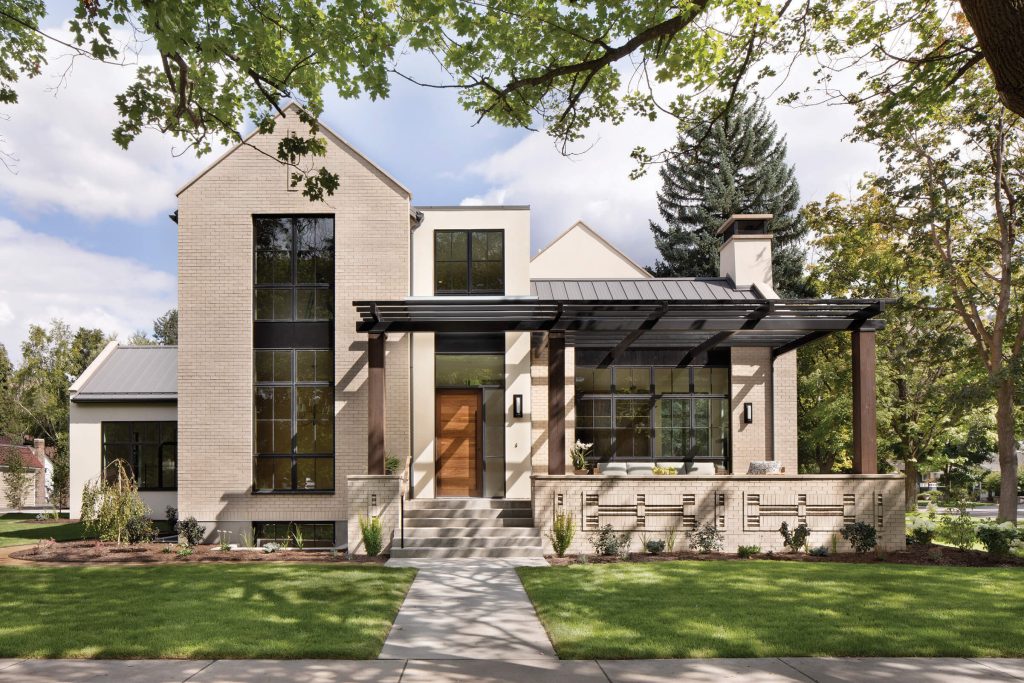
The exterior pays homage to Montana’s architectural heritage and was influenced by the Tudor homes around it, as well as buildings on the nearby University of Montana campus and Missoula’s historic downtown.
Yet, despite the impressive names and worldwide provenance of the furnishings, there’s a sense of timelessness and tactility that feels familiar and inviting. The space is reminiscent of a historic building, in that its materials are durable and authentic. Cabinetry by Missoula craftsman Ted Germansen, of Germansen Woodwork and Design, lends warmth to several rooms. The marble counters and backsplash invite the evidence of time. “She wanted the patina of materials,” says Lipski. “She wanted the marble to have the wine stains, the lemon acid etch. She wanted her house to live in that way.”
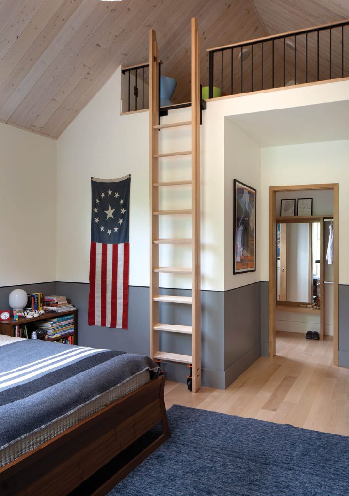
Taking advantage of the high ceilings, a kid’s room is equipped with a loft.
Both Lipski and Young agree that the design experience surrounding this home was nothing short of spectacular, and both credit the homeowner for pushing the envelope, remaining true to her vision, and being open to her team’s creative suggestions. “This home wouldn’t have happened if she hadn’t brought a certain amount of life experience and exposure to some great things to the table,” says Young.
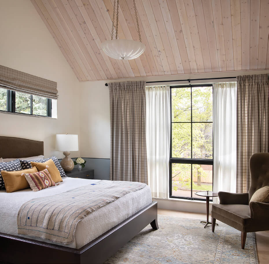
Neutral tones, coupled with an abundance of natural light, create a serene atmosphere in this bedroom.
Lipski concurs. The homeowner “wanted this really interesting mix of feeling on the exterior and interior,” she says. “And she’d say these things that were a little hard to reconcile into a design typology, but look at the richness of what resulted. … To create a house for the kind of mind that pulls together that type of ideology is super fun.”
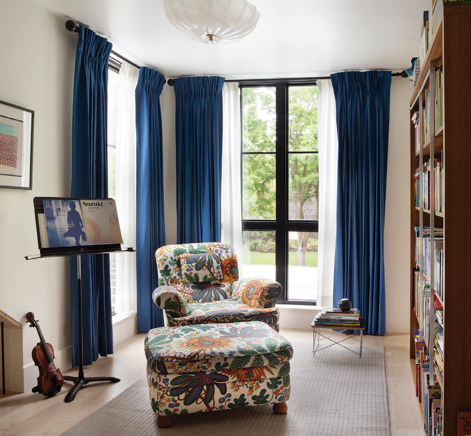
A small library and music space sit in a foyer by the bedrooms.
The result is fun, but it’s also effortlessly elegant and refined. In this lies the delicate balance of influences and aesthetic choices that, if employed even the slightest bit differently, could have easily gone awry. Instead, they merge to create a space that is at once serene and surprising, cosmopolitan and unpretentious, innovative and timeless.
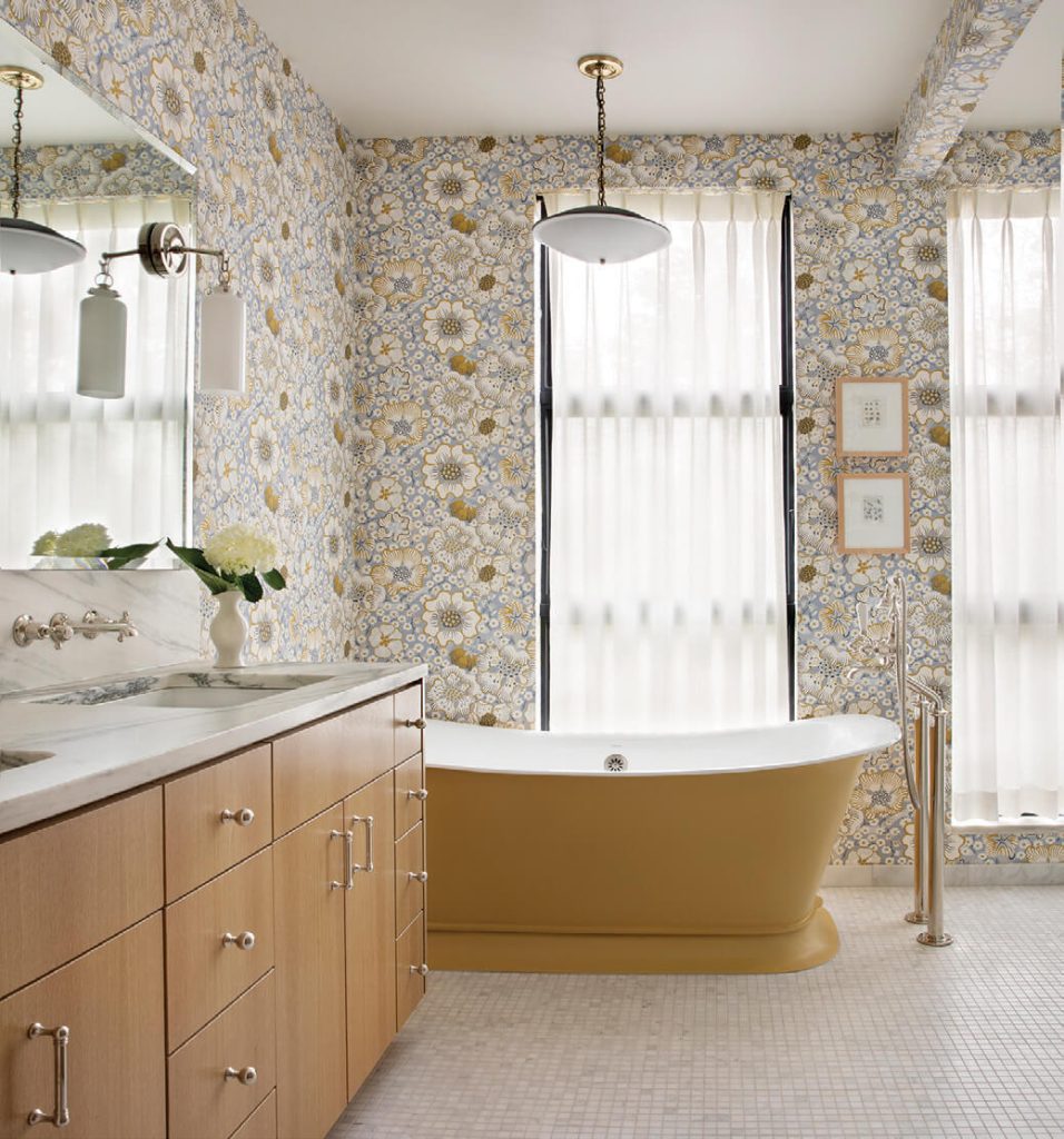
The master bath illustrates the homeowner’s penchant for bold and creative style. A custom gold tub pairs with luxe wallpaper from Swedish design company Svenskt Tenn.


No Comments