16 Apr Slopeside Delight
Sometimes, the inspiration for a house emerges from the most unlikely of places. In the case of one particular family, and their custom home at Montana’s Whitefish Mountain Resort, an unfortunate accident necessitated certain constraints. But those constraints, in turn, provided the family with unexpected opportunities to design and build a house that they otherwise may never have imagined. “Our son was paralyzed in a surfing accident, which changed all of our lives,” says the homeowner. “He’s a T9 paraplegic and an active, kick-ass skier. The house is a story of designing it around him, to make his life good. But inadvertently, we’ve made life good for a lot of other people too, including us as we get older.”
Although their son is now in his 20s and lives independently, the homeowners wanted him to be comfortable when he came to visit, and also to have direct access to the skiing that he — and they — love so much. The family had long planned to build a house at the resort and already owned a lot, but when the time to do so came, they realized their location wasn’t ideal. Because it wasn’t adjacent to the resort, their son wouldn’t be able to transfer to his sit-ski and hit the slopes straight from their house. Fortuitously, they found a small, overlooked lot right on the ski hill.
“It was kind of a scraggly, funny- looking little lot,” says architect Rich Graves of Altius Design Group. “It was an area where there had been a dead-end street, it was where Whitefish Mountain used to push a bunch of their snow, and there were a bunch of scraggly trees. It didn’t look like much, but [the owners] are pretty forward-thinking and pretty observant, and they recognized the potential in this lot.”
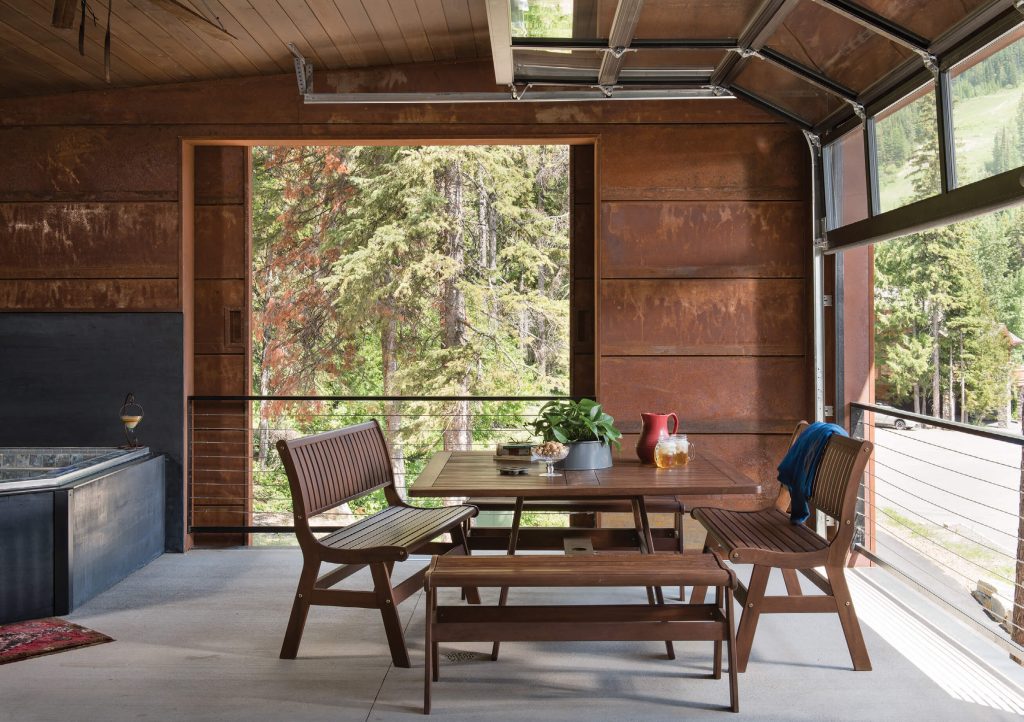
This unique gathering space — with a hot tub, fireplace, and TV — opens to the outdoors on two sides.
Aside from its proximity to the slopes, the location offered another bonus: Because all of the lots around it had already been developed, Graves was able to design the house to best capitalize on the spaces between them. “One of the main focuses of the design was picking up these view corridors between the existing buildings. Because it’s located at the end of the cul-de-sac, if you look up, you can see the summit of Big Mountain very easily, almost like you can reach out and touch it.”
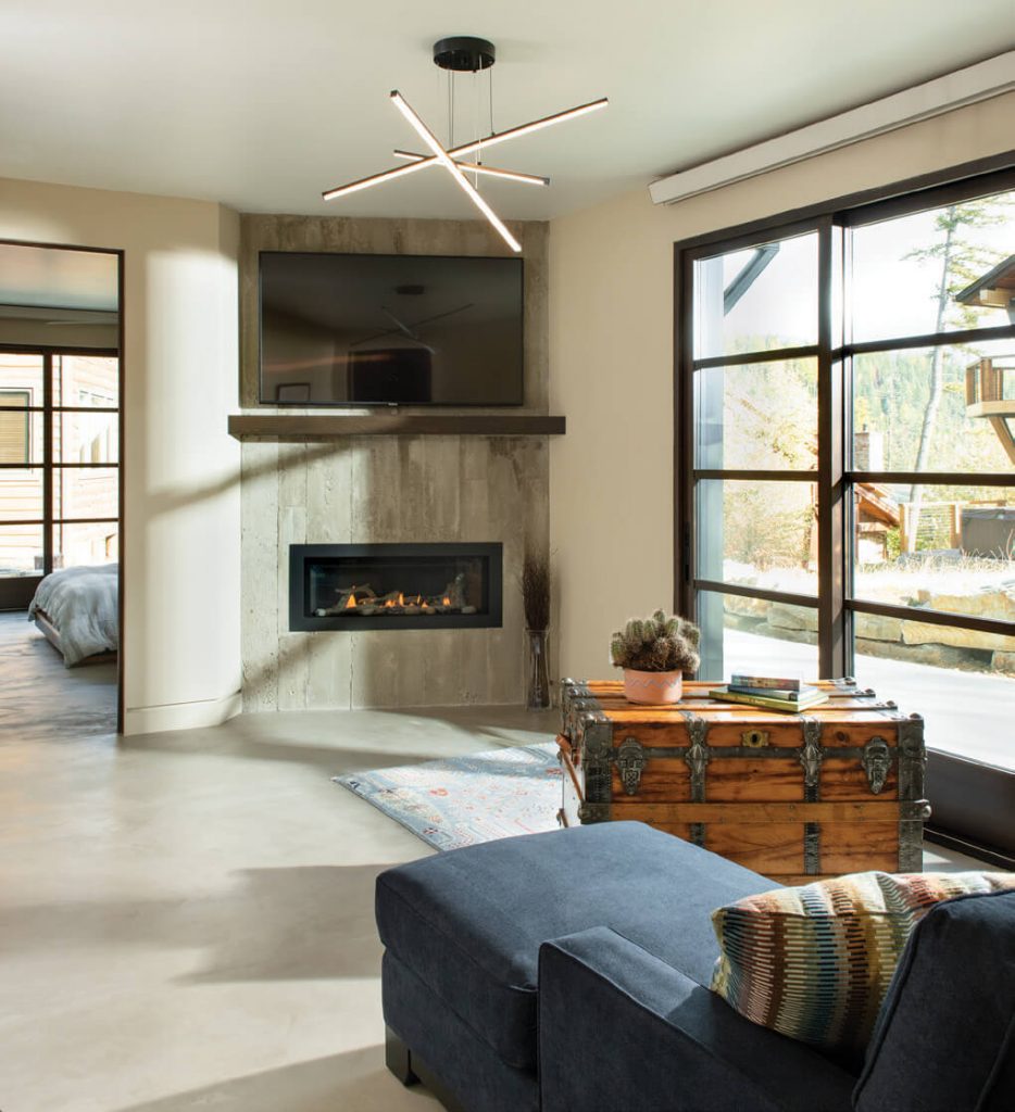
The first-floor bedroom suite is modern, cozy, and wheelchair accessible.
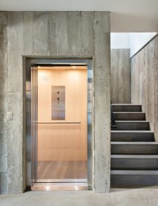
The lot is fairly small and oddly shaped, and because of pre-existing underground utilities, the footprint of the house is also fairly small and oddly shaped. However, after spending time pondering the situation, the owners and the design team discovered a perfect opportunity: In order to accommodate a wheelchair, the house would need to be equipped with an elevator. Why not flip the conventional house structure upside-down? Instead of putting the living room, kitchen, dining room, and other common spaces on the first floor, they decided to put them on the top floor to best capture the views. They also decided to build out beyond the footprint on these upper floors with cantilevered decks and rooms to maximize floor space.
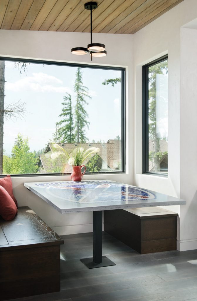
A custom concrete table in the breakfast nook includes an emblem of the 10th Mountain Division in honor of the World War II veterans who helped create the modern ski industry.The homeowner served in the same division during the late 1980s and early ‘90s.
The end result is striking as well as inviting. “It’s a fantastic house, just to be able to have four floors like that up on the mountain; this kind of perch from above is pretty unique,” says Andrew “Bear” Barinowski of Malmquist Construction. “The finishes really define it. It’s very mountain modern; it’s very stark, and it’s got a lot of grays and whites, especially where the concrete is. … It stands out strongly in that it catches your eye, but nothing about it looks goofy.”
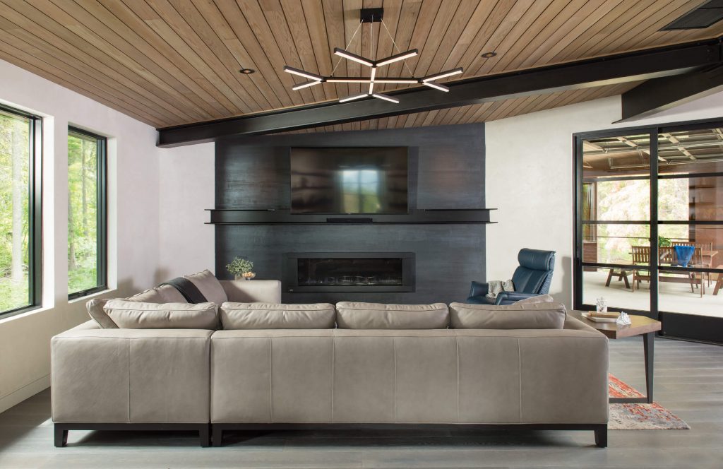
A cedar ceiling in the living room adds warmth to the modern interior, while the comfortable sectional couch softens the room.
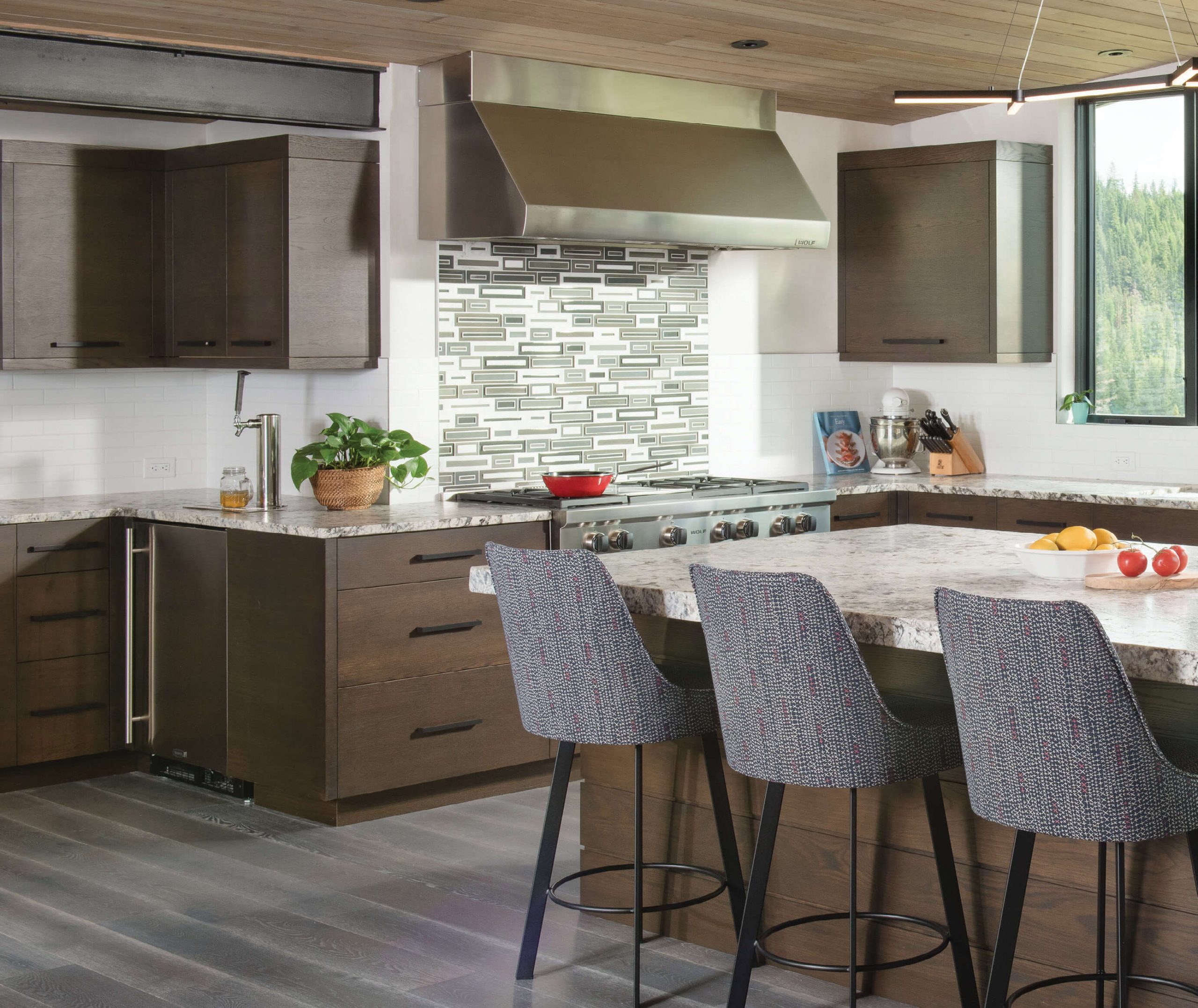
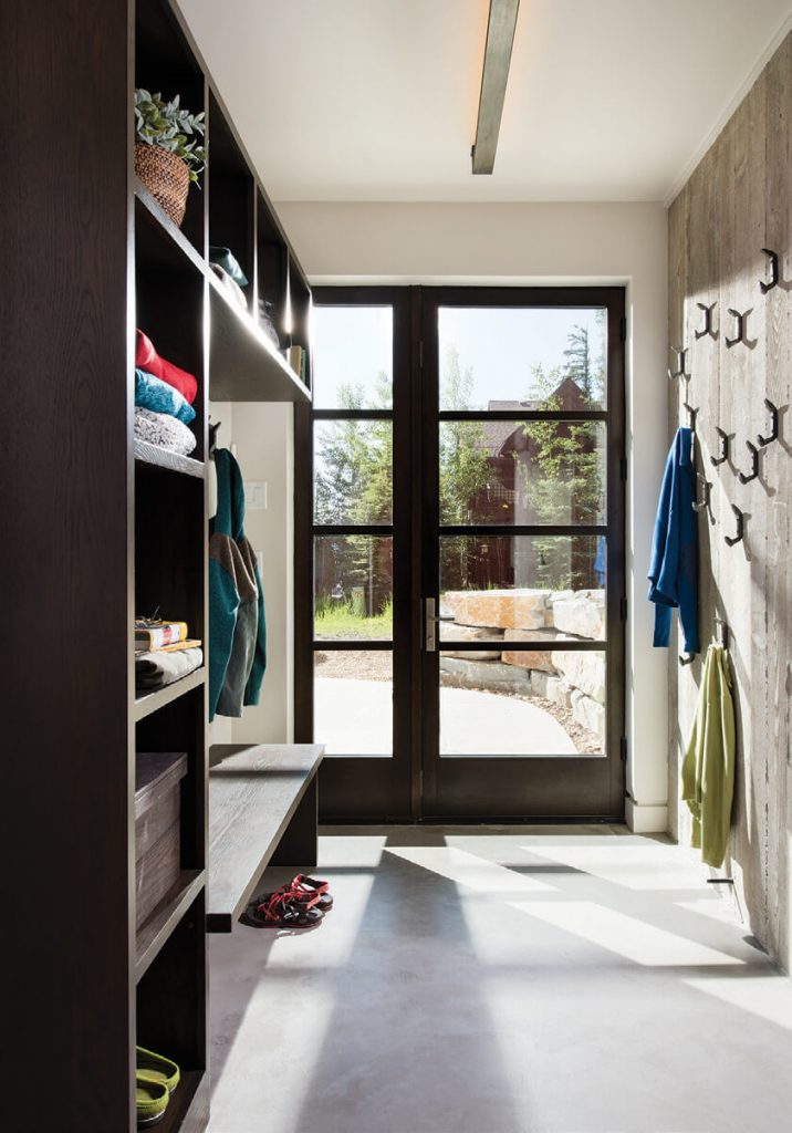
Finished on the outside with board-form concrete and Corten steel siding (which intentionally rusts), the exterior is not only visually compelling, but it’s also highly insulating, sound-deadening, and virtually maintenance-free, which were all additional goals of the owners. And inside, the finishes are modern without being cold. “They wanted it to be contemporary, which meant it was easier to make it ADA compliant,” says Barb Cooke with Cooke Interiors Studio. “The main goal was making it attractive and not institutional looking, with clean lines and simple details. And easy-to-clean surfaces are big for [the owners]. … And, really, a lot of the things in the house are pretty durable.”
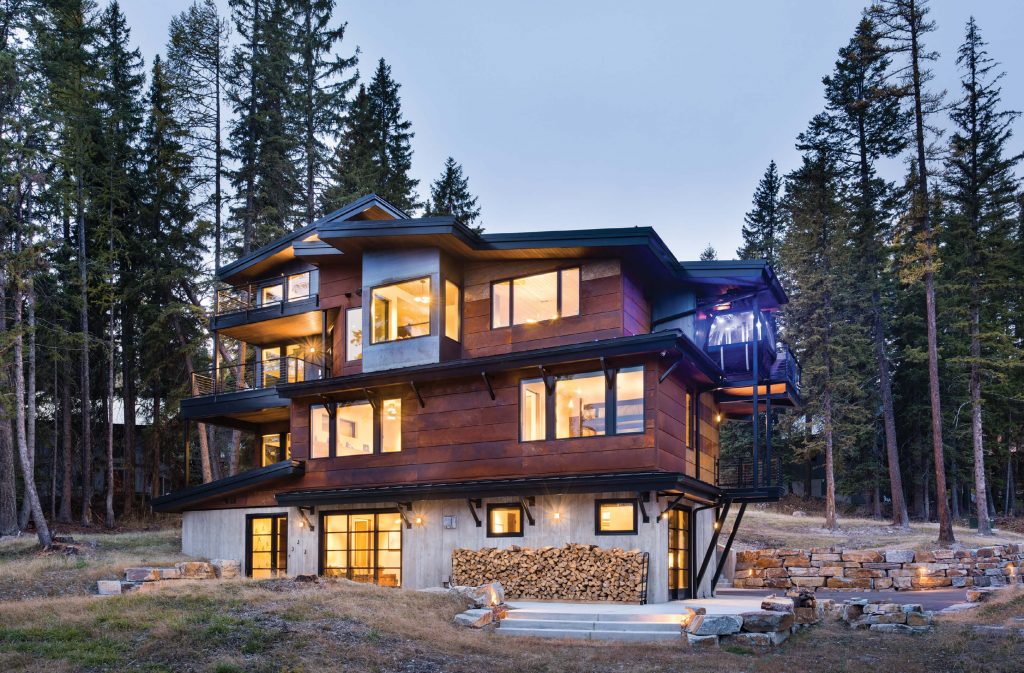
Cantilevered decks and living spaces allowed the house to expand beyond its first-floor footprint.
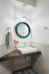
The resulting home is durable and contemporary, but also clever and creative. A covered outdoor space is equipped with glass garage doors and a sliding barn door, so when the family is enjoying the hot tub, fireplace, and TV, they can regulate the temperature and enjoy the outdoor views. The concrete table in the breakfast nook is inlaid with an emblem of the 10th Mountain Division, in honor of the World War II veterans who returned home and helped to create the modern ski industry as we know it — it was the same division the owner served in during the late ‘80s and early ‘90s. Another concrete table in the crow’s nest office is inlaid with glow-in-the-dark chips just for fun. The elevator sports a mural of Patagonia, a bathroom mirror is made out of a mountain bike tire, and outside, a gondola, once owned by the resort (and referred to by everyone interviewed for this article as “the $500 piece of junk the house was built around”), is used to bring firewood and kegs from the ground to the third floor.
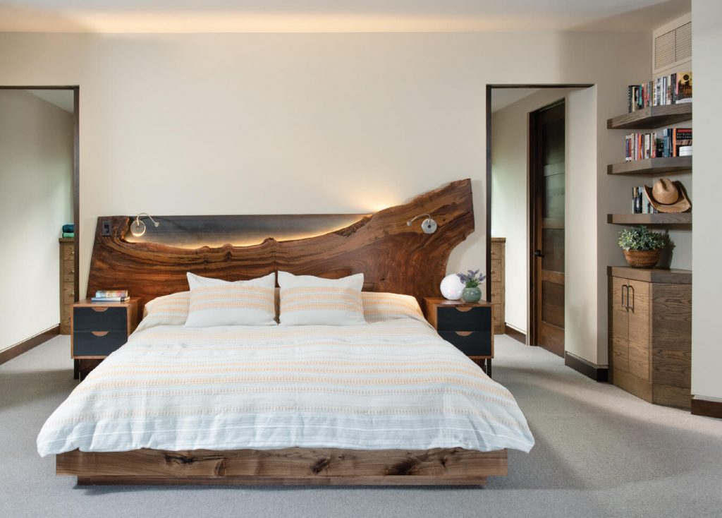
A custom headboard plays a starring role in the owners’ bedroom suite.
The house is attractive but also fun and functional. When the family hosts Wounded Warriors, the ADA suite on the first floor provides a welcoming gathering space, and also a perfect home base for adaptive skiing. “We had a party once where we had five or six wheelchairs in our home comfortably,” says the owner, who placed importance on creating a home that provides access and accommodation for all, while also being a truly great place to live. “At the end of the day, it’s just a house. But it’s got some really happy people living in it,” he adds.
- An elevator allows for wheelchair accessibility and also served as the inspiration for the design team to place the main living spaces on the third floor.
- An elevator allows for wheelchair accessibility and also served as the inspiration for the design team to place the main living spaces on the third floor.



No Comments