12 Apr Rock Creek Retreat
Construction
Granite Custom Homes
Interior Design
Abby Hetherington Interiors
Landscape Architecture
Field Studio Landscape Architects
Bill Mayer was the first in his family to fall for Montana’s pristine trout streams during a cross-country road trip with his family in a wood-paneled station wagon in 1970. But it was his son, Andrew, who pushed him to make Montana a regular part of their lives. “My son prompted me to combine a birthday and Christmas present into a trip to Firehole Ranch [on the recommendation of an Orvis dealer in Massachusetts],” Mayer explains. “It’s fair to say we never stopped coming back to Montana to fish after that. That was in 1995, and we continued to fish every summer for a week or 10 days, sometimes camping on Slough Creek, sometimes in West Yellowstone, but also on the South Fork of the Snake River in Dillon, and other places. Once, at the end of a day of fishing, our favorite fly-fishing guide told us Rock Creek was his favorite place to fish in all of Montana.”
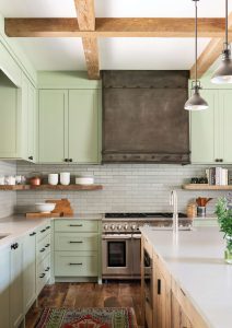
Bright and airy was the mode for a cabin kitchen in a valley where the sun disappears behind the ridge all too early. Light subway tiles, open wood shelving, and a soft sage color keep the dark at bay. The custom cabinets were built by Frank Horiel of Crown Creations.
Naturally, their next trip was to Rock Creek in the year 2000. As soon as they arrived, they knew they’d found their nirvana. And when they saw a cabin with a red roof on an inholding within the Lolo National Forest, the fly was cast. The family purchased the 70-acre property, which was subject to a conservation easement from the Five Valleys Land Trust. The land, mostly a lightly treed meadow along the banks of Rock Creek, backed up to low mountains within the Lolo National Forest, and it came with an 864-square-foot log cabin.
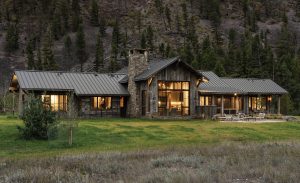
The 70-acre property is an inholding within Lolo National Forest and subject to a conservation easement. The owners sought to minimize the structure’s impact with reclaimed wood, Montana moss rock, and a standing-seam metal roof. Its low-slung design nestles the home into the landscape without calling attention to itself and still allows for oversized windows to take in the sweeping views. “About a third of the way through, Eric Bergerson, who managed the project, took me aside,” recalls the owner. “He said our goal when this is done is for the house to look as though it grew out of the ground.”
For almost two decades, they made the most of the opportunity. But the little log cabin, while charming, was small and dark — a drawback in a narrow river valley where the winter sun disappears behind the mountains in the early afternoon. Also, the couple would soon retire and were planning to spend more time in Montana. Finally, with seven children between them, they needed more beds and a bigger kitchen to adequately gather as a family.
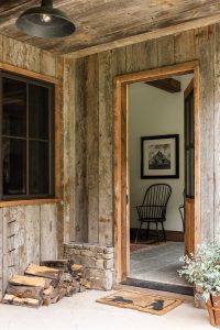
The Humble entryway, with vintage-feel lighting, continues the modest and timeless aesthetic.
Once they started thinking about new construction, the first consideration was the site. “My initial reaction,” says Mayer’s wife, Diane Currier, “was to think of the Wizard of Oz and this house landing in a meadow. I had a strong reaction that the meadow should be left the way it was.”
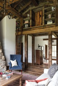
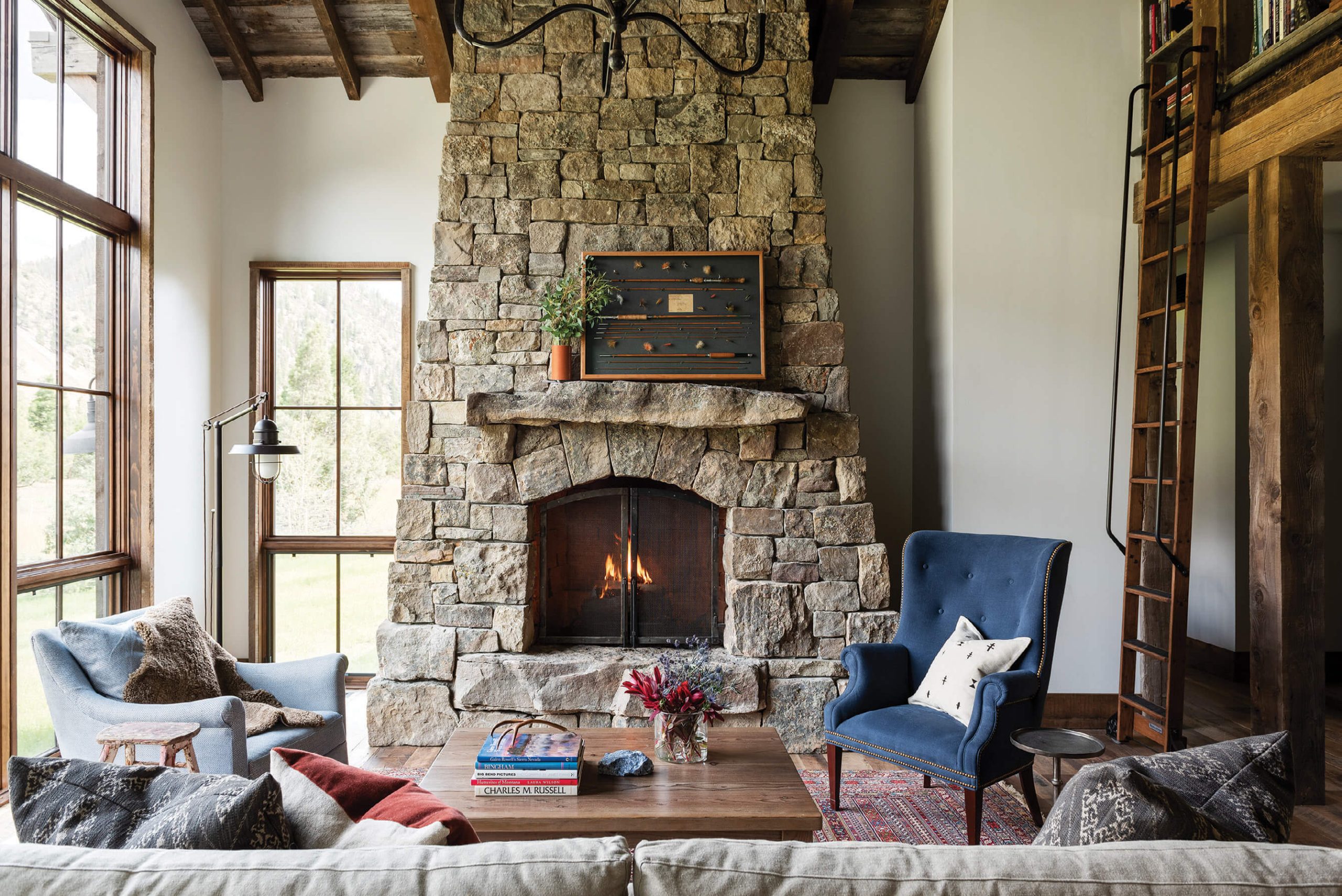
The most playful feature of the house is the hidden loft, which is accessed by a sliding iron ladder and leads to a secret door. “The owners had a collection of Montana authors and they had these cool fly-fishing rods,” says interior designer Abby Hetherington. “They came with collections that were important to them; we created these nooks and crannies so they could enjoy them.“
Making as little impact as possible would prove to be a theme — one that led them to Miller-Roodell Architects and Granite Custom Homes — and resulted in an unassuming, mostly one-story structure of reclaimed wood and Montana moss rock with a standing-seam metal roof. Minimally intrusive and screened from the river and road by intermittent poplars, aspens, and cedar trees, the house successfully stakes its claim as part of the landscape. “When we initially wrote up the program for the house,” recalls architect Joe Roodell of Miller-Roodell Architects, “‘modest’ was the first word the clients used. They appreciated the property and they didn’t want to take away from that. They wanted to touch it lightly; they wanted to minimize the disturbance and they wanted to use natural reclaimed material. It was all about modesty and natural light.”
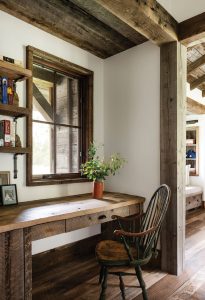
A built-in desk in a pass-through makes practical use of space in a compact design.
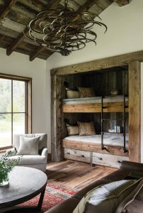
The lounge — a great place for games, TV-watching, or a private phone call — doubles for overflow sleeping with built-in bunks and under-bed storage.
At just under 3,000 square feet — with an open living space, two bedroom suites, and a bunkroom — the house was designed to be low-slung, tucked discreetly into the base of the rounded mountains that rise immediately behind it. While the interiors are characterized by reclaimed wood beams and posts, wood floors, and wood trim, the overall effect is light, bright, and minimal due to large and plentiful windows, ample drywall, and an open kitchen punctuated by light green cabinets, white subway tile, and airy light fixtures. The tall central portion creates extra height in the great room, where the dramatic volume highlights a charismatic Montana moss rock fireplace and meadow and mountain views. On the entry side of the living room, wood posts define the hallways leading to either wing and support built-in bookcases accessed by a library ladder. An inquisitive child exploring the upper reaches will find a sliding door of reclaimed wood with a crescent moon cut-out. Behind that lies a secret room with built-in beds and a small square window looking across the valley to the mountains on the other side of the river: the perfect perch to create one’s own Western fairy tale.
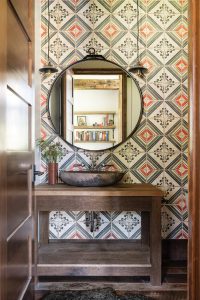
For the powder room, Hetherington worked with the client’s favorite colors to create custom Tabarka tile, then juxtaposed a found mirror with contemporary pendants.
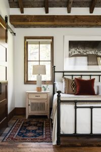
A simple bedroom continues the timeless aesthetic with an iron bedstead, curtainless windows, and black-and-white photography.
In addition to two full baths and a powder room, the home has the all-important mudroom — which, for the owners, was all about housing fishing gear and waders — with built-in lockers to keep things organized and custom-built hooks on the entry porch so rods could remain outside. Playful use of color — a blue velvet wing chair in the living room, blue chairs around the dining table, vivid Tabarka tiles in the bathrooms — and efficiency of space define the cabin. A built-in desk workspace is tucked into a nook leading to the lounge, where the TV-watching area doubles as a bedroom, with bunks and under-bed storage. Several rooms have window seats with built-in storage and bookcases, as well.
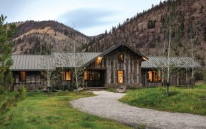
Out the front door lies a meadow dotted with trees and views across the valley; out the back, miles and miles of national forest.
As for the furniture and finishes, “The owners came with their own story,” says interior designer Abby Hetherington of Abby Hetherington Interiors. “Diane has a really good design sense and knows what she likes. She came with ideas for the color palette, tonality, and texture. We spent time with them and listened to them, then sourced materials and products that told the story they were trying to tell. Diane also brought a lot of the product vendors and lines with her. They wanted it very comfortable but also sophisticated. And they wanted quality. Most of the pieces were handmade or artisan-made, from furniture to light fixtures. What I love about this home is that the program is so simple. The bathrooms are all the same reclaimed wood, materials, and styles, so there’s no competing program, and there’s a level of sophistication because of how simple and elegant it is.”
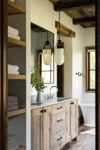
The owners’ bathroom suite demonstrates Miller-Roodell’s mastery in working with reclaimed wood. The perfect balance of wood and drywall, and narrow trim around windows and doors, keeps the rooms from feeling too dark. A contemporary white vessel tub from Kohler and minimal-profile countertops complete the effect.
The theme of simplicity carries outside. There’s a porch with two chairs, and a small screened-in area adjacent to the dining room that gets a lot of use on mosquito-riddled evenings. The patio spills out from the living space and drops down to ground level, giving way to minimal, naturalistic landscaping designed by Charlie Keys of Field Studio Landscape Architects.
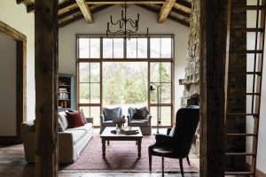
Throughout the house, says Hetherington, “There are a lot of warm tones. There are oranges and reds, but what I love about them is they’re soft, not bright. We took very traditional colors, toned them down, and made them softer.”
Throughout the project, both inside and out, the focus remains on nature, whether it’s the simple white vessel tub tucked beneath two huge windows, or the binoculars kept by the front door for scouting elk and bighorn sheep on the open meadows across the valley. “About a third of the way through, our project manager, Eric, took me aside,” recalls Mayer. “He said our goal when this is done is that we want the house to look as though it grew out of the ground.”

The bedrooms have a homey, contemporary country feel — a balance of white walls with wood floors and ceiling, and soft colors to create restful refuges. The use of reclaimed sawn beams, versus hand-hewn, gives the interiors a subtle sense of refinement.
“The house doesn’t make a big statement,” adds Currier. “It’s just long and low and settled into the ground. That’s very much what we were hoping for, and I think the team pulled it off.”
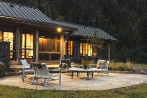
A screened porch makes the most of all seasons, says architect Joe Roodell. “What’s different about the dining room is there are large doors that open onto the screened porch. Those doors live open most of the time. You don’t have to worry about screening them, since they open onto the porch, and you always have a nice breeze coming through.” Landscaping designed by Charlie Keys of Field Studio Landscape Architects is as understated as the house, with minimal intrusions into the natural world.



No Comments