14 Jul Western Design: Modern Solutions
Bozeman’s wealth of natural amenities, sprinkled with a touch of civic refinement, have proven to be as potent an elixir for 21st century settlers as they were for those that migrated to the Gallatin Valley nearly 150 years ago.
Brian Caldwell and his family were drawn to live in one of Bozeman’s historic neighborhoods as much for its ties to the past as for its endless possibilities for the future. The nearly 2,800-square foot home Caldwell completed on South Black pays homage to its late 19th century roots while clearly embracing the owners’ desire for more modern, culturally-forward looking architecture. ThinkTank Design principals, Erik Nelson and Bryan Caldwell, designed the home for Caldwell’s family using the same principles they incorporate into every ThinkTank designed home: “It’s site specific, concept driven architecture,” says Caldwell.
This particular property was originally home to a structure built between 1898 and 1904 in the American Vernacular style of architecture. While this historic block contains a smattering of homes built in early 20th century Bungalow, Queen Anne and Colonial Revival styles, the prevalent style of the neighborhood is American Vernacular — roughly translated as architecture without architects. This is the simplest and most common method of creating housing around the world. American Vernacular relies heavily on locally available resources and typically reflects the cultural and historical context in which it exists. ThinkTank Design co-opted the best of this simple design process, infusing their modernistic flair. “Good design wants to be critical of the place and time it was created; it wants to be relevant [to] what’s going on in the culture from which it was created,” said Nelson.
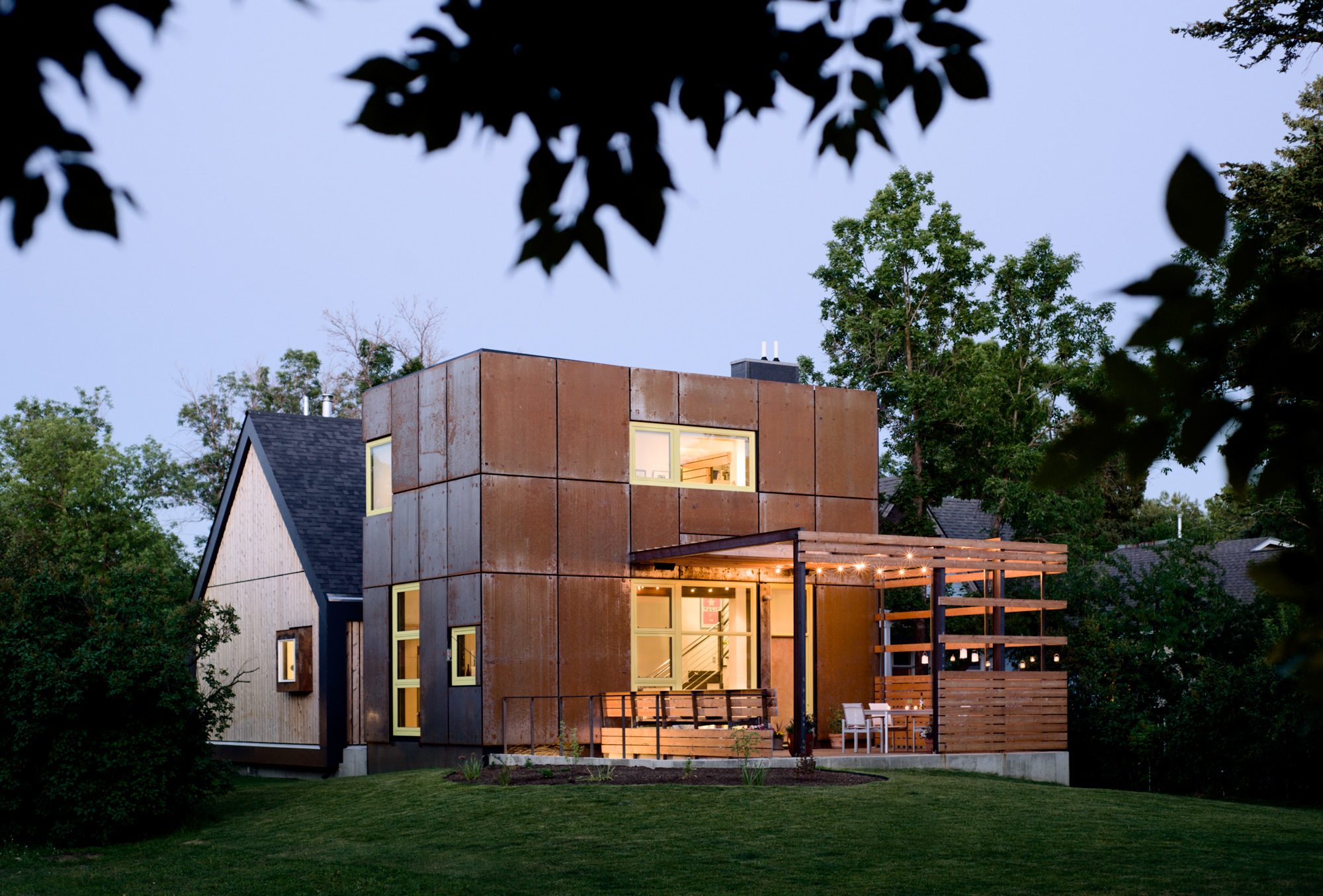
Caldwell and Nelson designed the home to address modern sensibilities and needs while paying respect to its historical setting. “We wanted to abstract and heighten the awareness between old and new,” said Caldwell. The house was built in two stages spanning three years, from 2008 through 2011. They’d planned to keep the original structure intact. Once remodeled it would house the public areas of the home with structural and aesthetic updates. A minimal, flat-roofed steel tower would then be built behind it, housing the private areas of the home. A connecting structure would be built serving as both a physical and abstract expression by bridging the private and public areas while melding its historic roots with its 21st century identity.
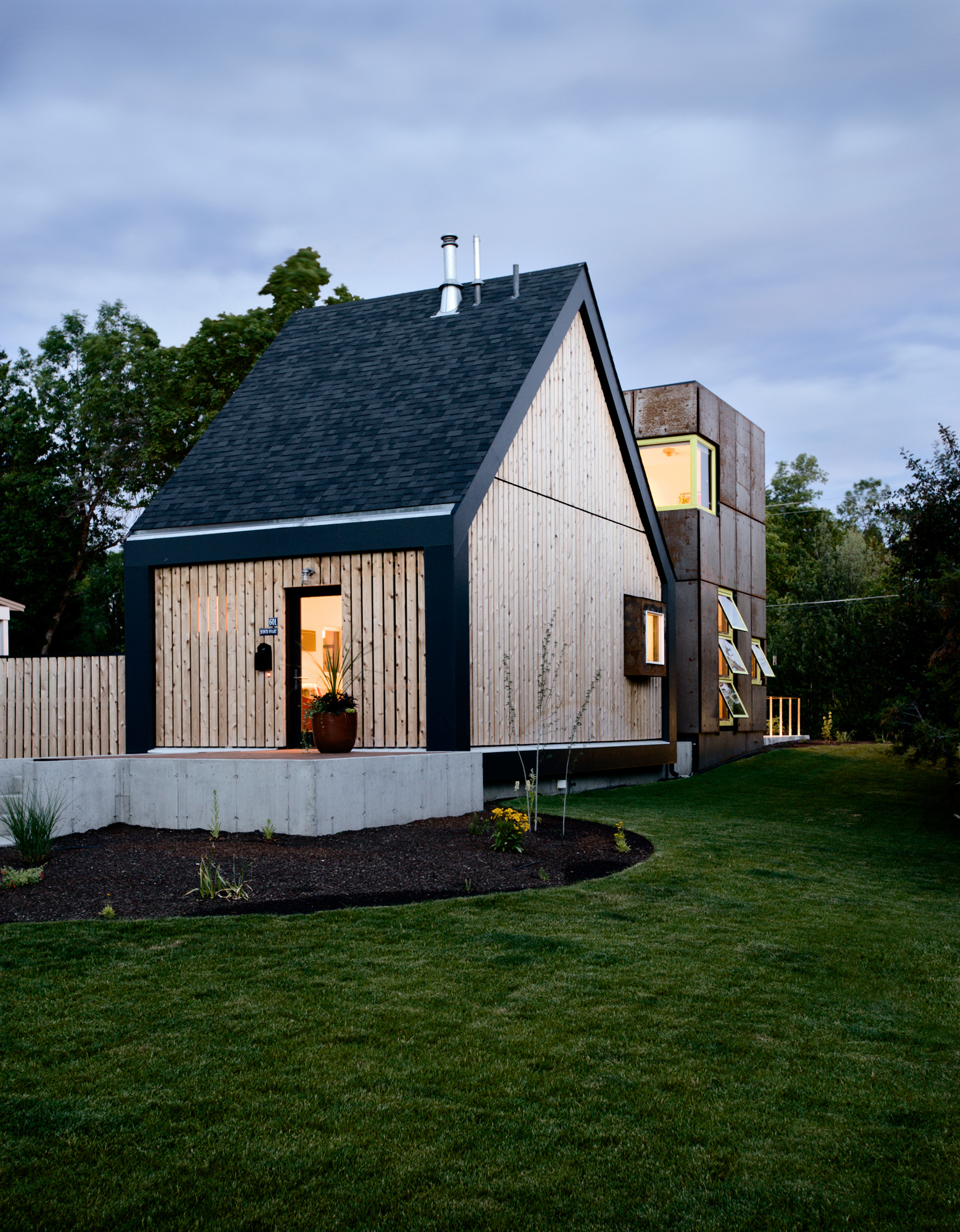
Issues with asbestos, mold and structural integrity thwarted plans to salvage the original home. During the second phase of building, the original structure was replaced with a much smaller, simpler, box-like structure topped with a steeply gabled roofline. The reinvention — the juxtaposition of old and new architectural philosophies — is most evident when viewing the house from its northern exposure.
The natural wood-stained 2-inch by 2-inch vertical cedar skip-lap siding of the simplified house form in front provides only subtle hints that it belongs to the adjacent metal-clad, flat-roofed tower.
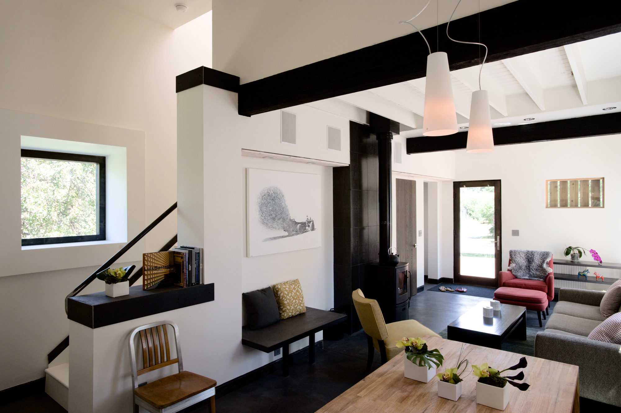
This contradiction of form is again experienced upon entering the home. The mysterious windowless façade of its streetside exterior belies the volume of space and light waiting inside. The main living room is awash in white, punctuated by two great ebony stained ceiling beams above, while the radiant, integrally-dyed concrete floor provides an earthy foundation for the space below. Occasional pops of color — a well-placed orange chair or piece of color-infused artwork — are playfully interspersed within the Swedish-inspired space. As inviting as the space is, with its cushy chairs and oval Morsø burning stove, the eye is drawn to the back of the home. Here, one finds an open invitation to waltz through the living, dining and kitchen and exit through three walls of glass to the pergola-covered deck outside.
“We invite exploration by compressing and manipulating perspective, layering visual lines of site and space,” said Nelson. “It’s more of a subtractive design process as opposed to ladling on finishes.” The articulation of ceiling heights provides a hint of the volumes to come as you enter the tower. The cohesive, modernistic interior design makes moving between the two structures a mere afterthought.
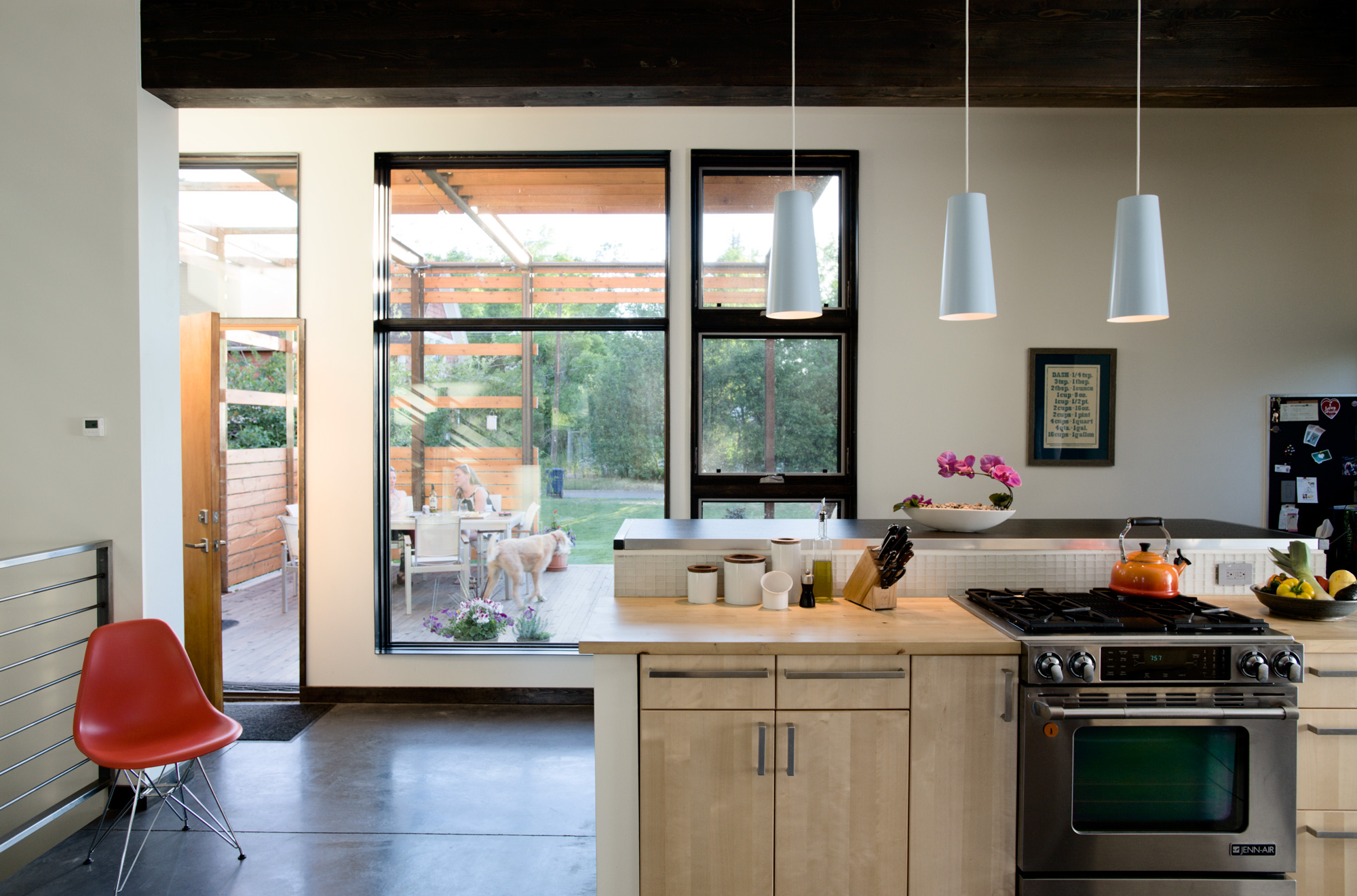
Hidden to the right of the glass wall, well within the first room of the tower structure, is the home’s simple, efficient yet very spacious kitchen. The home embraces recession Modernism through its extensive use of IKEA furnishings and cabinetry. Light birch cabinets line the large kitchen bar and wall behind. Counters adorned in butcher-block tops form a soothing palette accented by original art and lots of light.
Metal fabricated railings, fashioned by blacksmith artist Mike Combs of Burning Hammer, line the stairwell and provide visitors with two choices: move down through the tower to the guest space and laundry below or up to the master bedroom suite. The master bedroom tower was built to capture Bridger Mountain views and early morning light. A nature-inspired master bath provides expansive space. Here entry walls are lined horizontally with natural wood-stained slats, providing a contrasting backdrop to the large format, earthen-stained porcelain tile draping the shower walls, ceiling and floor. Two-inch pearl-colored tiles provide a sea-inspired platform for the raised bathroom sink.
The guest suite is located underground but you would never know it. The creative use and placement of two large window wells lined with walls of glass softly infuse the room with light. Once landscaped, they’ll resemble secret canyons and private retreats rather than the ubiquitous metal-lined cavern. Off the main living room, a stairway is quietly tucked away, unnoticed until steps are retraced upon your departure. They lead to a small hidden treasure, a loft-inspired office. The pickled whitewash wood floor with its wire-brushed texture sets the tone for the room. A south-facing window provides views of a small garden area below, inviting one to pull up a chair and grab a favorite book.
The home’s interior is a whimsical reference to Caldwell’s youth and his memories of misspent summers with his family at their waterside cottage. Caldwell and Nelson designed the home with an overall sense of play, using simplified lines and bold forms to marry what they love most about Bozeman’s historical district with their passion for Modern design.
- During lazy summer afternoons and festive Bozeman evenings, the expansive pergola-covered deck takes center stage.


No Comments