15 Apr Modern Comfort
A home in Whitefish, Montana, is created with care and purpose
There are plenty of beautiful homes out there, along with plenty of homes designed with an eye toward function, or with the goal of maximum sustainability. But rare indeed is the home that combines all three of these attributes — form, function, and performance — in a package so seamless that it can only be described as elegant.
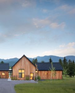
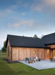
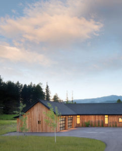 Nestled on a few acres on the outskirts of Whitefish, Montana, this 3,000-square-foot home showcases exactly what can happen when a team of like-minded professionals, at the top of their game, have the opportunity to work together. “While the owners drove the process, they enabled the architect, the builder, and the interior designer to make the most of ourselves, and that’s part of the reason for the success,” says Dave Radatti, with the Whitefish, Montana-based Mindful Designs. “The owner told me right in the beginning, ‘Build this the way you would build it if it was your house, within our budget. I don’t know exactly what you would do, but I want you to do that.’”
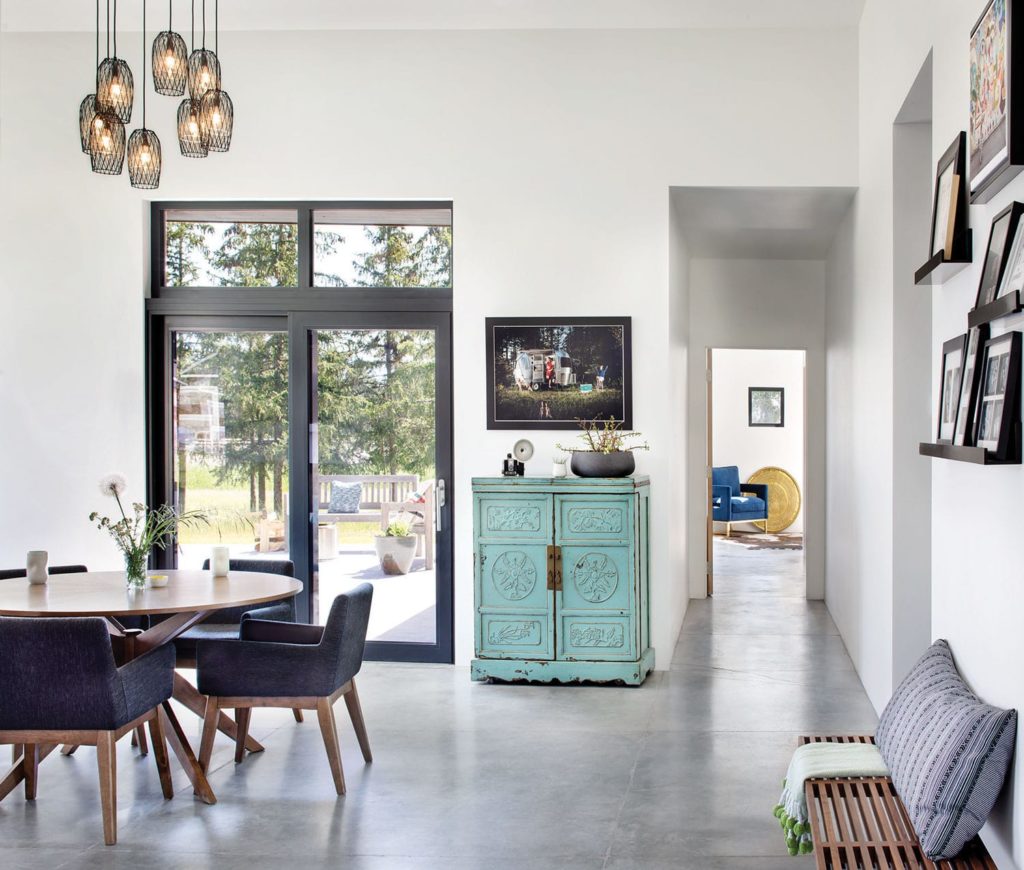
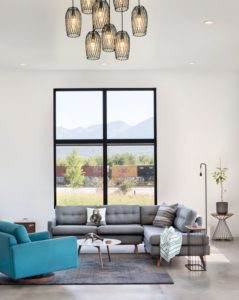
Concrete floors contribute to the home’s sleek look, and also enable radiant floor heat.
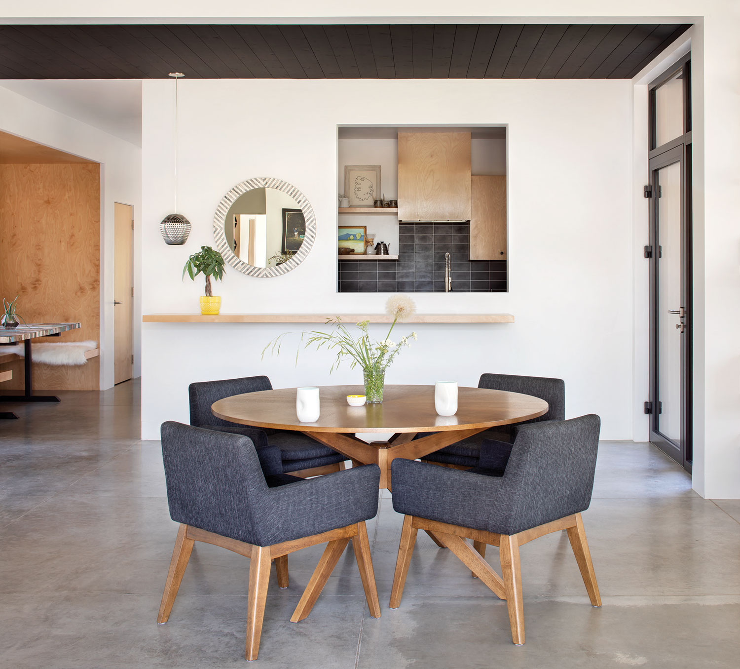
In addition to sustainability and modern aesthetics, they required a few additional specifics, including a separate-yet-attached space for the homeowner’s photography studio to be used as a place where she could meet with clients without interrupting family life; a small music studio; adequate — but not excessive — living space for the young family; ample built-in storage to keep clutter to a minimum; and plenty of windows to capitalize on the views toward Big Mountain, Great Northern Mountain, and the train tracks that skirt the back of the property. Guided by these directives, the team employed a minimalist design that highlights the surrounding landscape, accommodates the family’s individual needs, provides clean lines in cozy spaces, and prioritizes system performance.
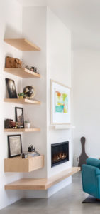
 “It’s an incredibly simple structure, just in terms of how it’s built,” says Charlie Deese with CTA Architects Engineers. “The home isn’t austere, it’s very nuanced. But [that simplicity] allowed our client to spend more money on what they see and use every day. It’s more bang for your buck, when you can put that same money into appliances or windows or insulation.”
Radatti echoes the sentiment, stressing the value over the long haul of investing in systems and materials that result in a comfortable, high-quality, livable home. “It’s not just about what you see when you look at it,” he says. “It’s about that philosophy of taking the long view, investing in the home as a place you intend to enjoy over the long term. You can immediately feel and enjoy the fact that this house was so well built by its internal comfort and sanctitude.”
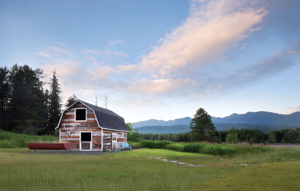
The original barn provides storage and an art space.
That internal comfort is due in large part to the savvy use of materials and technology, with an eye toward minimizing heat loss and maximizing performance. Continuous foam insulation beneath the siding on the exterior of the house creates a seamless barrier, a technique often used in commercial buildings but only occasionally applied in residential construction. A high-end vapor barrier sandwiched between the drywall and framing provides breathability and reduces the risk of mold and structural damage. Radiant floor heat is set within a super-insulated concrete foundation. Triple-pane windows limit heat loss and also serve as an effective sound barrier.
 “We went into the project with sustainability as a priority, and also comfort,” says the homeowner. “I love our windows, I love our living room, because it’s so open and light. We get to watch the sunset on the mountains and see the deer — it feels like we’re outdoors even though we’re in our home.”
In order to best capitalize on those spectacular views, Deese worked some architectural magic. “We carved away underneath one of the gables in the living/dining room, and oriented that wall toward the Great Northern view,” he says. “It’s not over the top, but it subtly guides your eye in that direction, and it also gave them the ability to have patio doors with a little bit of cover.” They echoed that angled wall on the other end of the house where the music room is, not just to balance the aesthetics, but also for technical reasons — music rooms perform better when the walls are not at right angles.
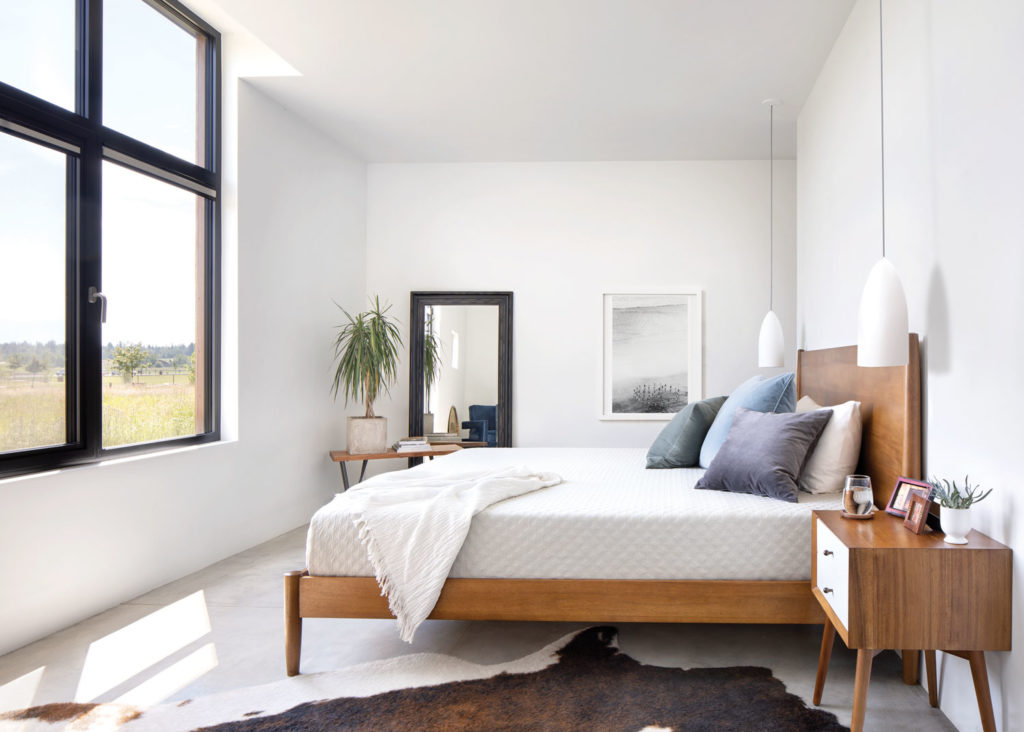
Large triple- pane windows offer expansive views and also reduce heat loss.
It’s this level of attention that makes this house shine in a soft-spoken, intentional way. “The eye-stoppers in this home are very specific,” says Radatti. “It’s highly contemporary, so if your eye’s drawn to a detail, it’s because your eye was meant to be drawn to it. Every line, every color, every juxtaposition, everything is under acute observation. In a well-executed contemporary home, the simpler it looks, the harder it is to achieve.”
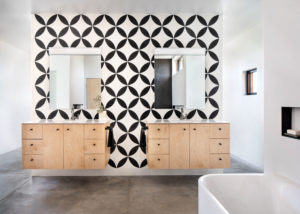
The meticulous pairing of pattern and color bring the bathroom to life.
That deliberate decision making stretches all the way from the layout of the house to the material and design choices for the interiors. “Heidi Tate, of Tate Interiors, did a fantastic job working with the owner and cabinet maker to come up with very specific designs on all of the built-ins and very specific use of materials,” Radatti says. “There was some experimental use of materials, things we’ve never used before. Heidi pushed the envelope in an effort to get them exactly what they were looking for.”
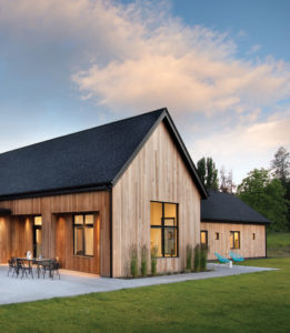
From the placement on the lot, to the simple cedar siding, to the accents of texture and color throughout, it’s clear that not a single decision was made haphazardly, and each element was introduced with care and purpose. “There’s such simple elegance. It’s a house that feels like a temple,” Radatti adds.
Architecture: CTA Architects Engineers
Construction: Mindful Designs
Interior Design: Tate Interiors


No Comments