08 Apr Metamorphosis
Architecture
Altius Design Group
Construction
Malmquist Construction
Interior Design
Liz Kahn Design & Tate Interiors
Landscape architecture
Bruce Boody Landscape Architect
What was intended to be a remodel on a dated 1980s-era house overlooking Montana’s Whitefish Lake resulted in a completely new home. A consensus call by the team of architects, engineers, and interior designers, it still wasn’t without its risks. “Those situations are always tenuous,” says architect Rich Graves, principal of the Whitefish-based Altius Design Group. “There’s always the chance of getting fired — but we kind of went out on a limb, and the client agreed.”
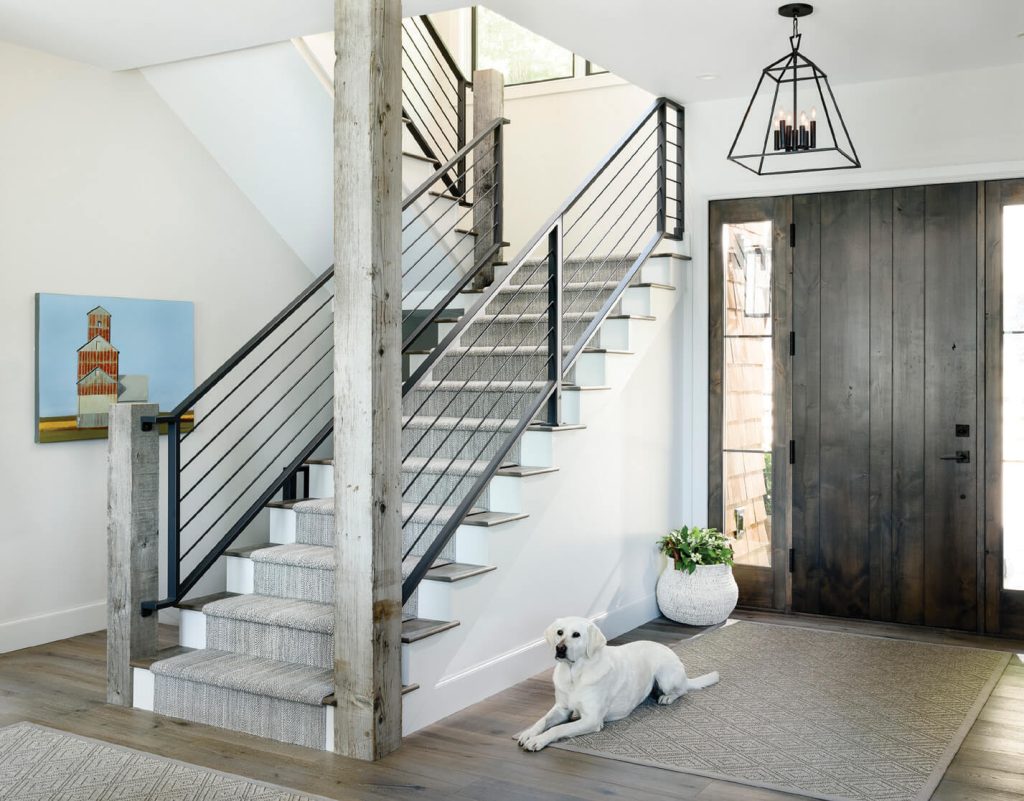
The steel used for the interior stairway adds a decidedly modern look and feel.
This is owner Tierney Ryan’s second home on the water: “The view is to the lake, and then the hills across the way,” she says. “We have front-and-center views.” She and her husband approached Graves and builders Malmquist Construction after purchasing the home, hoping for higher ceilings, bigger windows, and a deck off the back. “We set out doing that and came up with a floor plan and landscape plan,” Graves says. “Then we started digging into the construction of the house and the sequencing and the cost.”
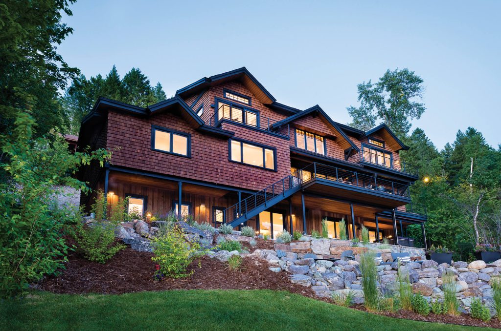
The architect chose shingle-style cedar cladding for the exterior, lending the home a “coastal look, with a nod to Montana rustic.”
Graves and Paul Coulston, project manager with Malmquist, looked at the existing home with a structural engineer. “We were afraid they would not get the look they wanted, because it had eight-foot ceilings, and some lower,” Coulston says. “We thought it would be a better project if they started over.”
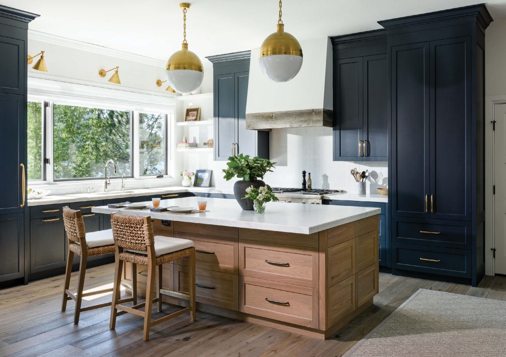
The interior design team — which included Liz Kahn Design and the Whitefish-based Tate Interiors — offset the navy-blue cabinets by using walnut for the kitchen island and white Carrara marble for countertops.
Along with that, Ryan agreed that the original home was poorly designed. “It was built to keep cool because the sun is so intense there,” she says. “There were small windows and little interaction with the lake — and it had no curbside appeal from the lake or the road.” She and her husband agreed that the costs of remodeling outweighed the benefits. As Graves pointed out, why spend so much and get 90 percent of what you want, when you can spend the same and get everything?
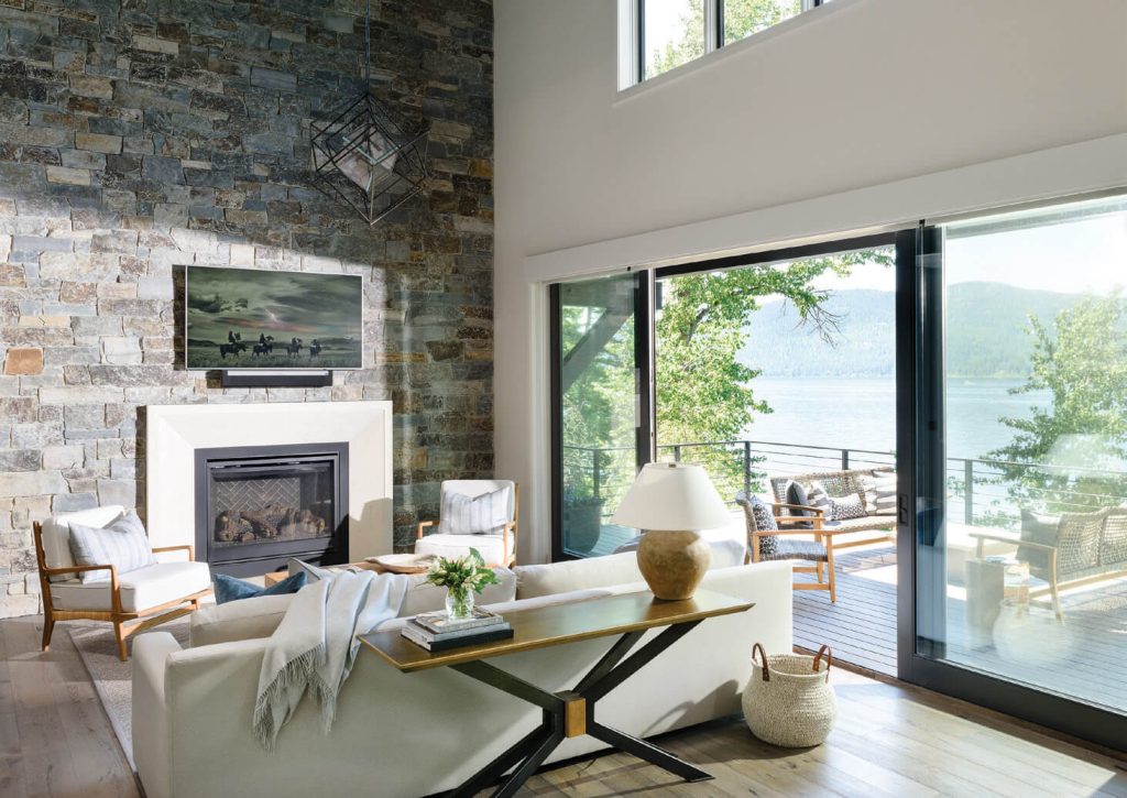
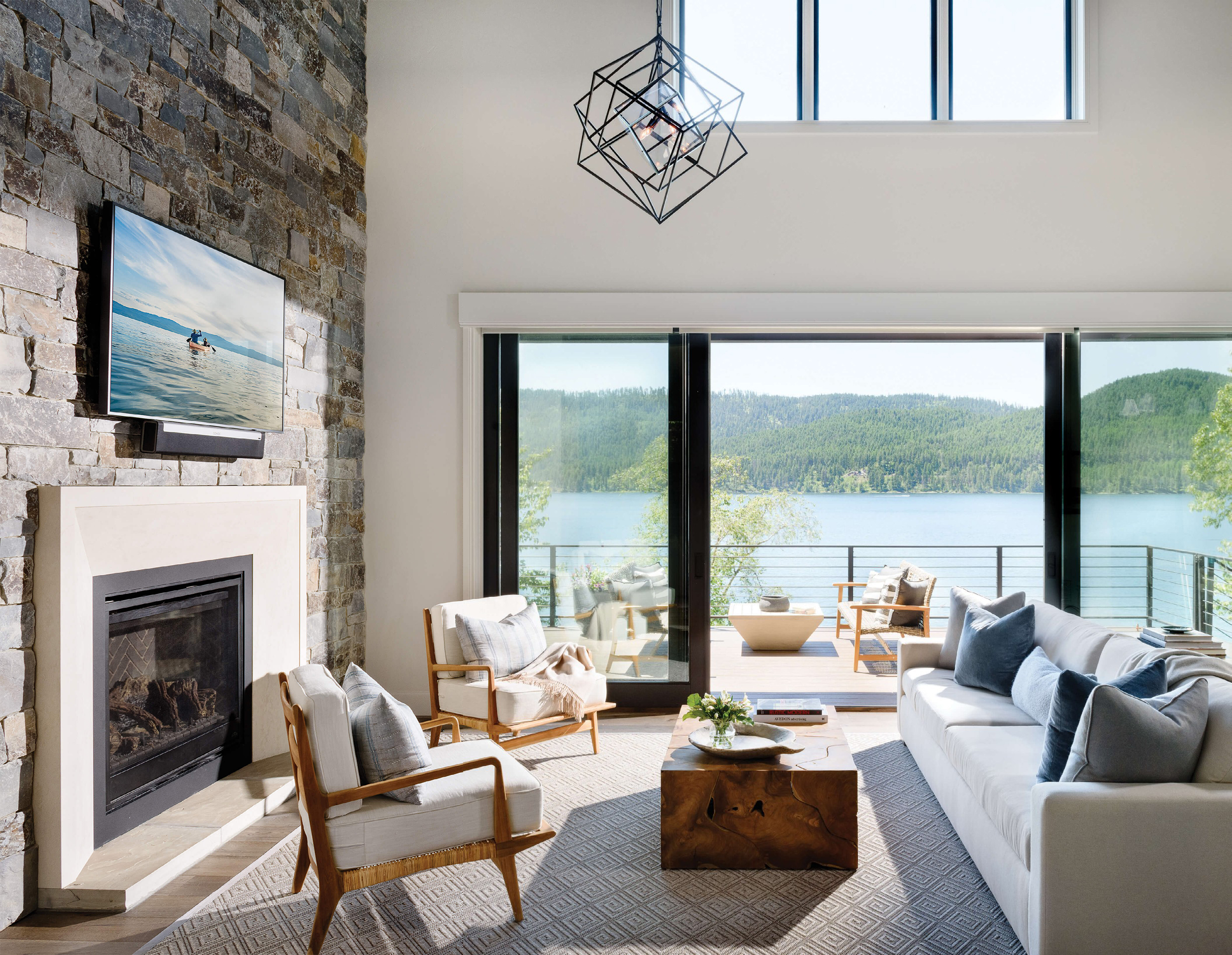
The living room fireplace insert fits seamlessly into a 20-foot-high wall built from local stone.
So they sliced the house off from the garage and used the existing foundation. That gave Graves room to provide a real indoor/outdoor feel and experience, with show-stopping views of the lake, and plenty of style. “The old house was a kind of Montana lodge-y thing, and we wanted to dress it up a little,” he says. “We gave the new house a shingle-style, coastal look, with a nod to Montana rustic.”
On the side facing the lake, Graves added large doors and windows to bring the views in — especially in the primary bedroom suite — and introduced an open floor plan. “The intent was to bring up the ceilings, and have that indoor/outdoor feeling, with very wide sliders to open up the living room to the deck and create one big room,” Ryan says.
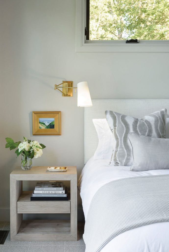
The soft palette of grays in the furnishings and fabrics adds a calming touch to this bedroom.
The landscape surrounding the home also got a new look and feel. Like most properties on the lake, it had a set of wooden steps that led down a steep slope to the water. However, Bruce Boody, owner of the Whitefish-based Bruce Boody Landscape Architect, had other ideas and recruited site work from the local company Valley Earthscapes. “He kept the existing retaining wall, expanded it, added a gravel path down to a patio, and then boulder steps down to the lake,” Coulston says. “He actually used the site in a better, more natural way.”
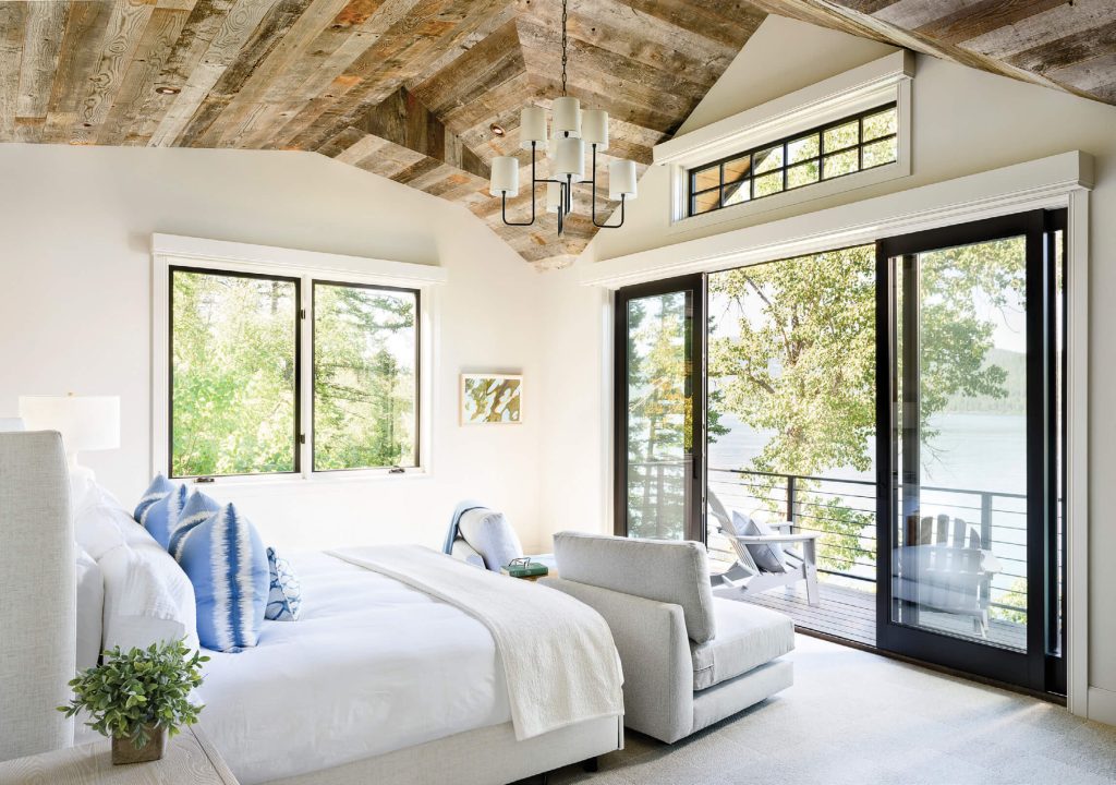
Ceilings of reclaimed wood and timber connect the interiors to the natural setting.
The 4,800-square-foot home — with approximately 1,600 square feet on each of its three levels — is stick-built, with trusses. The exterior features stone wainscoting from a local quarry around the base, along with western red cedar shakes and board-and-batten. The roof is a combination of shingles and metal. “It’s a shed roof with a standing seam, and the gables are shingle,” Coulston says.
Inside, Liz Kahn Design — the San Francisco Bay Area firm where Ryan works as a project manager — handled the fixtures, finishes, and furnishings. They brought in Anne Ambrosino of the Whitefish-based Tate Interiors to help during the design phase, and to work as a local liaison, especially when Covid-19 prevented onsite visits. “It was imperative to have local talent support us,” Ryan says.
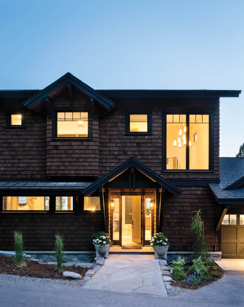
The street-side windows were placed higher for privacy, while still allowing abundant natural light into the interiors.
The design team used white oak flooring and reclaimed wood ceilings, adding timbers to warm up the rooms. They also slipped a fireplace of Moose Mountain stone into a wall in the great room. A breezeway upstairs — supported by an exposed steel beam — and the steel stairway add a modern touch.
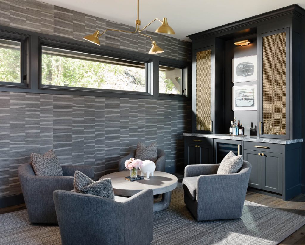
The lower level features a bar with a gray Italian Bardiglio marble countertop and a sitting area for gatherings.
In the kitchen, the designers used naturally finished walnut for the island to warm the space and soften the navy cabinets. Countertops in both the kitchen and bathrooms are laid in Carrara marble, the bar’s is a gray Bardiglio marble, and the designers mixed in other types of marble elsewhere. “The fact is, Liz and I were partners working on a house for me and my husband, and we decided to have fun,” Ryan says. “So we used Bardiglio and Carrara marble for a striped floor in the master bath.”
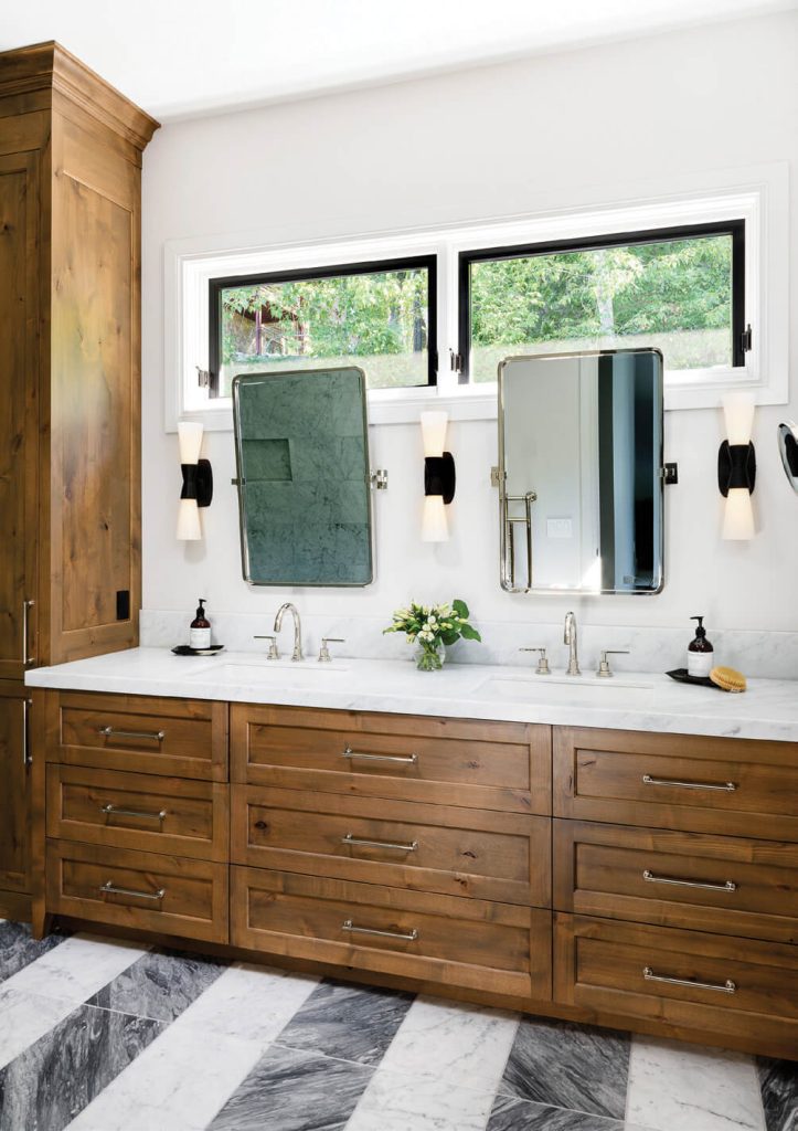
The interior designers employed Bardiglio and Carrara marble to create a striking striped floor in the master bath.
Surely, that kind of Bay Area touch would never have worked in a remodeled 1980s-era Montana-rustic home.



No Comments