12 Apr Functional Art
TUCKED AWAY ON THE WESTERN SLOPE OF THE TETONS, Alta, Wyoming, is a quiet mountain town and one of the country’s best kept skiing and snowboarding secrets. Home to Grand Targhee Resort, the area draws those in the know for its natural beauty, laid-back atmosphere, and an abundance of snow — an average of 500 inches each year. It was for these reasons that a Boston-based couple fell in love with the town and chose to build a smart, sustainable ski residence here.
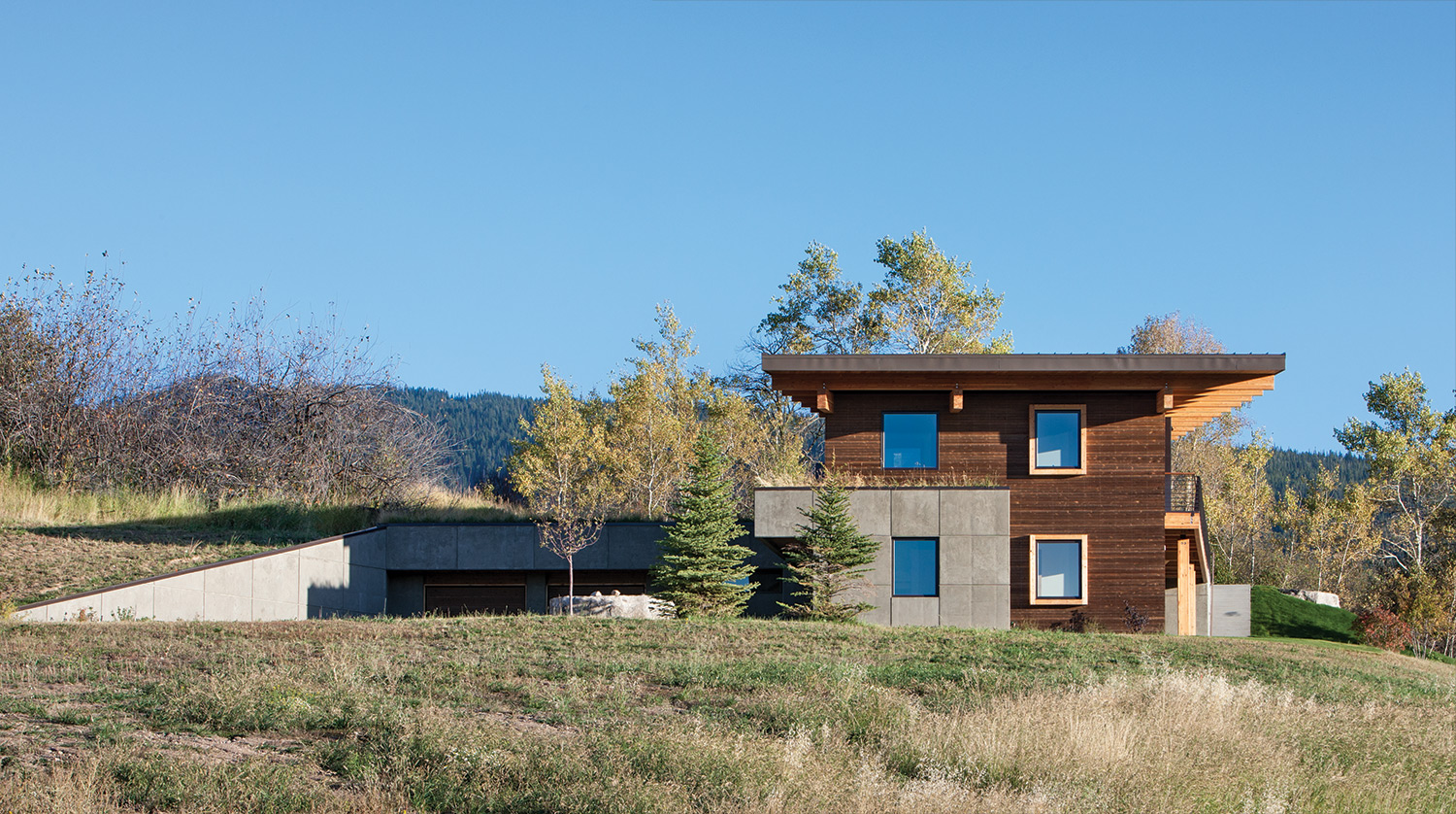
Sited just above a farm, the two-level, 4,453-square-foot house is set into its hillside lot.
“We wanted a home where we could feel a strong connection to the outdoors, and have access to the activities we love: skiing, hiking, and mountain biking,” said one of the owners. “We like Alta’s small-town sense of community and the fact that it’s not overdeveloped.”
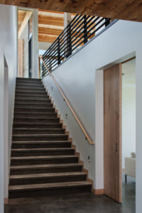
A stairwell on the ground floor leads up to the main living space.
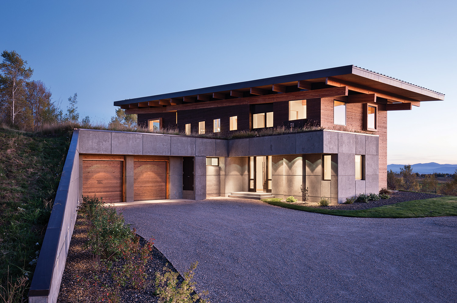
The linear fashion of the house offers a unique perspective from every angle and lets in natural light.
To bring their vision to life, they called upon Ward + Blake Architects, a firm known for its ability to create modern and contemporary design solutions that harmonize with the surroundings. “As someone who lives nearby, we felt Mitch Blake had a unique sensitivity and firsthand understanding of the local landscape,” said the owner. “We articulated to Mitch what was important to us and what we felt we needed. We also provided him with images of homes and materials that we were drawn to. Using what we gave him, Mitch worked his creative magic to design a structure that not only addresses our needs and wants, but speaks beautifully to the landscape as well.”
Sited just above a farm, the two-level, 4,453-square-foot house is set into its hillside lot. Rendezvous Custom Homes, a builder that specializes in eco-friendly modern homes, was part of the process right from the start.
“The site is part of a subdivision that was originally a farming property,” explained Blake. “Farming still takes place around the subdivision. As the seasons change, the crops mature and are harvested — it’s always changing which keeps the landscape interesting.”
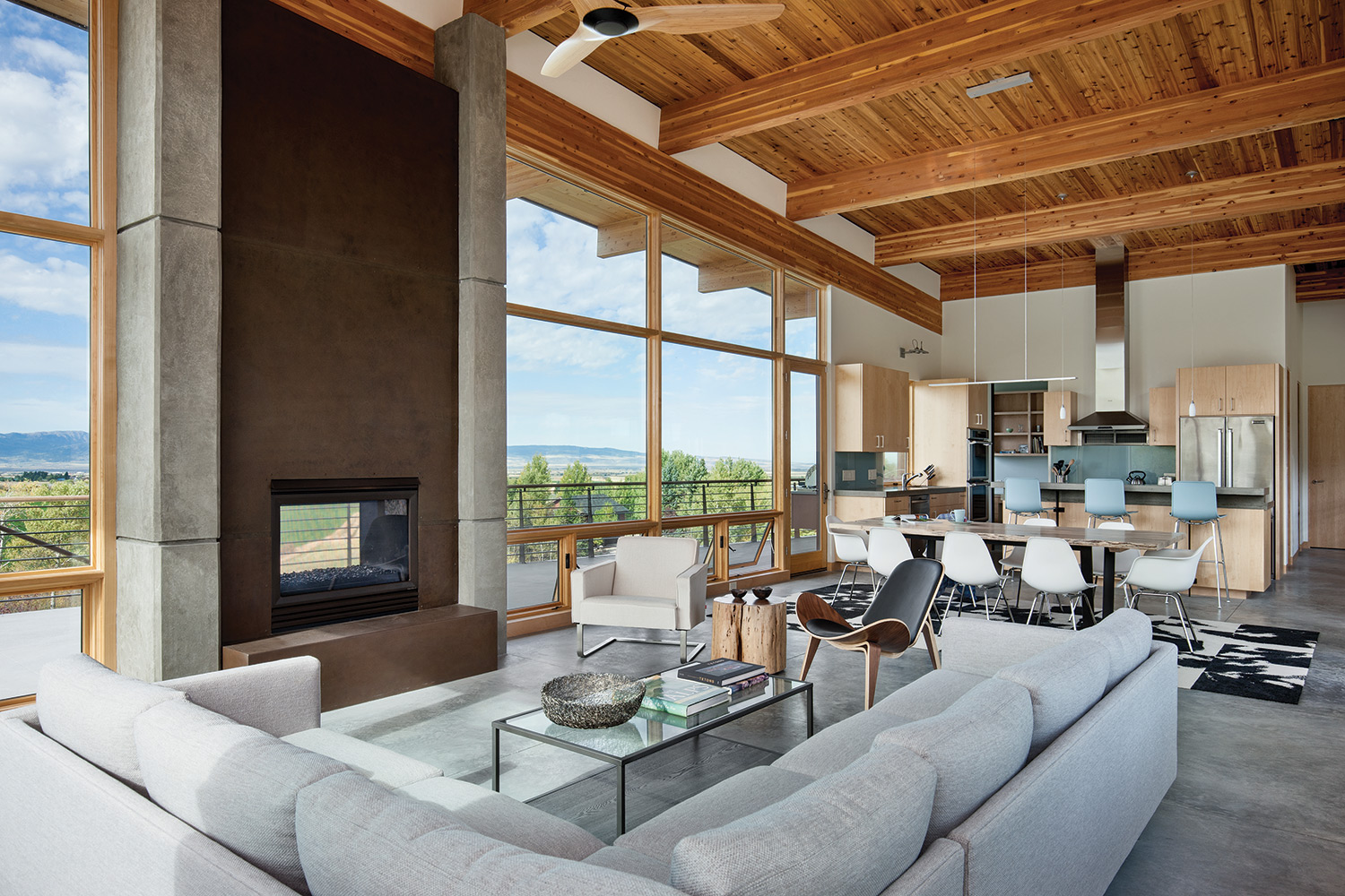
The airy open living and dining area features a large wall of windows that lets the outside in.
The interior spaces are compact and efficient, making maximum use of volume, proportion, and light. On the first level, the three-car garage sits buried into the slope. A couple of steps up lead to two guest rooms, a bathroom, and an exercise room. On the second floor, the house expands, accommodating an airy, open living and dining area with a large wall of windows that let the outside in. The second floor also holds the kitchen and the master bedroom.
The main living areas of the house are stretched along an axis that points from the peak of Treasure Mountain on the southeast to the western summer sunset.
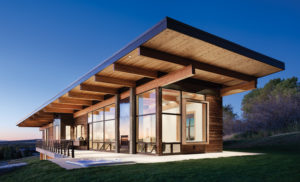
The low, sloped roof mimics the cross slope of the hillside
“I like the linear fashion of the house — it gives all of the rooms unique views in several directions and brings in natural light from multiple sources,” said Blake. “The house is quite light in terms of natural illumination; it spills throughout the house.”
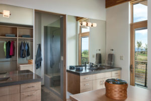
Designed with convenience and efficiency in mind, the home makes smart use of materials and space.
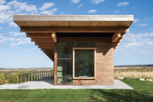
Taking into account the solar orientation of the site, the roof overhangs are extended to cover outdoor entertainment areas and provide a passive solar balance between the seasons. The roof slope rises, mimicking the cross slope of the hillside, as well as adding intimacy to the master bedroom and grandeur to living and dining areas.
“Initially, HOA rules didn’t accommodate the low sloped roof that we designed. We were able to show them that it was a quieter solution and harmonized better with its surroundings. Beyond aesthetics, it also worked to minimize volume.
“Sustainability was important to the client and obviously to us,” said Blake. “The house received a Home Energy Rating score of 41, which means it performs 59 percent better than the International Energy Code. So this house is performing at the high end of energy efficiency.”
Using steel, concrete, and weathered cedar, the house is low maintenance, while the ground source heat pump, super insulation, and high-performance glass reduce its energy footprint. The interior is modestly finished with tongue and groove cedar ceilings, concrete floors, concrete countertops, drywall, and maple for trim, doors, and cabinetry.
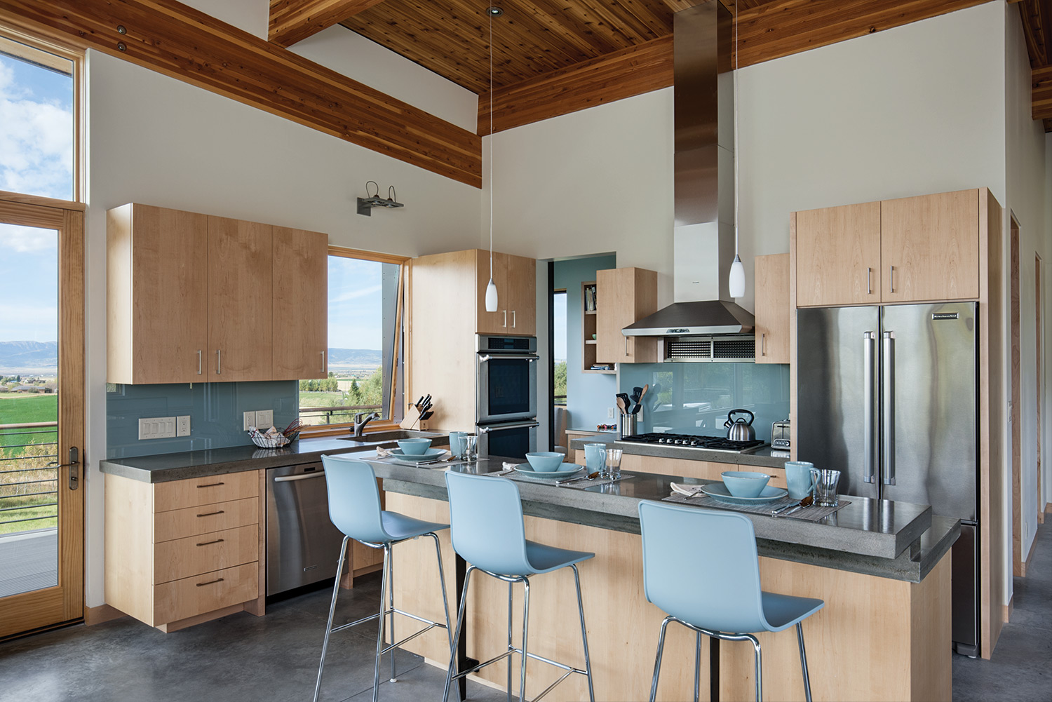
Sleek and simple lines in the kitchen are accented with soft blue hues that mimic the sea and sky.
“We love the concrete floors and radiant heat,” said the owner. “They are so practical and smart for a ski house.”
To reinforce the indoor/outdoor connection, the couple opted for a simple and subtle color scheme — only four colors of paint were used throughout the interior. “We wanted the outdoor views and natural materials in the house to be the things you notice,” she said. “We chose colors of the sea and sky to use as accents.”
Custom-finished steel railings, structural connections, and fireplace panels add texture and detail to an otherwise simple design.
“Understandably, the owners wanted low maintenance. All of the siding has been treated with Valhalla Lifetime Wood Treatment. Over time, the house will look like a weathered, silver-gray barn,” said Blake.
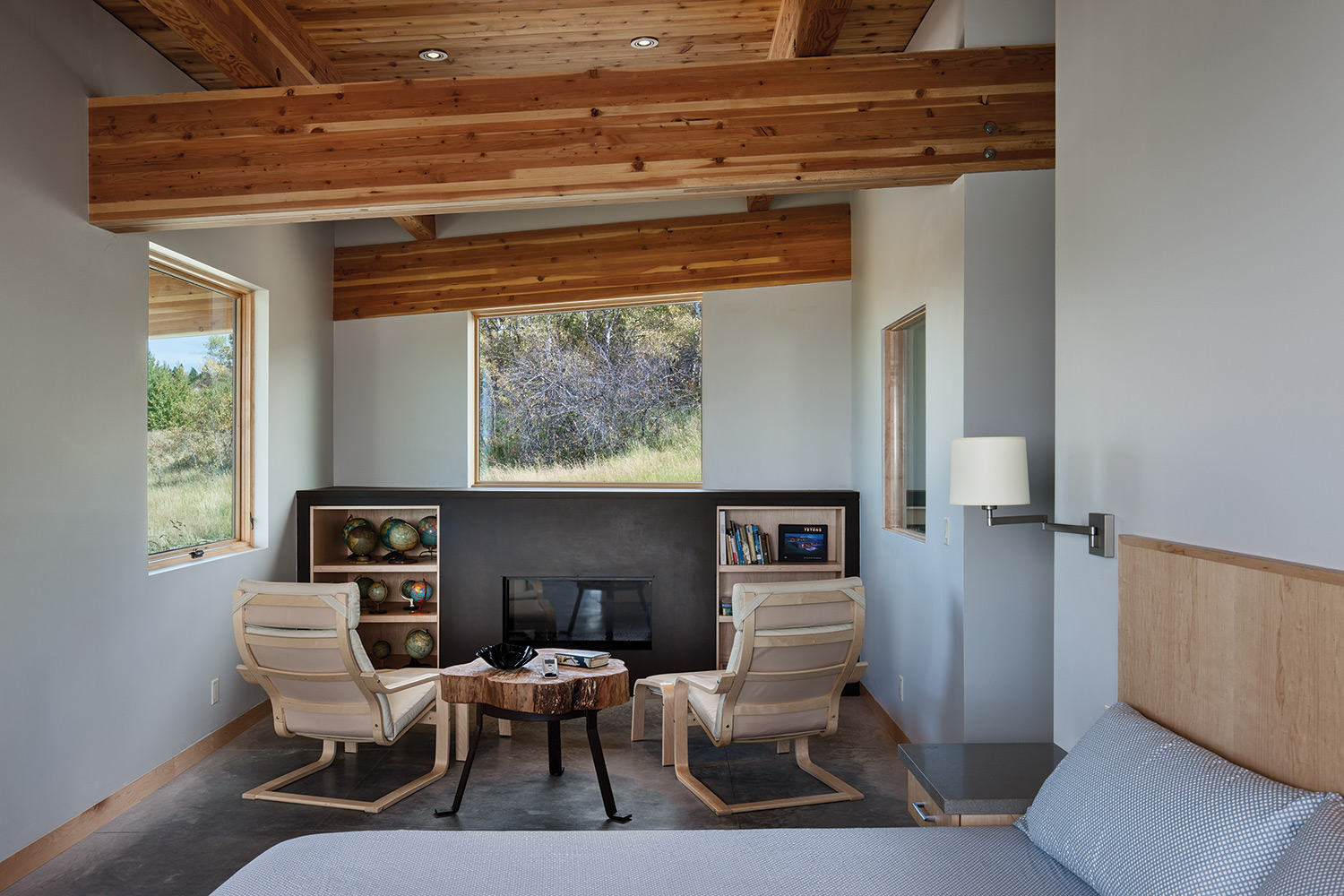
The interior spaces, such as this bedroom, are compact and efficient.
Early in the process the build team discovered huge boulders buried into the soil.
“It was like digging up cars from the ground — they were huge and really unexpected,” said Blake.
Some of the excavator’s machinery couldn’t carry them away; they had to be dragged off. Ultimately, the team reincorporated some of the large boulders back into the hillside and landscaping. The owners lovingly refer to them as “picnic rocks.”
Recent empty nesters, the couple uses the home as much as they can — largely in the summer and winter, though they hope to spend more time there in the future.
“We’re not fussy people,” the owner said. “We love to be out enjoying the natural world. This house is great because it’s fairly easy to keep, and is comfortable and welcoming for friends and family. Mitch did a great job of creating a lovely, functional home for us.”


No Comments