14 Apr Eclectic Expertise
EARLY 20TH-CENTURY INDUSTRIAL LANDSCAPE. Ultra-urban, modern design studio. Midcentury upscale loft. Weatherbeaten barnyard. Depending on where your gaze falls in this home, your impression of it will shift. And yet, somehow, the whole thing holds together in one mesmerizing kaleidoscope of color, texture, and material.
“There’s definitely an eclectic aspect to the house,” admitted Jeff Brandner. “It’s true there are a lot of different things going on.” If anyone can speak to the eclecticism — and the intent behind it — it’s Brandner. As the owner and founder of Brandner Design, he and his team conceived of the home, built it, and what’s more, they built just about everything in it as well. And now, to top it off, he lives there.
Brandner bought the property, and the small, 1950s-era cinderblock house on it, in 2009, with the intention of redoing and adding onto it. The resulting 2,600-square-foot home now serves a dual purpose: “We didn’t have a showroom at the time, so the house became our showcase piece where we could build some really cool things, and bring clients through and show them the scope of what we do — because it’s kind of a big scope,” Brandner said.
“Big scope” is something of an understatement, given the breadth and depth of Brandner Design’s expertise. Based in a 22,000-square-foot workshop in Bozeman, Montana, the multifaceted firm not only designs architectural elements, furniture, fixtures, interiors, and landscapes, but they’ll also build it all right there on site. “We’re lucky — we have a full metal shop, wood shop, finishing rooms. We do leatherwork, we do some glasswork. We have a great base of artists who work in our shop, and we can pretty much build anything.”
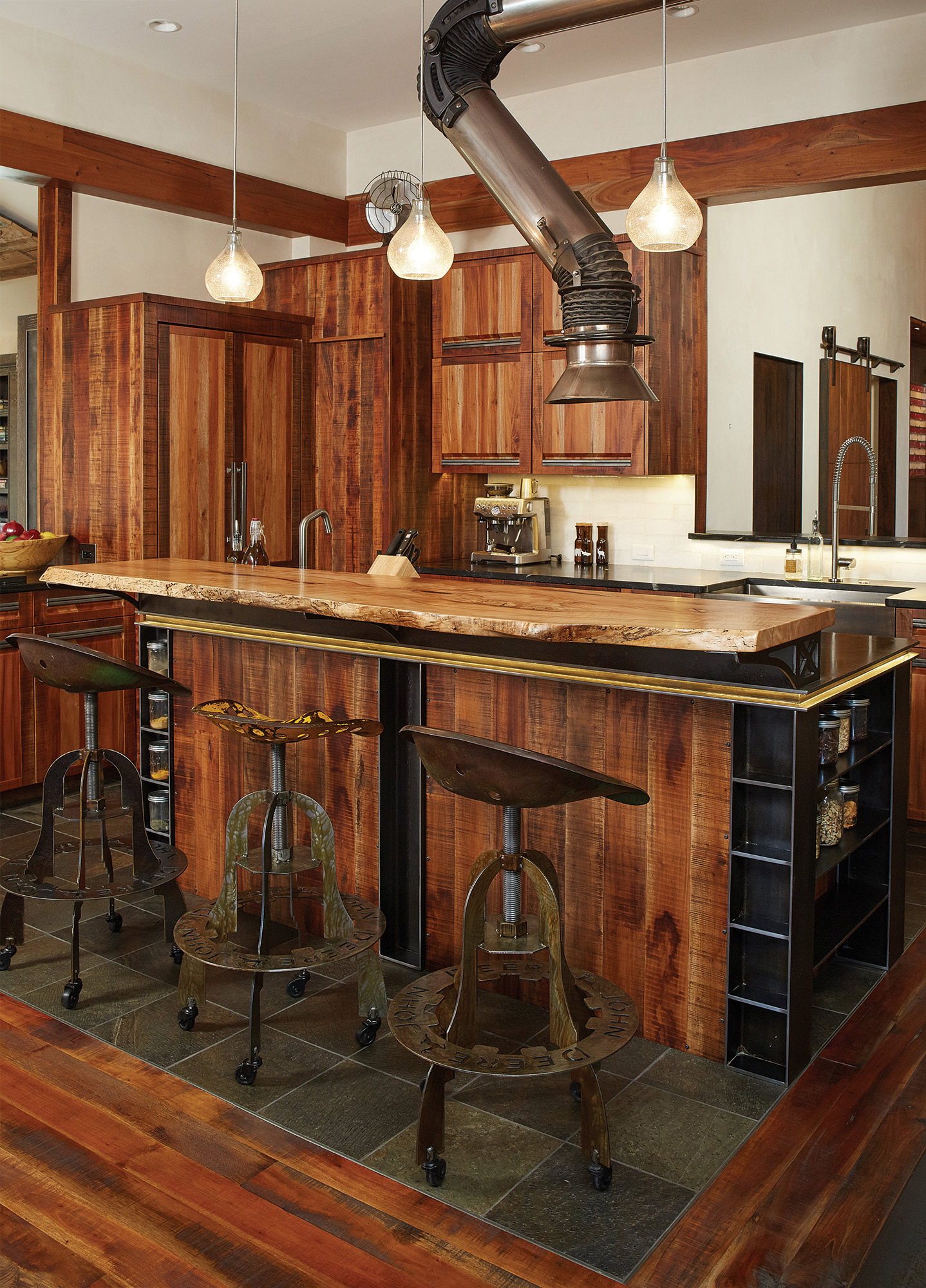
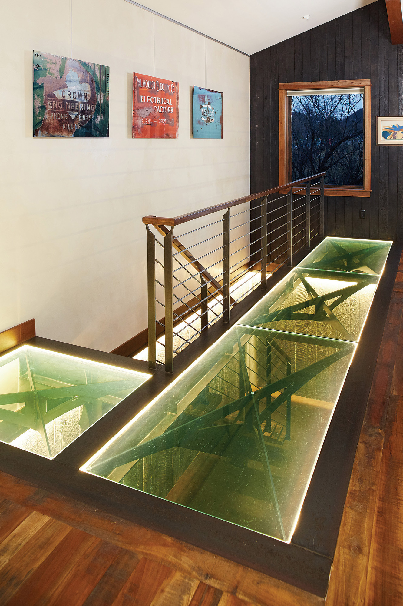
All of that expertise is on full display in the home, and the juxtaposition of surfaces and styles is a visual delight. A glass floor in the main living area affords visitors a view of the staircase descending into the basement, the austereness of the metal railing balanced by the warmth of mahogany stair treads and a walnut railing. In the kitchen, modern cabinets of skip-sawn boards pair with stainless appliances, bar stools made of reclaimed tractor seats, and above everything, a welder’s fume hood has been repurposed as a cooking vent. “It’s great,” said Brandner. “We build a lot of big oven hoods, but I didn’t want to have something massive hanging from the ceiling. I just had that idea one day, and I love the look of it. It’s different, and it’s really functional — you can pull it down tight to what you’re cooking, and then push it up out of the way, and most people don’t even notice it.”
That willingness to borrow ideas, repurpose materials, and think unconventionally is one of the things that makes Brandner Design unique. “I love to go to salvage yards. I kind of grew up doing that on a farm in Pennsylvania,” said Brandner. “So I go through salvage yards all across the West, and there are so many cool things out here. Nothing really rots out here, nothing decays, and you can find these really interesting pieces and forms, unique shapes.”
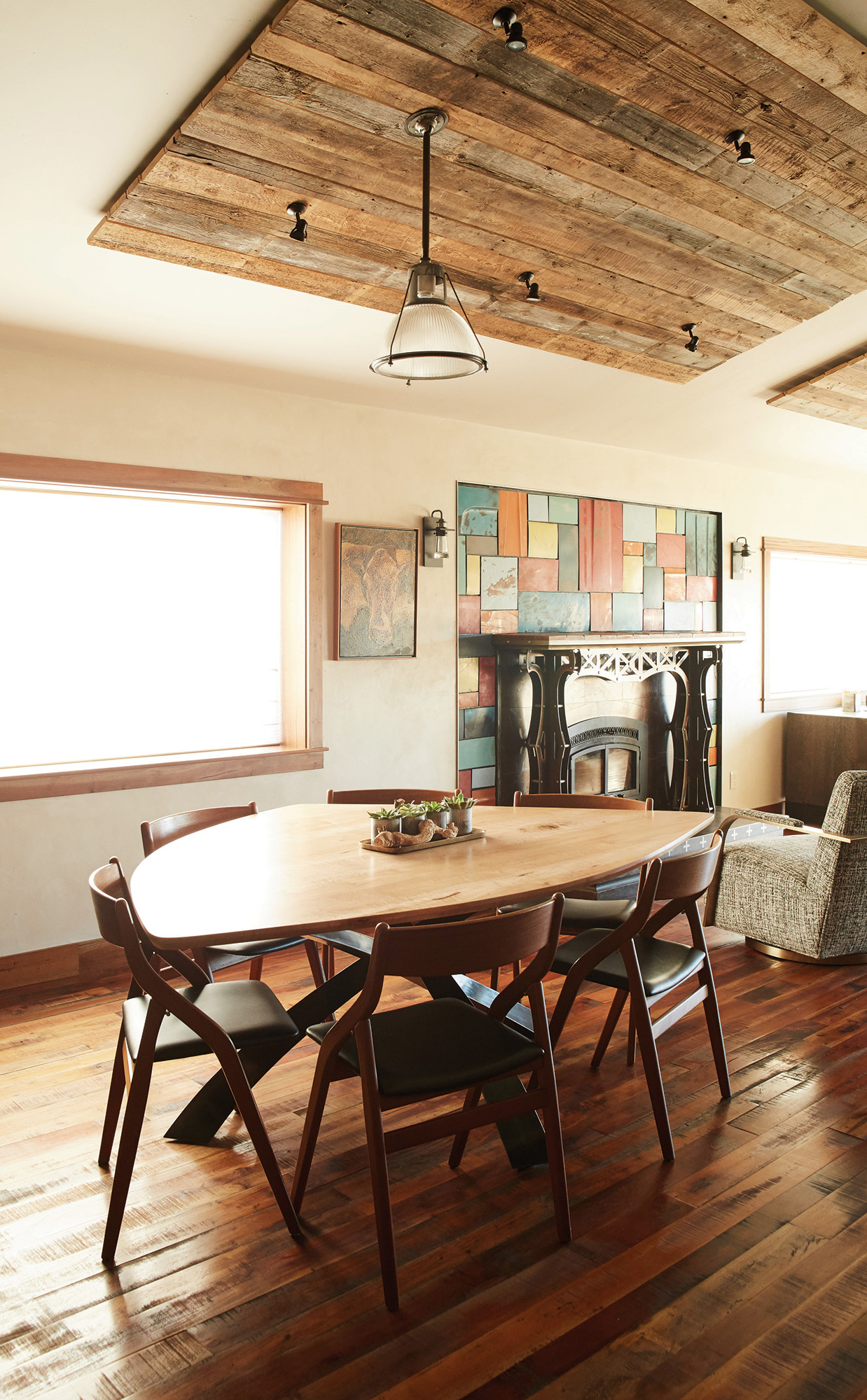
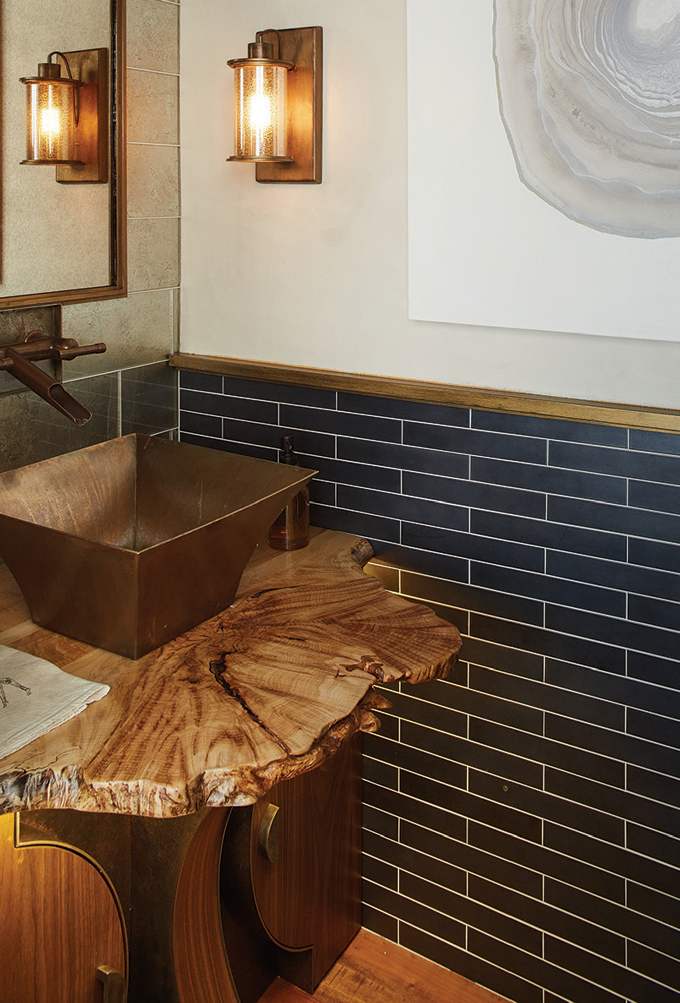
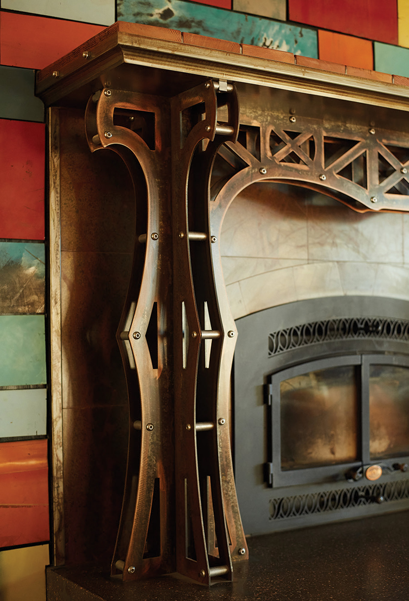
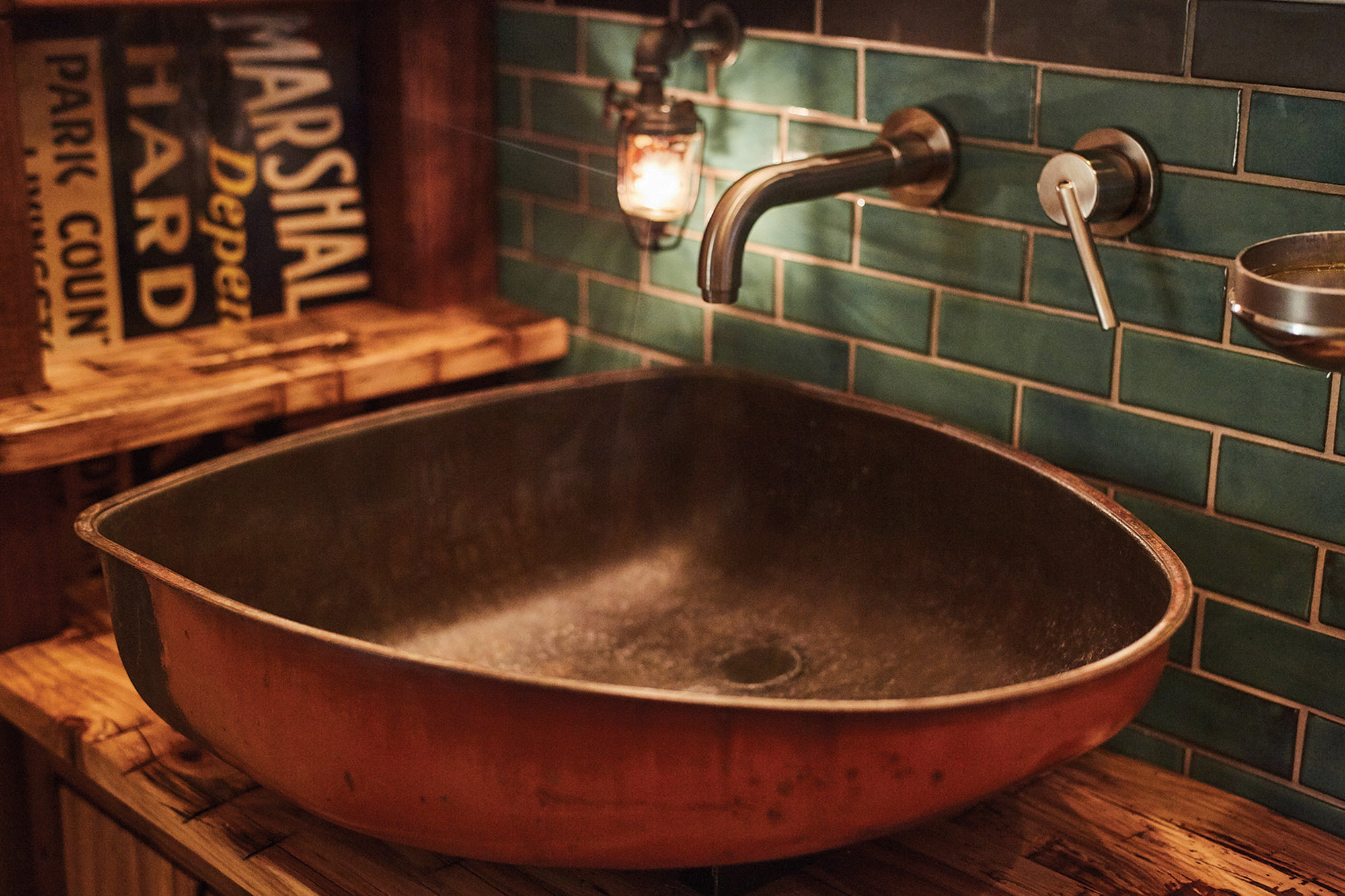
And just as the welder’s hood became a kitchen fixture, Brandner sees not what things are, but what they could be: The sink in one bathroom is half of the gas tank from a 1940s-era Case tractor. The nightlight in the same room is the petcock off of the same. The vanity on which the sink sits is made from reclaimed wood that was, in the 1700s, a loom in Virginia. Sliding glass doors in the basement were scrounged from a Montana industrial site. The tiles around the fireplace are made from the sun-bleached hoods of salvage-yard pickup trucks.
Of course, it’s one thing to come up with clever ways to reuse old materials. It’s another thing entirely to build a high-end design firm that’s not only funky and unique, but has a reputation around the country for doing exceptionally high-quality work, too. “There are a lot of furniture and hardware and accessory and architectural furnishing companies out there that build nice-looking things that aren’t necessarily the best quality,” Brandner said. “But we have always maintained our standards. We believe in American craftsmanship, and we’re building things that are going to last. That’s the way things are supposed to be built.”
Throughout the home, and in every material, the level of skill and attention to detail are abundantly apparent. Brandner credited this commitment to quality and craftsmanship with helping the company get off the ground — and grow by leaps and bounds, even in the thick of the 2008 recession. “It was a risky thing for us to do, because we could have just jumped on the bandwagon of mass producing designs for cheaper, and we were approached by many companies, even some in China,” Brandner said. “But we refused to do it. It’s going to cost a little bit more, but it’s something that you’ll really cherish and value, and there are people out there who still appreciate that.”
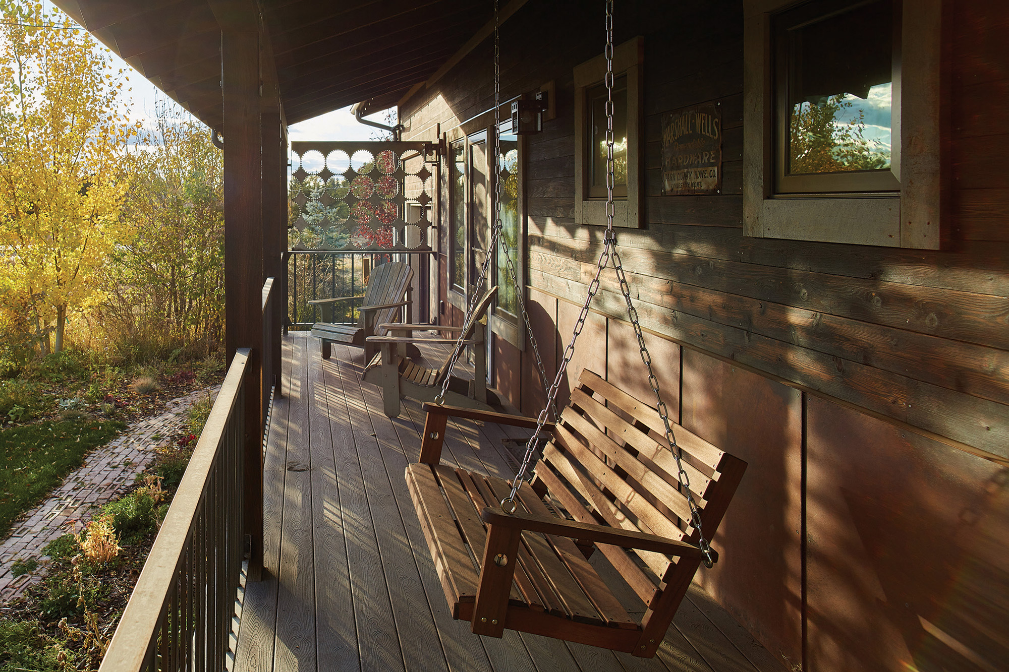
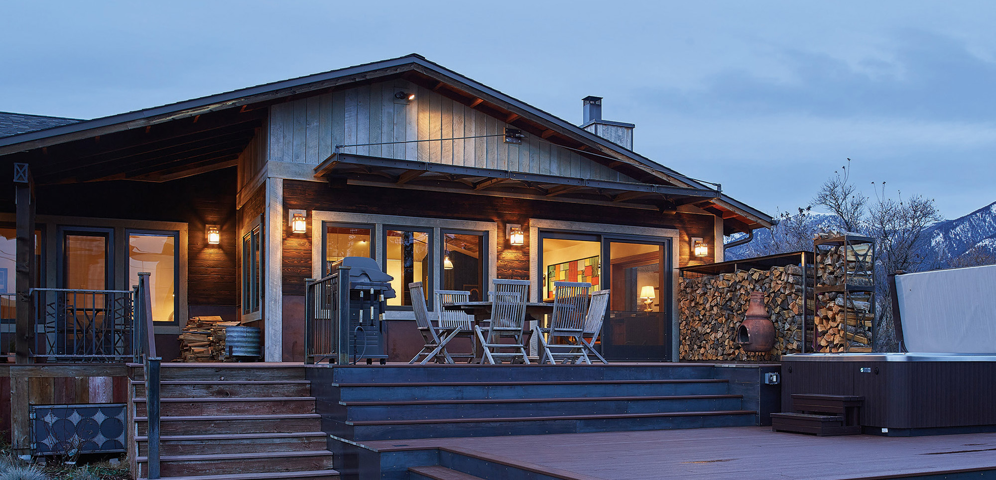
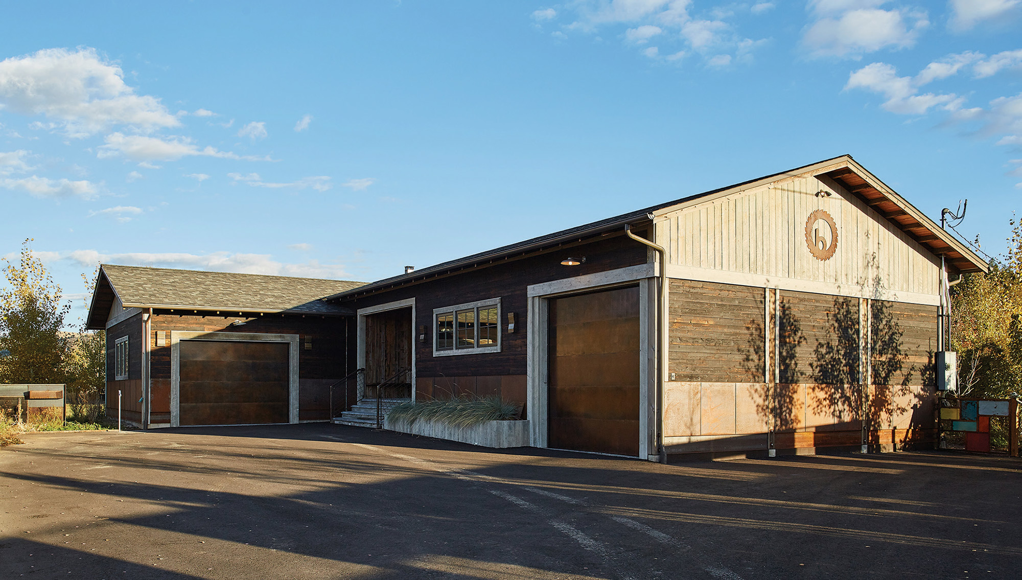
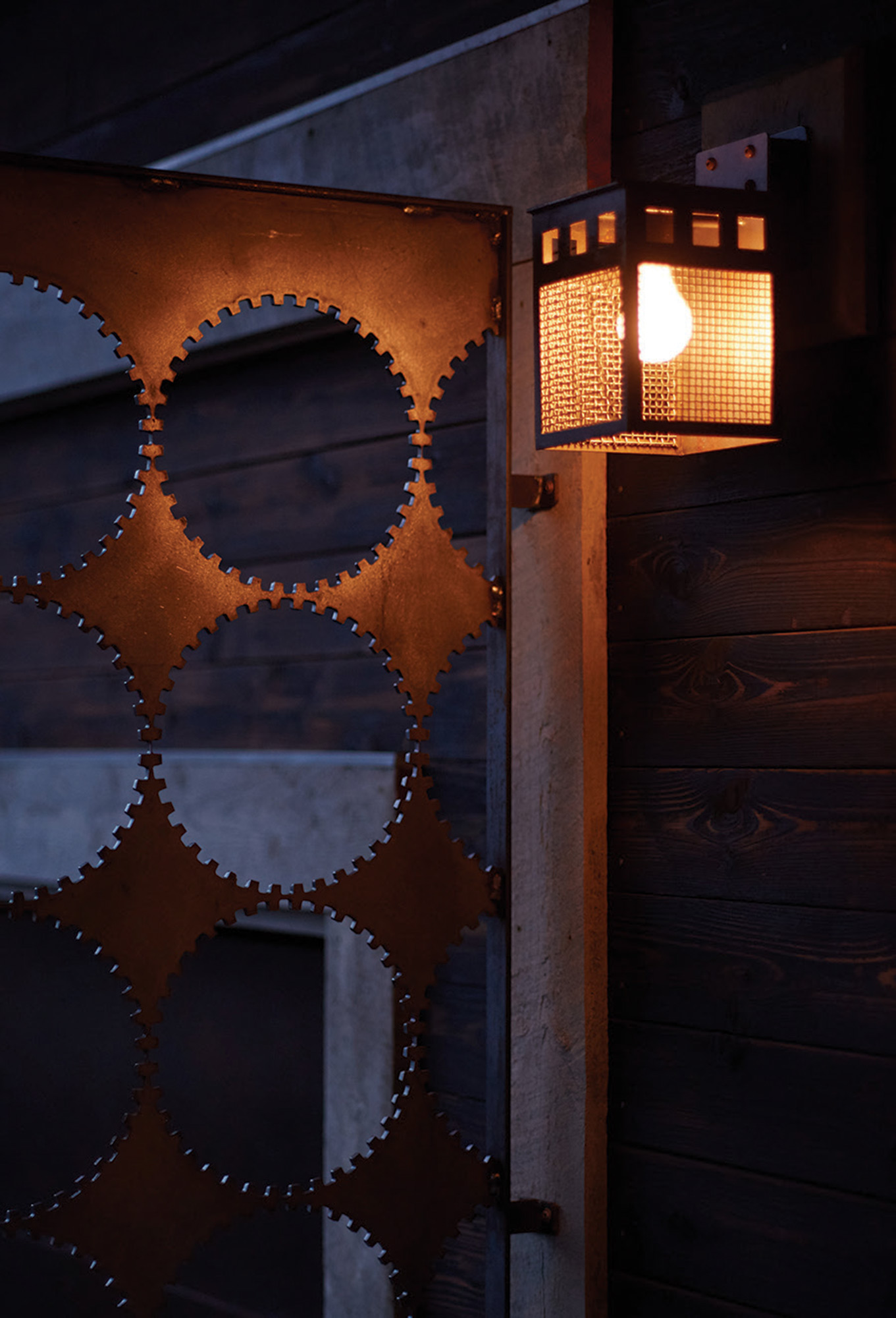
Ultimately, the home showcases what every good designer should do: create a space that’s comfortable, creative, and well-executed, and also draws inspiration from its surroundings. Sitting just a stone’s throw from the historic Story Mill and not far from downtown Bozeman, the home plays off the area’s industrial past. “It was a millworker’s house, and we designed it so it would be reminiscent of the mill itself. We used some steel, and we used shou sugi ban (burnt wood) on the exterior of the house, and we did some industrial things inside the house as well, trying to carry that mill vernacular through the whole design.” A Mondrian-style fence surrounds the property, a patchwork of sheet steel and gravel screen providing an industrial feel that is tempered by the native vegetation that creeps through the gaps and peers over the top. Even the low pitch of the roof and the angularity of the exterior mirror the lines of the mill itself, standing in the distance.
Given the chance, would he design the home the same way again, with all of its quirks and eccentricities? “It really comes down to what the property tells me,” Brandner said. “I think a home needs to fit the land it’s on.” But, as far as this house goes, he’s pleased that it serves both of its purposes: to showcase the skill set of everyone at the design firm, and to provide a compelling space in which to dwell.
“I just love the feel of this house,” he said. “I’m a very sensory person, and when I first walk in, I still get excited and comfortable at the same time.”
- There’s no one word to describe the Brandner home: There are aspects of the distinctly modern, yet other elements draw their cues from the industrial architecture of the early 20th century and rural farm life.
- Reclaimed tractor seats become bar stools, and a welder’s hood is repurposed as a kitchen vent.
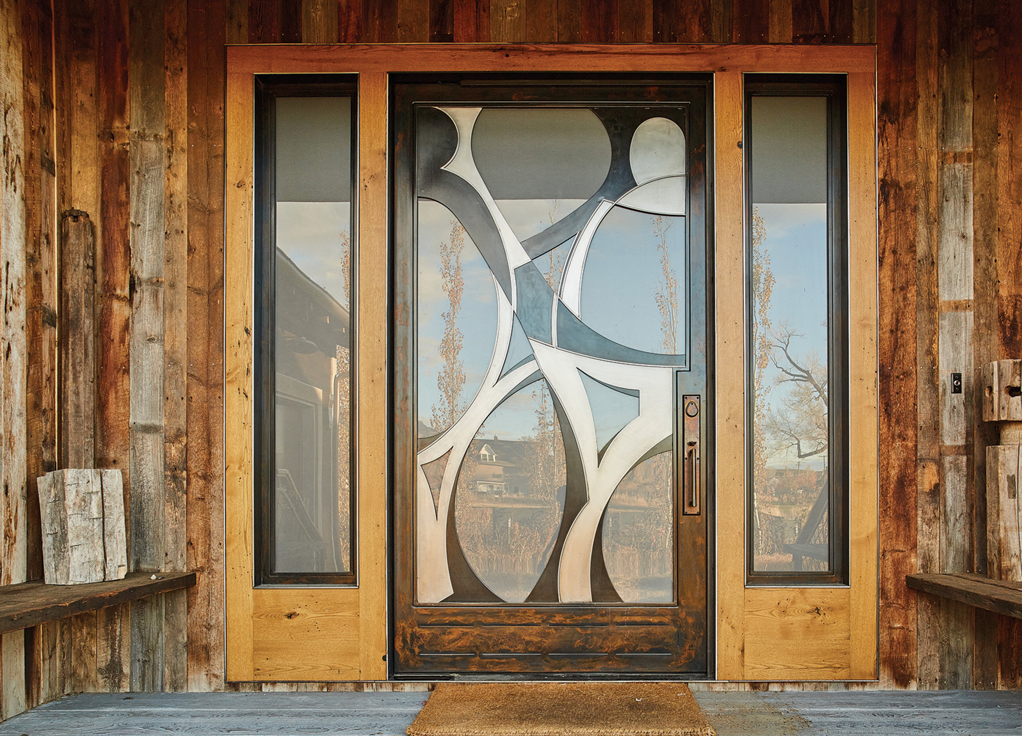
- Glass and steel lend an industrial, edgy feel to the home, while the Picasso-esque, 700-pound pivot door provides a unique entry point. Reclaimed materials — such as barnwood and scrap metal — play a key role, as do hardwoods such as walnut and mahogany.
- There’s no one word to describe the Brandner home: There are aspects of the distinctly modern, yet other elements draw their cues from the industrial architecture of the early 20th century and rural farm life.
- A copper sink and fixtures pair unexpectedly with slab wood and art-deco elements.
- In this home, the delight is in the details — and very intentionally so. The tiles around the fireplace were cut out of the hoods of old junkyard trucks.
- There’s no one word to describe the Brandner home: There are aspects of the distinctly modern, yet other elements draw their cues from the industrial architecture of the early 20th century and rural farm life.
- There’s no one word to describe the Brandner home: There are aspects of the distinctly modern, yet other elements draw their cues from the industrial architecture of the early 20th century and rural farm life.
- There’s no one word to describe the Brandner home: There are aspects of the distinctly modern, yet other elements draw their cues from the industrial architecture of the early 20th century and rural farm life.
- The whimsical mailbox echoes colors and motifs found inside the home.
- Glass and steel lend an industrial, edgy feel to the home, while the Picasso-esque, 700-pound pivot door provides a unique entry point. Reclaimed materials — such as barnwood and scrap metal — play a key role, as do hardwoods such as walnut and mahogany.
- There’s no one word to describe the Brandner home: There are aspects of the distinctly modern, yet other elements draw their cues from the industrial architecture of the early 20th century and rural farm life.
- And the cog-blank shape cut from sheet steel makes a nod to the area’s industrial history.







No Comments