10 Apr A New Angle
Architecture
Thinktank Design Group
Construction
North Fork Builders
Interior Design
Envi Interior Design Studio
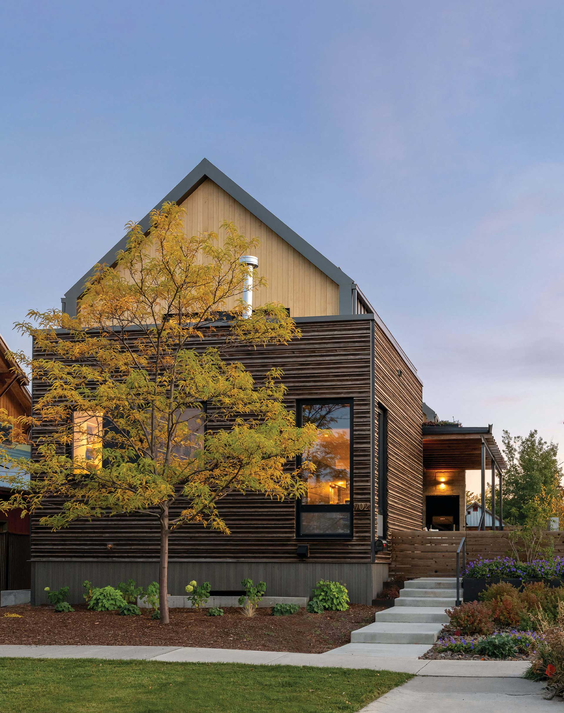
At the nexus of building and design, neighborhood and belonging, sunlight and shelter, is a house becoming a home. A four-bedroom, three-and-a-half-bath, 4,500-square-foot home in northeast Bozeman, Montana blends old ideas with contemporary design, standing as a metaphor for the neighborhood.
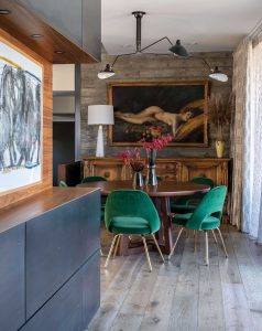
“We combined relics and antiques with new furnishings,” says interior designer Susie Hoffmann. A limited dining room area ended up as a showstopping addition when Hoffmann’s Envi Interior Design team opted for a round table to maximize the space, which was highlighted by an heirloom European oil painting of a nude in a gilded frame against contemporary concrete and complemented by modern chairsupholstered in a lush vivid green velvet.
The lot, tricky by any standard, became an enigma that needed solving. And Erik Nelson, an architect with Bozeman’s Thinktank Design Group at the time (now with Nest Partners), was just the person to solve it. “The idea, from the very beginning, was to understand that the neighborhood is going through change,” Nelson says. “The home had to be conscious of place, scale, and mass in order to give it context and character, and to reflect the artistic qualities of the neighborhood.”

The family’s playful vibe is on display in the downstairs family room, with a mule deer mount offering a nod to the Montana locale against a graphically dynamic wallcovering. An oversize tufted leather coffee table provides space for game play as well as overflow seating for entertaining.
To avoid the building appearing too large, Nelson broke it into two structures, with a connecting corridor between them. He points out that the neighborhood has historically been working class, situated near the rail yard, former ice houses, and still-standing industrial buildings, like the one currently housing the gallery Tinworks Art across the street. The new build uses concrete, metal, glass, and custom crib wall siding that was applied laboriously by hand like a jigsaw puzzle. “The metal on the sides of the gables is reflective of the industrial nature of the area; the blond Accoya wood reveals that it’s more than an industrial building,” Nelson says. “The intricate, cedar crib wall siding creates texture on the building and harkens to old structures, as does the board-formed concrete used in front of the house.”
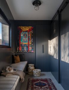
Dark, moody walls highlight a prized Tibetan wall hanging in the dedicated lower-floor mudroom.
The owners wanted to fit in with the neighborhood, and they chose that area because they loved the feeling it evoked; they weren’t thinking about what it could become in the future, Nelson says. He points out that the building faces north, which normally would cut down on the amount of light the interior receives. But Nelson came up with a way to angle the structure toward the sun. “Splitting up the building with a slight angle gives more natural light to all the spaces within the building,” he says. “The most challenging part of the project was the narrow condition of the site and that it runs on the north-south axis.”
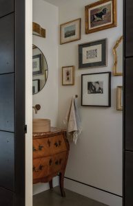
“We tried to look at old pieces in new ways,” says Hoffmann of working with the homeowners’ family heirlooms, including the antique miniature armoire that the team repurposed as a powder room vanity.
As it turns out, the angles make it a dynamic space. “The clients care deeply about place and that inspired me to work within the nuances of everything they wanted,” Nelson says. “This included angling the building, responding to the materials, as well as working with some of their existing art and their pattern of living. It’s their house; it has to fit the pieces of their lives.”
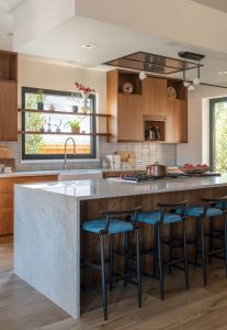
The Scandinavian-style kitchen blends practicality with hospitality. Warm wooden cabinetry, well-lit counter space, and an oversize pantry focus on function for the accomplished chef homeowner while bar stools in vibrant blue leather provide a place for willing tasters to hang out.
The layering of stairways was meant to define different zones, to occupy and include transitional spaces, with gallery walls for the clients’ artworks. “The step-up living space was a response to the needs of the owners,” Nelson says. “Everything exists for a reason. Being very human about needs and not lavishing spaces with unnecessary aspects — it’s basically essentialism. Everything you need is enhanced to create delight. This holds true whether I’m working on a hotel, housing project, or home.”
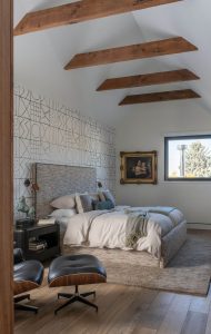
The primary bedroom embraces the home’s European feel including a king-size bed comprised of two twins, French-made Pierre Frey wallcovering, and an 18th-century oil from the homeowners’ collection — which is balanced with the warm wood and clean lines of the overhead rafters and the Eames lounge chair and ottoman for a timeless appeal.
The project became a harmonious collaboration between the architect, builder, and interior designer. Susie Hoffmann, founder and creative principal of Envi Interior Design Studio, and Megan Riff, the primary designer for the project, took care of the interiors, working with the clients’ collection of family heirlooms and art. “In some ways, this move was downsizing for the clients — it was a big change in lifestyle,” Hoffmann says. “They came from a ranch in Colorado that they ran for a long time. They were looking for a community that was really cool — more of a city lifestyle.”
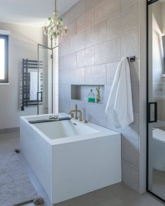
A Venetian Murano glass chandelier brings whimsy and a touch of luxe to the primary bathroom, its delicate curves and pop of color highlighted against the very contemporary perpendicular lines of the tub and black grid towel rack.
The project began during COVID, which presented the team with myriad challenges, but Hoffmann found joy in the process through it all. “It was clear that the interior sensibilities would be driven by their antiques and the art that came with them,” she says. “Ornate pieces of furniture, works of art, it was very eclectic. The question became how to take the envelope of the architecture, bring these pieces in, and blend the two.”
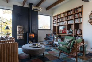
The living room is one of many spaces where the couple’s book collection found a home in custom built-in shelves. An antique chair, reupholstered in contemporary fabric, and an ornate cuckoo clock somehow “look right” with the pared-down halo pendant light, custom log rack, and mid-century-style chairs in an “eclectic look that required puzzling all the pieces together and ultimately creating a story, threading the palette throughout,” says Hoffmann.
The couple’s personalities came through in the pieces they brought with them, but Hoffmann understood who they were as she integrated old and new, traditional and contemporary, into the various rooms. For example, they purchased a Murano glass chandelier while in Venice. “I knew it didn’t really fit, but she loved it, so we put it in the primary suite with the soaking tub, where she could enjoy it,” Hoffmann says. “That was a challenge. It turned out to be very fun to work like that. The husband studied with the Dali Lama, and he collected Buddhist relics. And the book collections are wonderful. We put bookshelves in every room, which provides a rich texture and introduces life into the space.”
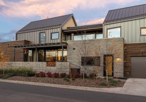
The architects designed the four-bedroom, three-and-a-half-bath, 4,500-square-foot house in a series of levels, pushing the envelope of an unusually skinny lot. Its modern form references the northeast Bozeman neighborhood’s industrial history in concrete, metal, and glass, which are also low-maintenance and capable of standing up to sometimes harsh winter weather.
The homeowners were not afraid of color or texture, Hoffmann says. “That was also a lot of fun, especially with the wallpaper, which added a European sensibility. It was exciting to work with, particularly here in Montana.”
Hoffmann says she loves working on primary residences because they convey a sense of intimacy through deeper meaning. The clients sent Hoffmann a catalog of all these pieces they wanted to incorporate into the house. “There was a marble-top dresser, and we turned it into a little vanity in the bathroom,” she says. “There is a story behind all the pieces, and that helped us figure out how to use them. This really was a delightful project to work on.”
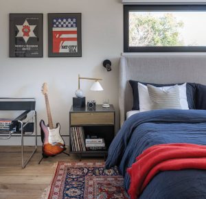
A vintage guitar and posters — including “Hunter S. Thompson for Sheriff” from Aspen, Colorado — offer a ‘60s Americana vibe for this upstairs guest bedroom.
Mark Webber, project manager at North Fork Builders, agrees. “The clients couldn’t have been nicer,” he says. “That house is ahead of its time, as far as the neighborhood is concerned. There are a lot of changes coming.”
That said, the project itself was a challenge. “It was a complicated house,” Webber says. “It has an 85-degree angle on the two exterior walls, which created a lot of challenges during construction. On top of that, we had every variance possible. And for North Fork Builders, it was one of the smallest houses we’d ever built. But it became a really cool house.”
Aside from the variances and the technical aspect of building an angled structure, the largest impediment was the timing relative to the global pandemic. “We did all our estimates pre-COVID, and the supply side of the pandemic wreaked havoc,” Webber says. “Material cost differences were substantial. But the clients understood the situation. With all the shortages, it was a mess. It ended up taking us over two years.”

An indoor-outdoor glass-bridge sunroom separates the primary suite from guest areas and offers a private aerie for lounging with a view.
The articulated crib siding, which looks almost like stacked books, lends a savvy characteristic to the exterior. Every one of those pieces was put up by hand, row by row, and every piece is not a square. “They are individually milled into parallelograms, and each one was connected with stainless-steel fasteners that are hidden,” Webber says. “That was very time-consuming … and very unique.”
With all the complications, the end result was well worth the cost and wait. “Everywhere you go, it’s a feast for your eyes; so many things are happening,” Webber says. “The sight lines make the interior so interesting, and the stairwells are tapered, creating a repetitive memory point for the house. It tricks your brain like an optical illusion.”
Webber notes that the project was a great example of collaboration among the design-build team. “We all had strong relationships,” he says. “It’s a good example on the North Fork side since it was more contemporary than we usually do. It was one of our first, and now that’s 50 percent of what we do.”
In the end, the home merges seamlessly into the growing artistic vibe of Bozeman’s northeast downtown neighborhood. It fits in with the multi-generational houses down the road and across the street. It’s quirky in a place where quirky is the norm. The two-part structure hides the square footage, keeping the home from appearing too large for the lot, and it nods toward the future of Bozeman while embracing the neighborhood’s past.
Freelance art writer and author Michele Corriel earned her master’s degree in art history and her doctorate in American art. She has received a number of awards for her nonfiction, as well as her poetry. Her latest book is Montana Modernists: Shifting Perceptions of Western Art (Washington State University Press, 2022).
Visual artist Audrey Hall is known for her poignant landscapes, evocative images of wild places, and luxurious interiors. Her art is part of the TIA Collection, whose unique purpose is lending significant works to museums and institutions. She brings the rigor of her fine arts and architectural background to the challenges of creativity, resulting in a growing collection of celebrated books, features, and creative projects.


No Comments