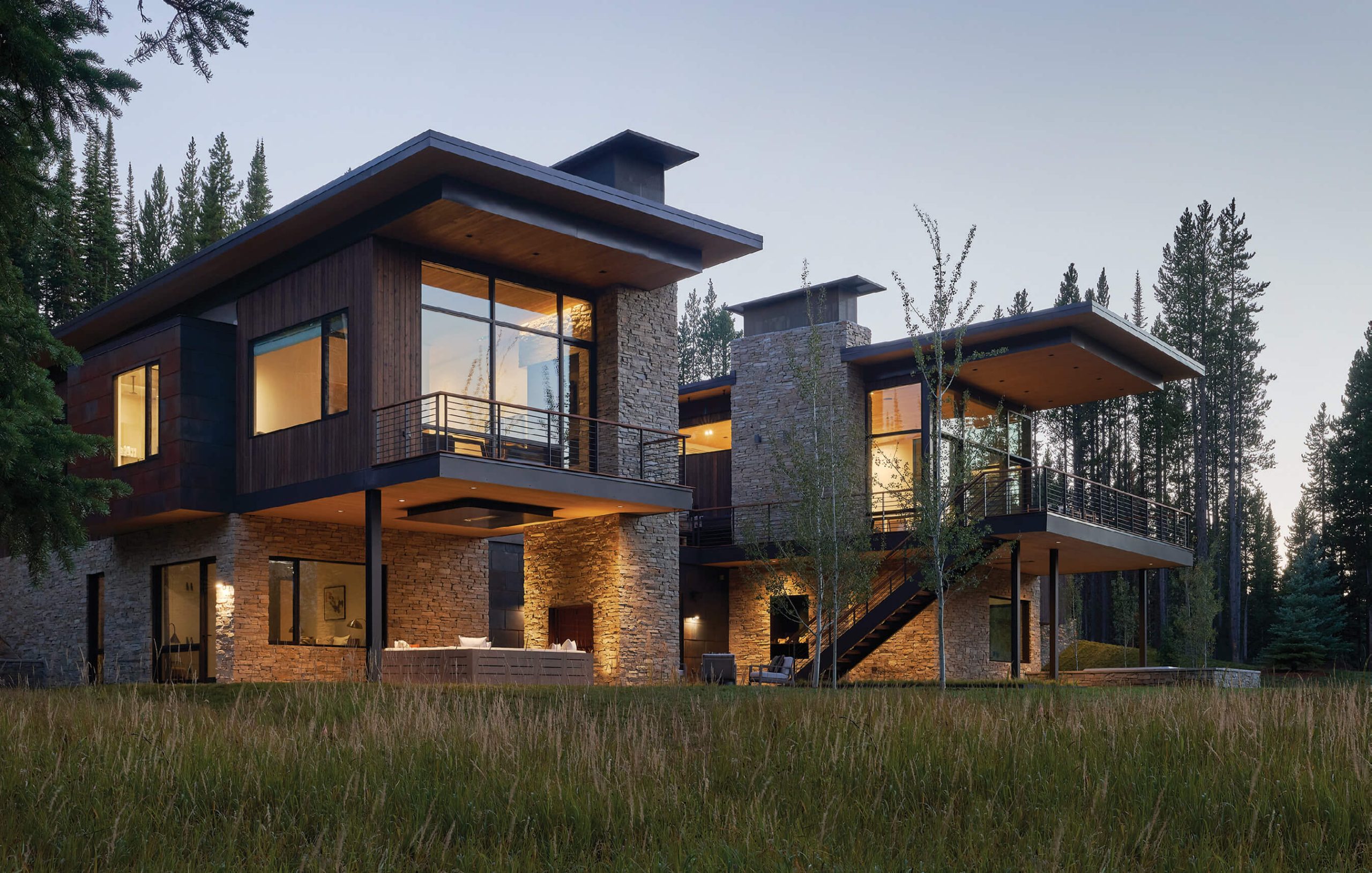
12 Apr Moonlight Basin Basecamp
Architecture
CLB Architects
Construction
Highline Partners
Interior Design
CLB Architects
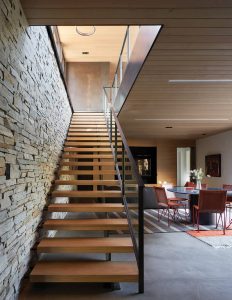
The floating stairs offer a lightwell to the lower level game area and bar.
Snugged in among the lodgepole pines at Moonlight Basin in Big Sky, Montana, a home designed by CLB Architects serves as a basecamp where the homeowners can decompress, gather, and spend time outdoors. “When we met this client in New York City, he painted a nostalgic picture of spending time on his grandfather’s tree farm in New Hampshire,” says Kevin Burke, principal architect of CLB Architects. “His time on the farm when he could just be a kid left enduring memories for him — the kind of memories he wanted to hand down to his own children.”

Low profile furnishings by Dimitry & Co., ROOM, and Cassona maximize sightlines and highlight perfectly framed views of the mountains.
CLB’s design approach is getting to know their clients, learning what they want, and allowing room for them to take an active role. “Part of our process is to show our clients multiple ideas that try to solve the design problem in front of us,” Burke says. “Each design response creates a productive dialogue that allows us to better understand the best response — usually a hybrid of ideas. We also try to allow the site to dictate some of those decisions.”
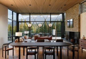
A composition of line, plane, and mass helps the space feel grounded while maintaining visual connection with the exterior. The dining table and chairs by De La Espada and pendant lights from ROOM bring outside colors and textures inside the home.
The Moonlight Basin basecamp consists of 6,000 square feet overlooking a lake in a heavily treed alpine forest. Natural materials and unobtrusive design meld seamlessly with the landscape while the home’s dramatic cantilevered wings angle outward.
Burke’s client wanted a place where the family could ride bikes, hike, or ski year-round; to establish a home, particularly during special occasions, where they could be together as a family. “It was fun walking the property with him, imagining his life on that piece of land,” Burke says. “We wanted to be as sensitive to the environment as we could be, and not simply nuke all the trees to make way for a huge structure. We worked closely with a landscape architect as part of the team to integrate the home into the forest, as well as enhance the health of the dense stand by actively thinning and promoting the penetration of sunlight deeper into the surroundings.”
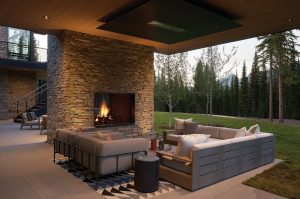
Soft furnishings and an outdoor rug maximize comfort in this indoor-inspired outdoor space.
“From a material standpoint, we took our cues from the site,” Burke adds. “Because the site was so heavily wooded, with a lot of lichens that showed up as dark green to almost black, we picked up on that existing color palette, hence the dark charred-like wood siding.”
In addition to the tranquil lake and natural groves of trees, the site boasts sweeping views of Beehive Basin. “But the big iconic view to Lone Peak was never available,” Burke says. “In a lot of ways, that was very liberating and opened up architectural possibilities for us. We found a beautiful spot where we could tuck the house into a natural rollover, which unfolded to a lower floor opening out into the landscape.”

A steel-sculptured fireplace surround is both light and grounded in stone. Chairs from De La Espada, with forest green leather upholstery, offer connection to the outdoors.
With the owners’ concept of using the house as a launchpad to connect with the outdoors and each other, Burke says it all began as a journey he took with his client. “It’s not unlike what a lot of our clients are looking for — there’s something magical about living in the West and being outdoors,” he says. “[And] it manifested into the design of the house. For example, the bedrooms became a place only for sleeping, so we made them as intimate and private as possible.” However, those spaces spill out to the environment, overlooking the land where occupants can step outside and enjoy breathtaking views.
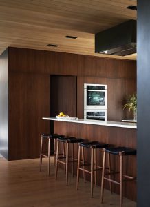
ich walnut millwork helps to bridge dark metal accents with the light wood floors and ceiling.
The structure appears to be a one-story house at first glance. Only upon arriving at the main level is the lower portion noticeable. The main floor houses the garage, mudroom, kitchen, dining room, living area, and primary suite, including an office. “They can live on one floor with no reason to go downstairs,” Burke says. Below is a bunkroom and three bedrooms that spill into a common game and media room. “The kids can hang there, as well as visitors and friends. There’s a nice separation between those two zones.”
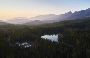
his aerial view of the home illustrates its careful siting to take advantage of lake and mountain views.
Burke knows many of his clients buy land in Montana and Wyoming to participate in outdoor recreation, drink in the vistas, and bask under the big open skies. With that in mind, his houses often take advantage of their locations with large glass windows. “That connection is the reason they bought the lot,” he says. “There are challenges with glass, but there’s nothing like a giant pane of glass opening up to a stunning view. So, with this project, we tried to capture that western view toward the lake and the mountains beyond.”
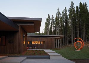
An outdoor sculpture designed by the homeowners’ personal friend is meant to stand out and contrast the earthy textures and colors of the forest.
The primary suite is at one end and the kitchen on the other, each sitting in the two cantilevered sections. The primary bedroom, pushed deeper into the site and overlooking a wetland, allows for inherent privacy. For the lower floor that buries into the hillside, Burke wanted a heavy material that would ground the site. “We ultimately chose a ledge-laid quartzite for the base of the home and the two chimney masses. Blackened steel was used as an accent material inside and outside, primarily linking the two cantilevered portions of the house and in select areas of the interior.”
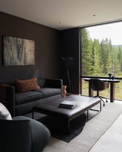
This moody space serves many functions: office,
TV lounge, or guest bedroom.
Rob McRae, principal at Highline Partners, has known about CLB Architects for 15 years, but this was his first collaboration with the firm. “The magic of CLB is that they have such a well-defined process and are incredibly organized, which makes the project smooth for the general contractor,” he says. “This project was an interesting lot to develop, very overgrown, and none of the views were apparent, so a lot of work went into creating those stunning views. The results were amazing. You couldn’t see any of the mountains before the work began.”
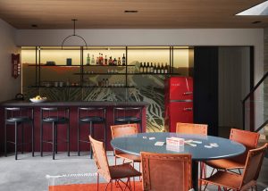
The bar and game room are meant as a contrast to the rest of the home, providing a colorful, playful vibe using vibrant reds and blues. The custom lighted accent wall designed by CLB is an abstract interpretation of the local ski area.
McRae notes that a lot of study went into the project, including construction and the final elevation of the house. “At Highline Partners, we always balance the clients’ desires from a budget and timing standpoint,” McRae says. “In this case, we created an exceptional project and provided value to the client, with a high-end home for a reasonable cost.”
“The team we had on the project performed very well,” he added. “It really comes down to the individual people from Highline that are on the ground every day doing the work, and they did an awesome job.”
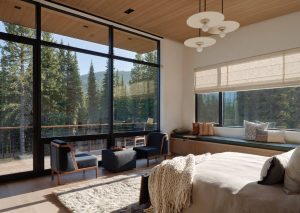
he primary bedroom welcomes and embraces the surrounding outdoor color scheme consisting of greens, deep blues, and rust. The pendants are by Anna Karlin.
Keeping with the idea of an indoor/outdoor aesthetic, interior designer Sarah Kennedy, principal at CLB Architects, used an array of natural fibers and materials. “Throughout the house, when picking the palette, we brought the outdoors in,” she says. “The palettes we developed picked up on that moment of projecting you outdoors. You feel like you’re sitting among the treetops.”
CLB’s architecture and interior design teams work hand in hand with each other and the client, which allows CLB to formulate the entire project from start to finish. Both Kennedy and Burke met with the owners at their loft home in New York City. “Our role was really focused on the idea of a compound for his family, a space where he could eject them from the city lifestyle and get them involved in nature,” Kennedy says.
To do this, CLB created zones in the house, both through the architectural and interior design processes. “There is such an intimate connection with the outdoors,” Kennedy says. “It’s essentially a ski house and a summer fishing house. When people enter, there’s a drop zone for the gear according to the season.”
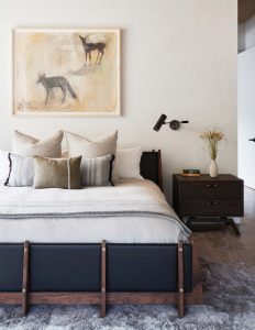
The primary bedroom melds soft leathers and a plush rug with a sculptural bed by Thomas Hayes.
Kennedy combined the owners’ private art collection with newer, contemporary Montana art, encouraging an individualized dialog between the two. For example, Annie Oakley, by Rudi Broschofsky, is made to look like it came right out of an old newspaper and hangs in the bar and dining area, while abstract painting Conjured Dreams, by Hugo McCloud, resides on the opposite side of the room. The contrast of the two pieces accents a dichotomy of history and myth, of nature and speculation.
In the primary bedroom, Jane Rosen’s painting, Coyote Hill, uses soft colors alongside an abstract image of a deer and coyote. The tension in the painting dissipates through the use of muted pastels and quiet shadows. “That was very intentional,” Kennedy says. “It was interesting to develop the furnishings and collaborate with the art. Nothing reflects a home’s personality like the selection of art. It’s fun to weave that portion of it into a home.”
Walnut, oak, and other natural wood pair with rusty greens throughout, except in the game room, where the red leather furnishings complement a rear-lit color-backed glass that depicts the ski runs on the mountain. “We made sure none of the areas seemed too cavernous, but instead are cozy and comfortable for the whole family,” says Kennedy. “We also included some fun aspects, so nothing feels too serious.”

In this bath, minimalistic forms mix with neutral colors to provide a backdrop for distinctive pendants by Hachi Collections.
“For this home, we did our best to find domestically sourced pieces, natural wood, linens, organic textures, and colors to bridge the gap from outside to inside,” she adds, “Trying to create a space of harmony is important. The clients wanted it to feel comfortable for anyone staying there.”


No Comments