08 Apr Design Elements: Painting A New Year
At the beginning of each year, many of the top paint companies announce the shade they believe best represents the design trends of that time, with picks that range from neutral tones to uplifting pops of color. Often driven by fashion, technology, lifestyle, and pop culture around the globe, these aim both to reflect and distill a specific mood.
This year, as the planet emerges from the pandemic with one giant sigh of exhaustion, the design world is responding with elements and accents that embody simplicity, comfort, and self-care, both inside and outside of the home. As such, a calming new palette inspired by nature is dominating the horizon. “Paint color has a direct impact on the mood of homeowners and their guests,” says Erika Woelfel, the vice president of color and creative services for Behr paint company. “We’re seeing homeowners lean toward engaging hues that are reminiscent of the outdoors. Calm hues and nature-based colors provide balance and a breath of fresh air in your space.” Though green is at the fore of 2022 color trends across the board, other affecting shades, ranging from sunny golds to rich blues, are completing the calming new palette.
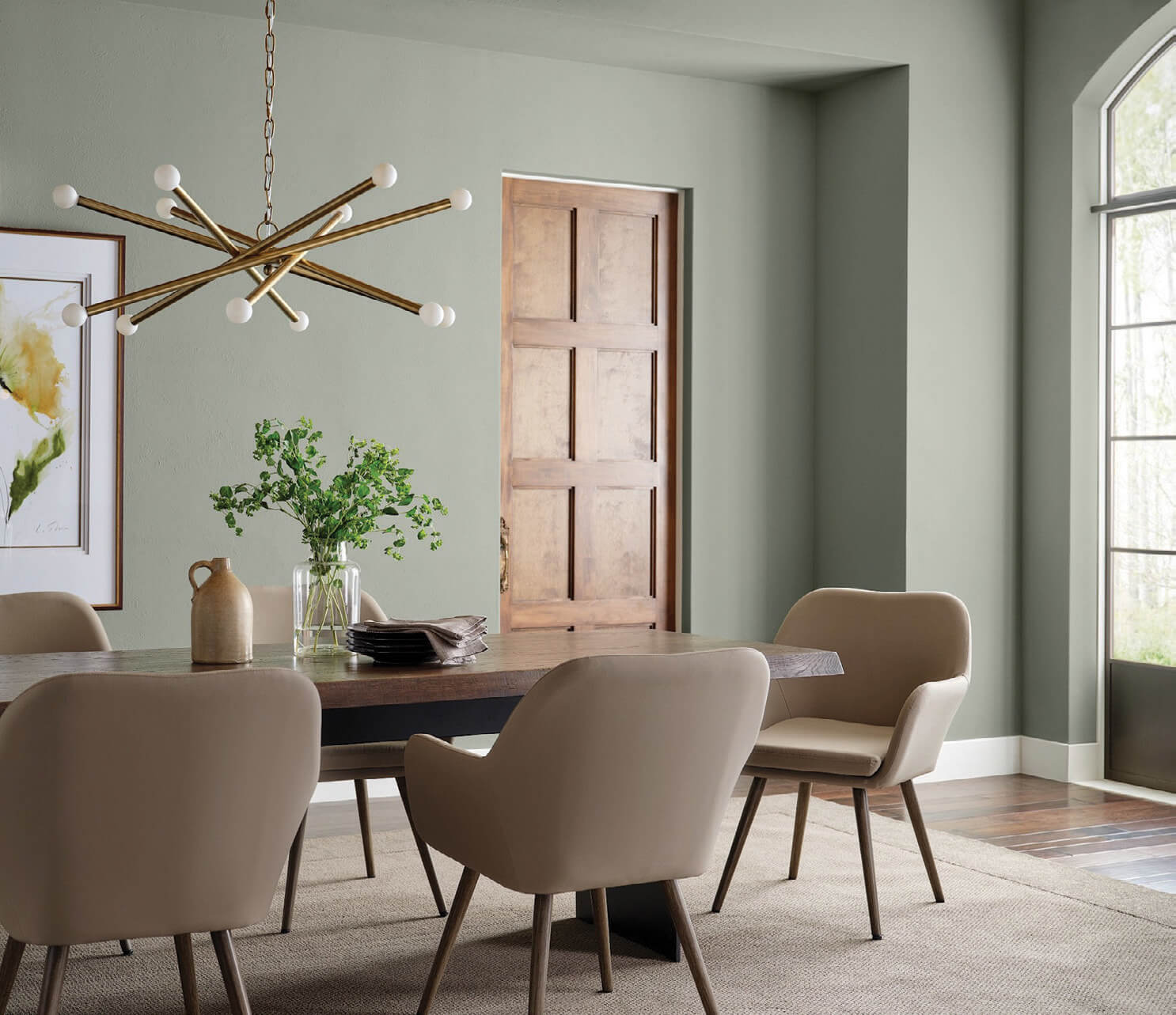
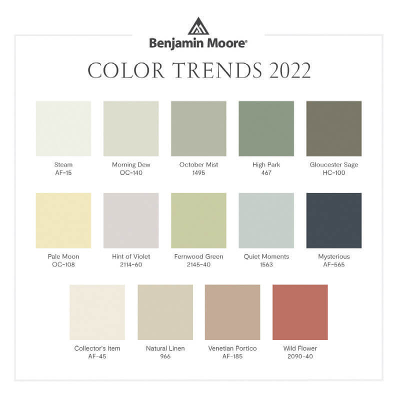
Benjamin Moore’s 2022 Color of the Year, October Mist 1495, came as no surprise to interior design professionals who have noticed green hues dominating the marketplace since the beginning of the year. The soft, sage green “quietly anchors while encouraging creative expression through color,” the company states. Indeed, the shade provides a subdued backdrop for understated complementary palettes and an equally inviting contrast to vibrant, eccentric choices. “October Mist 1495 and the corresponding Color Trends 2022 palette reflects an effortless harmony of colors, while inspiring unique combinations for any paint project,” says Andrea Magno, Benjamin Moore’s director of color marketing. “As the spaces in our homes continue to evolve, we uncover more opportunities to express our individuality and leverage the power of color to design environments that serve different functions and styles.”

For 2022, Sherwin-Williams selected Evergreen Fog, a nourishing and sophisticated gray-green. The company declares that after years of cool neutrals and bold jewel tones, this particular shade ushers in a new era of nostalgic mid-tones. Sue Wadden, director of color marketing for the paint company, describes it as “a sophisticated wash of color for spaces that crave a subtle yet stunning statement shade. Evergreen Fog inspires us to begin again and is a great choice for modern interiors and exteriors.”
While popular interior design publications like Dwell and Veranda concur that 2022 is all about the green, their other classic and contemporary picks include soft grays, warm neutrals, soothing pastels, and rich rusts that ground spaces in easy, earthy shades, while punchy floral-inspired accents in daring chartreuse, bright periwinkle, and sunny yellow inspire visions of lush, verdant gardens. Each of these choices, or charming mash-ups of many, reflect a touch of the pre-pandemic stylistic panache we’ve all been missing.
In fact, a new coat of paint can provide a welcome facelift to drab interiors, often setting the stage for style and design changes to make the old, new. Prior to looking at paint swatches, it might be advisable to consider how each room will be used; the furniture, art, and decorative elements that will remain in the space; and the ambiance you want to invoke. For instance, bedrooms should inspire sleep and relaxation, while kitchens might be more aptly defined by bright energy and light. These considerations can then be informed by color theory: bright shades bring energy, cool colors are calming, neutrals create blank slates for more vibrant decor. Minimalists might lean toward a simple white, while eclectic styles might mean bolder shades.
Whatever the reason for a fresh coat of paint, the range of options is endless and confined only by the reach of your vision. As French Post-Impressionist painter Paul Gauguin once proclaimed, “Color! What a deep and mysterious language, the language of dreams.”
FIVE IMMORTAL SHADES
According to marthastewart.com, five paint shades consistently dominate the housing interiors market and can predictably increase the desirability and value of your home.
WARM GRAYS can provide a sophisticated backdrop to almost any design aesthetic, and a soft touch.
SOFT WHITES are a classic choice for good reason, as they give buyers a blank slate for their art and decor.
LIGHT PASTELS are optimal for adding a whisper of color without the statement-making intensity of vibrant hues.
BEIGE is popular across all design styles and pairs nicely with natural materials like wood and stone.


No Comments