16 Apr Design Elements: Creating Classics
A Montana designer works with tradition
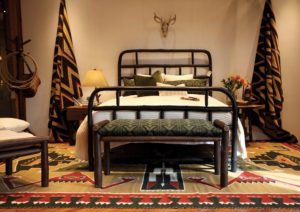
The Roundup Bed (queen-size), made from blackened, bent American hickory
Jeremiah Young has been the owner and creative director of the Billings and Red Lodge, Montana-based interior design firm and showrooms Kibler & Kirch for almost a decade. With a serious and long-lasting crush on the classic Old Hickory furniture brand, he visited their headquarters on a whim. Now, along with managing Kibler & Kirch, Young serves as the creative director for Old Hickory, a position he has held for the past year. Here, he chats with Big Sky Journal about scoring his dream job, and why he’s drawn to Old Hickory’s campy style.
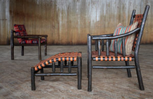
The Great Falls Chair and Ottoman (fore- ground) and the Butte Chair (back)
BSJ: What inspired you about Old Hickory?
Young: I am a lover of old things and of things well made, and made the way they’ve always been made. One of the places that you see Old Hickory’s original pieces are in the national parks. For example, when Old Faithful Inn was built in 1904, the place was furnished with Old Hickory from stem to stern. Those original pieces have been in continuous production and in continual service. They might need to be restored every 80 years or so, but they’re impossibly durable. My first experience was seeing it in the parks as a kid and loving that style. They pretty much invented rustic furniture as we know it — the bending of the hickory —and they’ve carried that mantle.
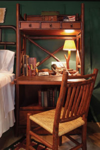
The Big Ranch Secretary desk
BSJ: How did you get involved with Old Hickory?
Young: It’s made in Indiana, not too far outside Indianapolis, and I had a family reunion there. I called up Bob Morrison [vice president of sales and marketing at Old Hickory] and took an extra day to see how it’s made. I’m kind of nerdy when it comes to how things are made. I spent a whole day there, and I just got along with those guys. They are wonderful people, and they’re doing something that I think is under-appreciated. A little voice said, ‘I have something I can add to this, a genuine love and passion for it, and an outside view.’
I proposed to Bob that we do a room for Old Hickory at the Western Design Conference. I would design it, and they would build it. I drew some stuff and went to the factory for prototypes. That year, my team won an award at the conference. I said to Bob, ‘What if I design furniture for you?’ He hired me to be the creative director, to design showrooms, trade shows, and give creativity in whatever form is needed. I started sketching, and I’ve designed about 15 pieces in the last year.
BSJ: Can you explain what their “campy” style entails?
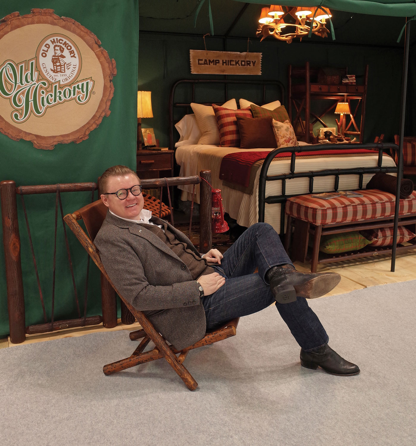
Young: We won Best Exhibit at the 2018 BDNY Boutique Design Trade Fair. It’s in the Jacob K. Javits Center in New York City, and there’s terrible flat light and a huge volume of space. I thought, let’s do something in there that literally transports people to somewhere else. In a sea of exhibitors, we had a green tent, like a camp setup, and everything inside was like a movie set of sorts, everything had been considered. It stood out, and there were a bunch of new designs in there.
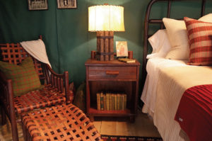
The Great Falls Chair and Ottoman, Gathering Lamp, and Roundup Bed
BSJ: how does this camp style suit the Rocky Mountain design world?
Young: It’s made for interiors, but for the design show we set it up in the tent. People call it “glamping,” like luxury camping. It’s being indoorsy in the outdoors in a way. If you pulled any of those pieces out, they could live in a traditional home. And pulled out of that context, they could also be put in a contemporary setting. Old Hickory is so flexible; it’s not just for a cabin. We see them put into clean-line projects, the ones that have soul. That makes for a great mix.
BSJ: What are some of your current designs?
Young: All the designs I’m doing, I’m naming after places in Montana. The Great Falls Chair … I just love it. It feels like it could have always been made by Old Hickory. It’s impossibly comfortable; your body sort of flows into it. It has woven leather; it’s kind of hip, but also an old way of thinking. •
6 Tips for designing a home library
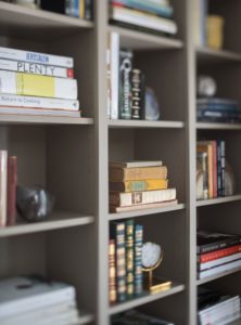
Photography: Aaron Kraf
With a master’s degree in library and information science, Christy Shannon Smirl has combined her love of books and interior design to create Foxtail Books & Library Services, working with collectors, designers, and book-loving homeowners to customize personal libraries that inspire and stir curiosity. Based in Jackson Hole, Wyoming, Smirl travels throughout the country, creating collections for clients that are sophisticated and timeless, and that also align with their personalities, aesthetic tastes, intellects, and interests. Her latest projects include curating a modern art/design library in New York City and organizing an extensive residential library collection in San Marino, California. Here, she offers six tips for designing a home library.
1. Use different textures and materials that correspond to the design of the room
Arranging books alongside metal, fabric, stone, and natural materials connects them to the room’s layers of warmth and culture. A variety of art and objects on your shelves speaks to the variety of literature and subjects in your collection.

Flo Mccall
2. Create symmetry by alternating the placement of books (vertically and horizontally) and spacing (the fullness of
the shelves)
Books give us the feeling of order and balance. Shelf-by-shelf variety makes a wall of books easy on the eye and draws interest to the details.
3. Design shelving with your particular books in mind
Shelving should suit the books you hope to showcase, so it pays to be thoughtful about elements like lighting, adjustable shelves, height, and depth. Rare books, children’s books, and particularly large format books are some examples of the variables that might affect the shelving you choose.
4. Be intentional about the books you place at eye level, and organize based on how you use the books
Eye-level shelves get the most attention and are the easiest to access. Are you constantly reaching for a particular reference or a favorite children’s book? Are you most proud of your collection of first editions or your beautiful photography tomes? Your most important or useful books deserve the best real estate.
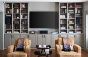
Aaron Kraft
5. Use your books to reflect who you are and what you’re passionate about
Sure, books work well as design elements because of their aesthetic qualities. But their content also adds to the look and feel of the room, and personalizes your home like nothing else can. Do you see yourself in your collection? Consider adding a few things that speak to recent travels or new passions.
6. Don’t be afraid to change things next month or next year
Books are design pieces that we use every day. Unlike a painting or a coffee table, books are easy elements to play with whenever it strikes your fancy. Using that flexibility can be a fun way to enjoy them, and to change up your space when you get the itch. •
BOOKS
Cabin Style: An artful experience
Written by Chase Reynolds Ewald | Photography by Audrey Hall
You can guess you’re in the home of an artist when every object, whether an important painting or a repurposed flea-market find, is placed in perfect juxtaposition to the other objects in the rooms. The result is that each item, no matter its value, is elevated to a piece of art. It can be a rarified experience to visit such a place, where the filled spaces are perfectly balanced by the negative spaces, and where the featured items are positioned to create an experience that is at once gallery-like and restorative.
For an artist couple, their search for a contemporary house in Jackson Hole, Wyoming, led to an unlikely choice: a 1989 log home and guest cabin. Although the house was well-proportioned and in good shape, the varnish applied to the logs decades before had yellowed. Inside, an oversized river rock fireplace constituted a domineering presence against floors of Douglas fir and quartzite flagstone. The windows were small, the rooms were dark and cut off from one another, and the home lacked a healthy connection to the outdoors.
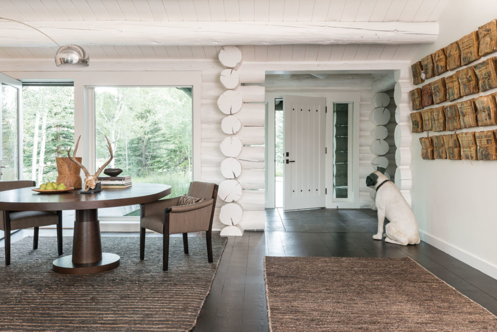
Having purchased the property for its proximity to the ski mountain, the privacy of the neighborhood, and the spectacular view of the Grand Teton, the couple placed their faith in Carney Logan Burke Architects and Tennyson-Ankeny Construction to enact a dramatic transformation. Architect Matt Thackray credits the owners — the husband a wood-turning hobbyist, the wife a mixed-media artist — with challenging the team to think creatively. “Great clients make great projects,” he says. “That was the case here.”
The house was straightforward in its design, all on one level with a separate two-bedroom guest house. The river rock fireplace was the first to go. The yellowed logs were blasted with ground-up corn cobs and finished to a muted blue-gray on the exterior, where white-painted trim enhanced the clean look. Inside, the logs were painted with an alabaster-tinted lacquer. The treatment brightened and united the interiors, while also highlighting the artistic quality of the true-stacked log corners and exposed log ends within the rooms.
The log surfaces were covered by drywall in places to create a suitable backdrop for art, then painted alabaster for a seamless transition between surfaces. Orange-toned circle-sawn Douglas fir floors were refinished and stained ebony for a modernist contrast. Other significant changes included installing a partial wall between the dining area and kitchen to create a sense of separation; re-engineering the art-filled office to install a large window; opening up the warren-like spaces in the master-bedroom suite; transforming the master bath with floating cabinets, a glass shower, and white subway tile; and introducing larger windows in the living room.
The home has outdoor living spaces on either side of the house to take advantage of — or escape — the sun. Hershberger Design enacted a rustic modern transformation of the landscape contiguous to the house with naturalistic plantings, rusted Corten steel partitions, and walkways of Peregrine Limestone. Terraces edged by tall grasses and lawn amidst mature aspens and cottonwoods give way to meadows extending north, where an additional lot was purchased by the owners to safeguard the view.
Inside and out, the house has a light and peaceful feeling, a far cry from its previous dark and dated incarnation. Carney Logan Burke’s Sarah Kennedy, who worked closely with the owners on the interiors, says, “These are creative people who put a lot of thought into the project and weren’t afraid to push the boundaries. The owner didn’t buy art for the house, she just created the most amazing pieces, like a bust covered entirely with pills. She has to take a lot of the credit for the beauty that is this house.”
With its modest volumes, great light, and perfectly placed objects, the house has a palpable serenity. “People want to feel a connection to nature in their homes,” says Thackray. “This is natural, timeless, and modern all at the same time. It has the cozy qualities of a cabin, yet it still feels fresh.”
from Cabin Style by Chase Reynolds Ewald and Audrey Hall, to be released on August 6, 2019, by Gibbs Smith.
Cabin Style
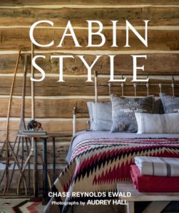 By Chase Reynolds Ewald, Photographs by Audrey Hall
Photos of stunning cabin exteriors and interiors, combined with well-told stories of the homes and their owners, take readers into the living rooms of cozy log, wood, and rock homes in Wyoming, Montana, Idaho, California, and Tennessee. Luxurious cabins lure the owners of second homes to relaxing weeks in isolated landscape settings or upscale enclaves within reach of ski resorts, fly-fishing rivers, and outdoor recreation of all types. This is the perfect gift for anyone planning, or dreaming of, a cabin home.
$50 | 224 pages | 10 x 12 in. | 200 photos | Release date: Aug. 6, 2019 | gibbs-smith.com
The Fantastic Seashell of the Mind: The Architecture of Mark Mills
 By Janey Bennett
Frank Lloyd Wright once said that seashells are nature’s perfect architecture, and Mark Mills, one of Wright’s apprentices, took it to heart. His life’s work is captured in this book by architectural historian Janey Bennett. Considered a visionary architect, Mills adapted roof systems to uniquely blend structural principles and the organic forms of seashells. He considered the ceilings to be shells for humans. The structural elegance of these reveal the skeletons of the buildings, exposed and visible from every part of the interior. Award-winning photographer Bill Sosin contributed to the book, which is an excellent and entertaining source on unique structural forms.
$44.95 | 208 pages | 11 x 7 inches | oroeditions.com
Who’s Afraid of Pink, Orange, and Green? Colorful Living and Interiors
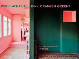 By Irene Schampaert and Iris De Feijter
This artful design book showcases more than 20 international interiors that are brimming with pops of color and personality. Gone are the days of black, white, and gray — instead, this parade of prismatic décor displays the use of warmth and atmosphere to create unique spaces. From deep, dark shades and pastels to strikingly vivid hues, this book will surprise you at every turn with a slideshow of technicolored living. Included also are interviews with acclaimed designers, and advice about design elements and color utilization to create funky and balanced home arrangements.
$44.96 | 240 pages | 11 x 14 inches | lannoopublishers.com
Home Design Shows
March 21 – 24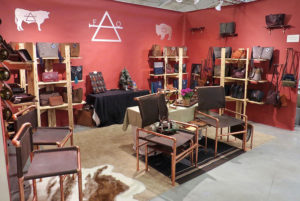
The Great Western Living and Design Exhibition
The Four Seasons Arena at the ExpoPark, Great Falls, MT
More than 80 vendors display and sell custom Western art, furniture, jewelry, clothes, and boots in a spirited atmosphere with live music.
March 23 – 24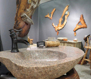
Home Expo
Brick Breeden Fieldhouse, Montana State University, Bozeman, MT
Meet experts in building and remodeling, and view independent vendors to see what’s new in home improvement, with a chance to win more than $3,000 in prizes.
 March 23 – 24
Builder’s Home Show and Lifestyle Expo
Lewis and Clark County Fairgrounds, Helena, MT
Featuring the latest in home design trends at one of Helena’s largest trade shows, with vendors, food, door prizes, and more.
March 29 – 31
Great Falls Home and Garden Show and Sale
Montana Expo Park, Great Falls, MT
greatfallshomeandgardenshow.com
Meet local experts in remodeling, design, building, and landscaping to help kick off spring renovations.
May 3 – 5 & Sept. 28 – 29
Cheyenne Home Show
1530 West Lincolnway, Cheyenne, WY
Local and national vendors feature new home technologies, design trends, gardening and remodeling displays, live demonstrations, and food samples.
July 12 – 14 & August 9 – 11
Art Fair
Miller Park, Jackson Hole, WY
The 53rd annual Art Fair features the work of local and national artists along with music, food, activities, and demonstrations.
August 9 – 11
Sun Valley Arts and Crafts Festival
Atkinson Park, Ketchum, ID
sunvalleycenter.org/arts-crafts-festival
This juried event showcases local and national artists and also includes daily demonstrations, events for kids, and more.
September 5 – 8
Western Design Exhibit and Sale
Jackson Hole, WY
More than 130 artists display fashion, jewelry, furniture, and home accessories for this juried, four-day conference that celebrates unique and functional Western designs.
September 20 – 22
By Western Hands
Buffalo Bill Center, Cody, WY
Showcasing the work of more than 35 top-tier artisans, this exhibition features fine woodworking, craftsmanship, presentations, and demonstrations.
October 26 – 28
Boise Fall Home Show
5610 Glenwood Ave., Boise, ID


No Comments