12 Apr Artful in Essence
When Donn Fuller decided to design a new home in Big Sky, Montana, he thought back to his college days and remembered a lesson from a revered professor during an aesthetics class. The professor asked his students to rank different works of art — painting, sculpture, opera, music, and architecture — according to their impact on the senses.
In the Fuller residence, the art and architecture melds seamlessly for a traditional mountain aesthetic in Big Sky. Photography by Karl Neumann
“I wrote painting or sculpture first,” Fuller recalled, “and everybody put down what they thought was most important, and then we started talking about them.”
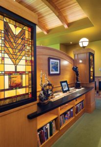
In the Christensen residence, art was not limited to paintings or sculptures, but is also visible in the architecture itself, as with this Tree of Life pattern inspired by Frank Lloyd Wright, found throughout the home. Photography by Karl Neumann
Within this aesthetic hierarchy, the professor explained, painting and music each engage one of your senses — your vision and hearing. Sculpture engages two — vision and touch. Opera possesses both vision and sound, but there is also a physical aspect of performance. Now with architecture, the professor said, there’s a structure that one sees and experiences. You can walk through it, touch it, and understand the visual statements it makes in its materials and form. And, better yet, you can fill it with all of the other art forms: painting, sculpture, opera, and music.
“Architecture, if you put it all together, can be one of the highest forms of art,” Fuller said, adding that he wanted his Big Sky, Montana, home to reflect this sensory and aesthetic experience, to be a complete art form that represented his family not only in the architecture, but also in the art and craftsmanship found throughout. Taking the collegiate lesson to heart, Fuller had a specific plan for the home from the very beginning.
He designed all of the furniture and cabinetry in the home’s three guest bedrooms, master bedroom, and multiple bathrooms. He also designed the staircase, reminiscent of the Old Faithful Inn in Yellowstone. And he incorporated his extensive Western art collection in strategic locations, working with Fire Mountain Forge in Livingston to ensure that they were properly lit. He commissioned one painting by artist Mark Rohrig to balance another by the same artist on the opposite side of a window in the living room. And he reserved a space in the living room for a favorite sculpture that he has had for 25 years, The Ascent by artist Gary Lee Price. The Fullers also planned for open, level areas in the backyard for outdoor sculptures, such as a bronze by John Coleman, The Rainmaker.
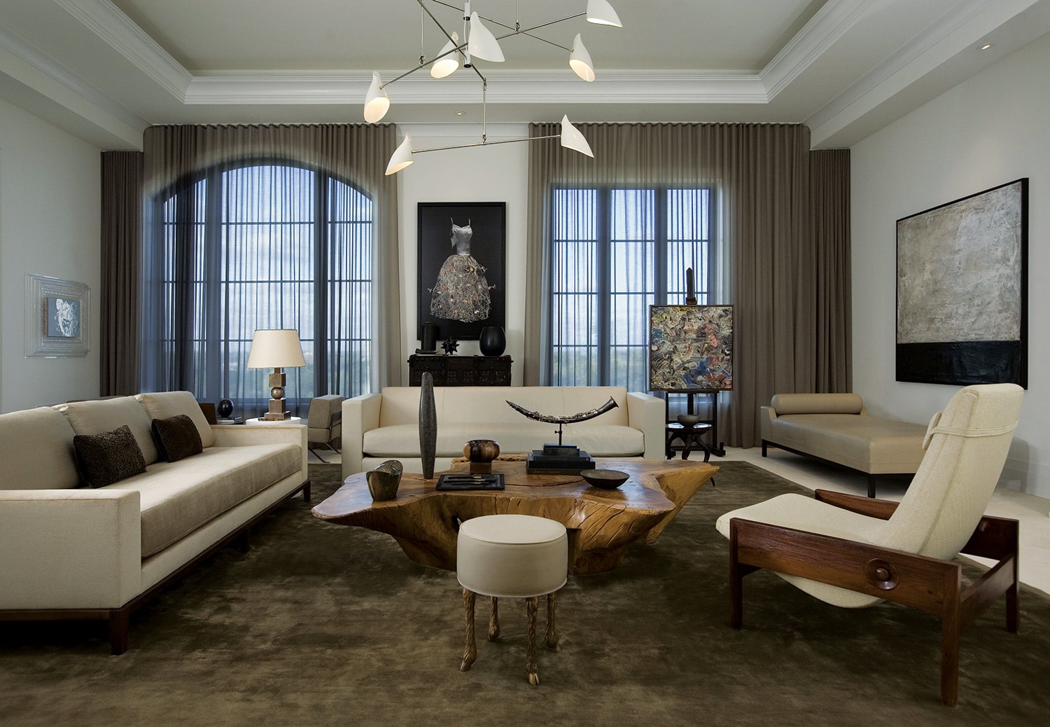
The artwork in this room, designed by Peace Design, sets a tone of serenity, making a statement amid the neutral color palette.
“I wanted to bring the outside inside the house,” Fuller said, “so I wanted to have some stone to make it more of a natural setting for sculpture, and I wanted to have some logs in the house, because there are so many trees outside. But I didn’t want a log house, because I wanted wall space to hang paintings.”
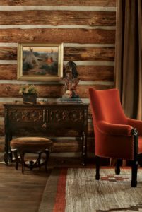
Peace Design creates balanced interiors that reflect their client’s lifestyle, from the artwork to the floor coverings and architectural details. Chris Little Photography
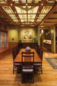
The Christensen residence includes more than 200 works of Western art. “I want to look at a picture and imagine a story,” Janna Christensen said. Photography by Karl Neumann
When a homeowner wants art to be a central theme in their new home, it’s important to plan on incorporating their collection (whether established or just starting) in the early design phase, said interior designer William Peace of Peace Design. Artwork sets the tone for a room and impacts multiple facets of design, among them lighting, color palette, and furnishings.
“We are thinking on day one: Will we light this location? Does a bronze look best in front of a reclaimed wall? Will an oil painting compete with the view out the window?” Peace said.
Incorporating custom niches, art lighting, and rails or mechanisms for hanging paintings are all factors to consider when designing an art-filled home. And it’s important to ensure that significant works of art are not overshadowed by design elements. To this end, Peace approaches interior design as an effort to create a neutral background so that both the view and the artwork are the central focus of each room. “Artwork, to me, can be the view. In the West, it’s all about looking out a window to the beautiful mountains or river or trees in the forest. And we are creating a neutral background to complement that view,” Peace said. “When we think about artwork, we are doing the same thing. We don’t want to compete with the view or architectural materials.”
Peace will commission new artwork to fit the scale of a room, and he often sources art for clients, preferring to work with local galleries or artists to find pieces that are unique to the area and therefore feel aesthetically appropriate. He considers adding variety to existing collections, and most importantly, finding pieces that reflect his clients’ interests and personalities, and that they will love for long time.
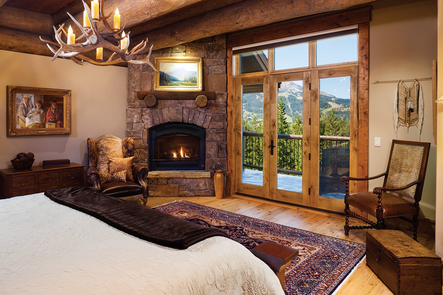
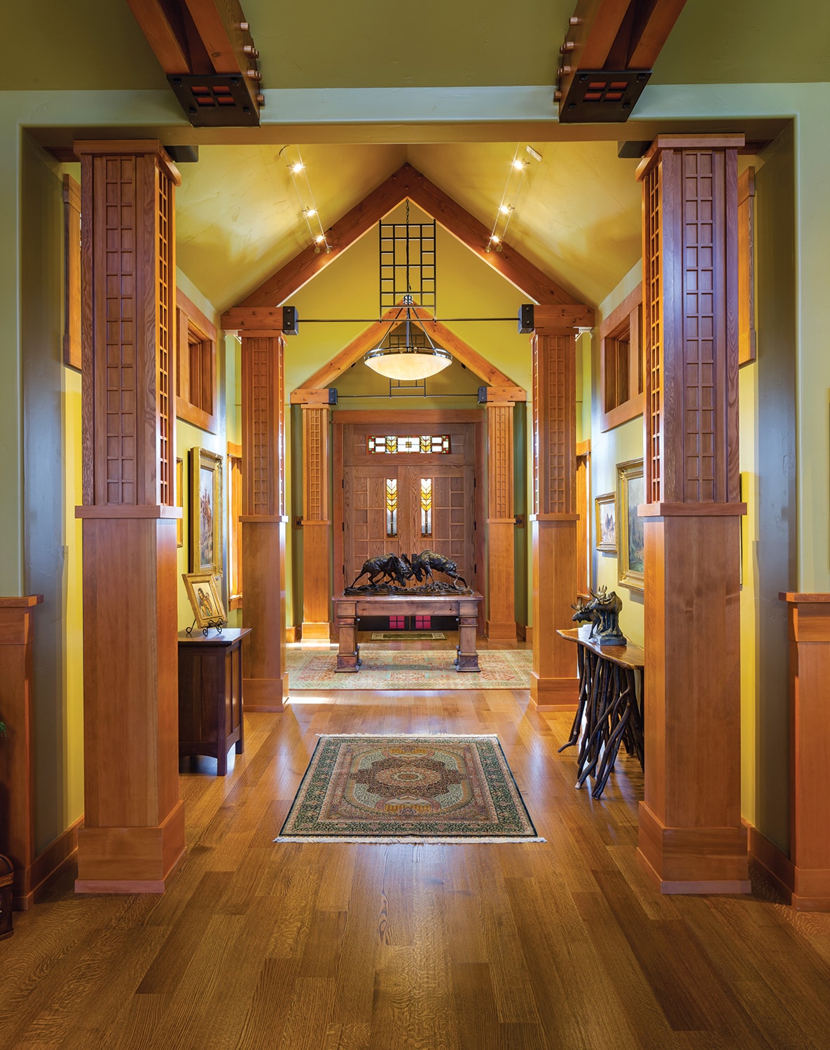
The Fullers wanted to design a home that had a lodge feel but left plenty of open wall space for artwork. Photo by Karl Neumann
“When we design houses, a lot of the time we go and find artwork and bring two or three paintings in for a certain area. We’ll try this, and then another one, and it’s always amazing how it can change a space dramatically, depending on what you select or what feels right,” he said.
Often Peace will reframe works so that they feel right in relationship to the architecture. The frame should complement the art and not command what you’re seeing, Peace said. And lighting, which “makes all the difference in the world,” is used to either focus on a subtle detail within the work or illuminate the whole image or sculpture clearly. “It provides the opportunity to make it really special,” he said.
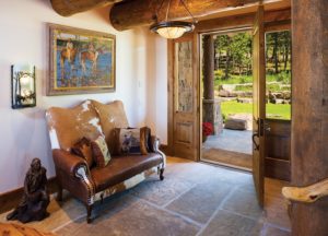
The Fullers worked to incorporate their extensive art collection, but avoided the stark, gallery feeling by offering plenty of negative space so that works of art could “breathe.” Photography by Karl Neumann
The Christensens considered lighting one of the most important factors when they designed their home in Bozeman as a showcase for their more than 200 works of Western art. The Western greats line the walls of their home: Tim Solliday, Logan Maxwell Hagege, Andy Thomas, Charlie Russell, E.S. Paxson, Frederic Remington, Clyde Aspevig, Ray Swanson, and O.C. Seltzer.
“Out here everyone loves the view,” Janna Christensen said, “but natural light isn’t necessarily great for art.” To balance the large windows that provide mountain views, they incorporated exterior overhangs to prevent direct harsh sunlight. And in the entryway, which showcases primarily deceased artists, the windows are elevated to allow for both natural light and plenty of wall space.
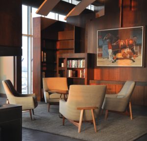
Peace Design approaches interior design as creating a background which lets the artwork and the view be a primary focus. When sourcing art for clients who want a Western appeal, they search for works that the homeowner connects to and that are “a subtle understatement of being in the West and not a cliche,” Peace explains.
“Almost every room has at least one art light. Even in the bathroom, there’s at least one art light,” Christensen said.
They also designed the lighting to be unobtrusive. In the great room, for example, they wanted to illuminate a Harvey Dunn painting over the fireplace, but instead of an obvious overhead light, a more subtle solution was to include a light on the opposing wall.
From the early planning stages, they worked closely with architect Frank Cikan, of Cikan Architects, to ensure that their collection would be highlighted throughout their Prairie-style residence. “We had copies of the blueprints, and we literally placed every piece of artwork within the blueprint, to scale, before the walls were even here,” Christensen said. “In the end, we tweaked a couple, but it’s amazing how many of them are up like we thought they would be.”
The Christensens chose a warm, green-gold wall paint, something that was neutral but not white, to avoid a stark gallery feeling. They knew the color also would complement the earth tones found throughout their art pieces.
“It’s amazing how much space it takes to put art up,” Christensen said. “Don’t overestimate what you can get on the walls, and you don’t want it to look like an art gallery. It takes some thought. You can’t think about it too much.”
The work of an architect forges connections between all facets of life, and art influences the atmosphere of a space. The beauty of intentional design is that it can appear subtle but still convey a strong feeling, ensuring enjoyment for generations.


No Comments